


Designing Accessible Websites: So Everyone Can Use Them

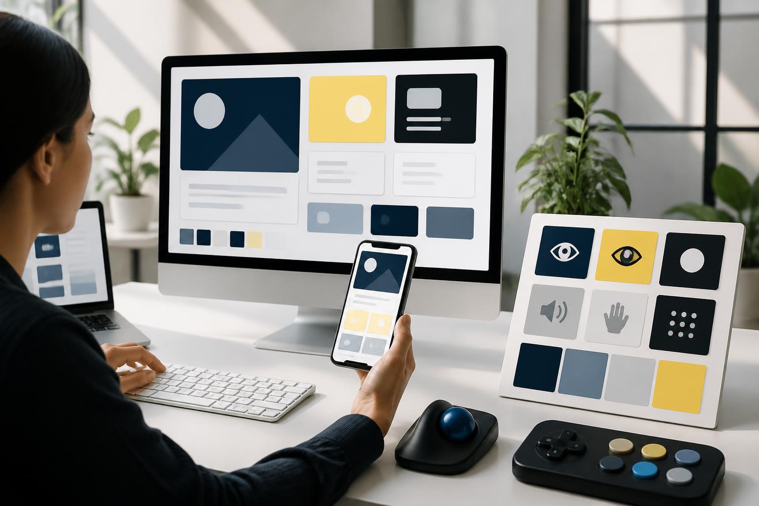
A website can make a strong impression with beautiful visuals, a modern layout, and smooth motion effects. However, these elements alone are not enough to ensure that a website truly serves users well. If a customer cannot read the content because the contrast is too low, cannot complete a form using a keyboard, or does not understand what a button does, their experience is still poor, no matter how polished the interface looks.
Accessible website design is an approach that incorporates the usability needs of diverse groups of users into the process of building digital products. Visitors may use small screens, unstable connections, assistive devices, or a keyboard instead of a mouse, or they may simply be in circumstances that make observing and interacting more difficult. When a website is designed with this mindset, a business not only expands the range of people it can serve but also creates a clearer, more consistent, and friendlier platform for all customers.
Accessibility Begins with How We View Users
Many teams think about accessibility only after the interface has been completed. At that point, fixing issues is often constrained by the existing structure. A button created as an image, a form with unclear labels, or a menu that depends entirely on hover effects will be difficult to improve if these considerations were not taken into account from the beginning.
Accessible design should be regarded as part of product quality, just like loading speed, security, or mobile responsiveness. Before choosing colors and arranging elements, teams should ask practical questions: Can users understand this page without seeing all the images? Can they move through the elements using a keyboard? Does the content remain clear when magnified? Can a first-time visitor recognize what they need to do next?
These questions are not intended to turn every website into the same interface. On the contrary, they help designers distinguish between elements that create identity and barriers that are unnecessary. A brand can still use distinctive colors, large images, or a highly visual layout, as long as these choices do not undermine readability, navigation, and interaction.
A Clear Structure Helps Users Find Their Way
Accessibility is first expressed through information structure. A page with a great deal of content but no order of priority will be difficult for everyone to understand, especially for people who do not read in the usual way. The heading system should reflect the relationships between sections rather than being used merely to create different text sizes. The main heading should describe the topic of the page, while lower-level headings should divide the content into meaningful groups.
Navigation should also be organized according to consistent logic. Menu item names should be concise, easy to understand, and appropriate for the destination content. Important links should not be identified by color alone. If a paragraph contains a link, its presentation should help readers recognize the link even if they cannot distinguish colors well. Calls to action such as submitting a request, scheduling an appointment, or viewing details should be expressed specifically rather than using overly general labels.
The main content should be placed in an easily identifiable position, while secondary areas such as sidebars, filters, or additional information should have clearly defined roles. A proper HTML structure also helps assistive technologies and search engines understand the order of the page. This is an example of why visual design, interface development, and content optimization should not be separated into completely independent tasks.
Color and Typography Must Serve Readability
Color is often considered an important part of brand identity, but it should not be used as the sole signal for communicating a state. For example, a form should not simply turn its border red to indicate an error. Users need to see a text message, know which field has a problem, and understand how to fix it. Similarly, success, warning, and processing states should be expressed through multiple combined indicators.
The contrast between text and its background should be checked in different contexts. A text color that looks attractive on a design screen may become difficult to read when displayed on a phone outdoors or in a low-brightness interface. Text that is too thin, too small, or too tightly spaced also increases the burden of reading. Typefaces should be chosen based on how well they display at various sizes, not solely on their aesthetic impression in large headings.
Magnifying content is a useful test. As text size increases, the layout should not break, important content should not be obscured, and scrolling should remain natural. Design teams should also observe the interface on multiple devices rather than checking only within a fixed viewport. A flexible system of spacing and dimensions will help the website adapt better to users’ diverse needs.
Do Not Overlook Keyboards, Forms, and Interaction States
Many users navigate websites with a keyboard or assistive device instead of a mouse. Therefore, every interactive component needs a logical navigation order. Users must know where they are when using the Tab key, and the selected or focused state must be clear enough not to be confused with the surrounding content. If a component works only when hovered over or clicked within a very small area, the experience will become difficult for many people.
Buttons that open menus, dialogs, filters, and expandable content need to clearly communicate their states. When a dialog appears, users must be able to easily identify the main content, perform the necessary action, and close the dialog when finished. Motion effects should have a purpose, a reasonable duration, and should not interfere with the main task. An e-commerce website, for example, should not force users to wait for an animation to finish before they can view product information or move on to checkout.
Forms are an area where many barriers commonly arise. Each input field should have a clear label and should not rely solely on placeholder text inside the field. If a special format is required, such as a date or phone number, the website should provide brief instructions before the user enters information. When an error occurs, the message should specify where the problem is and how to fix it. After a form is submitted, the system should also provide clear feedback so users do not have to guess whether the action was successful.
Images, Videos, and Content Need Context
Images can convey a great deal of information, but not every user can see them or see them in the same way. Images that carry meaningful content need suitable alternative descriptions. These descriptions do not necessarily need to recount every visual detail; they should accurately state the role of the image in its current context. A product image should help users understand what the product is, while a decorative image can be omitted so it does not create additional noise.
Videos should include captions when they contain dialogue or important information conveyed through sound. If the content depends heavily on visuals, a description or transcript can help users access it more fully. Autoplaying audio can also be disruptive and make users lose control, especially when they are in a public place or using a screen reader.
Text content should be written directly, clearly, and with structure. Paragraphs that are too long, sentences that are too complex, or unexplained terminology create additional obstacles, even when the interface performs well technically. Important information should be placed where users can find it rather than hidden behind multiple layers of unnecessary interaction.
Test Accessibility Throughout the Entire Process
No automated tool can completely replace testing with users. Tools can help detect certain issues, such as missing labels, missing image descriptions, or structural problems, but manual testing is still needed to evaluate how a person actually uses the website. Teams can begin with basic tasks: completing a task using only a keyboard, magnifying the page, turning off images, checking it on a small screen, and observing form error states.
Testing should be tied to specific tasks rather than limited to reviewing individual screens. For example, a user may need to find a product, compare information, fill out a consultation form, or complete the checkout process. This approach helps identify breaks between pages, where each individual component may look fine but the entire journey is difficult to complete.
User feedback should also be incorporated into a continuous improvement cycle. When a barrier is reported, the team should document it, identify the cause, and prioritize it based on its impact. Accessibility is not a one-time checklist that ends after completion, because a website is constantly changing as a business adds new content, features, and campaigns.
Accessible Design Creates Sustainable Value
An accessible website generally has a clearer structure, easier-to-understand content, and interaction processes that are less confusing. These improvements benefit many people, including those who do not consider themselves to have limitations. Older users, people using a phone with one hand, people working in poorly lit environments, or people with unstable network connections can all benefit from careful design decisions.
For businesses, accessibility also helps reduce failed interactions, limit repeated support requests, and create a sense of trust during use. When customers can find information, understand their options, and complete their goals without unnecessary obstacles, the website performs better as a channel for business and communication.
Rather than treating accessibility as a final addition, businesses should incorporate it into the brief, design system, acceptance criteria, and content management process. A beautiful interface may attract users within a few seconds, but a clear, flexible, and easy-to-use website is what can create a reliable experience over the long term.