Website Information Architecture: Organizing Content So Users Can Find What They Need

Why Does Information Architecture Determine Website Quality?
A website may have an attractive interface, polished images, and fast loading speed, yet still frustrate users if they do not know where to start. They may see the menu but not understand how its items are organized, visit a page but not know what to do next, or have to return to the homepage several times just to find basic information. These issues usually do not originate from colors or typography but are directly related to information architecture.
Information architecture is the way content on a website is categorized, organized, named, and linked together. It can be imagined as the map behind the interface. Users do not see the entire map, but they clearly experience its quality through the menu, search bar, breadcrumbs, categories, calls to action, and internal links. A logical structure helps visitors quickly form answers to three questions: what does this website offer, where is the information I need, and what should I do after finishing reading?
For businesses, information architecture is also the foundation that allows content, design, SEO, and operations to move in the same direction. When the initial structure is unclear, every addition of a new product, service, or article can make the menu more complicated. Conversely, a well-planned system allows a website to expand without leaving users lost among too many choices.
Start with Search Needs Instead of a List of Content
A common mistake when building a website is to begin by listing everything the business has. This list often includes its history, capabilities, products, services, news, projects, documents, and various other internal content. However, the fact that a business has certain information does not mean users will look for it in the same way. Website architecture should originate from the actual needs and questions of visitors.
Before naming menu items, identify the main user groups and their goals. A new customer may want to understand what solutions the business provides, how suitable they are, and how to get in touch. An existing customer may need user guides, support policies, or warranty information. Meanwhile, partners or candidates may be interested in capabilities, collaboration processes, or the working environment. These groups may access the same website but do not follow the same journey.
The important question is not “what content do we want to put on the website?” but “what does the user need to accomplish when visiting the website?” Based on the answer, the team can determine which content needs to appear in a prominent position, which content should be grouped into a separate area, and which content should serve only a supporting role. This approach helps prevent the website from becoming a disorganized information repository.
Three Layers That Need to Be Clarified in a Website Structure
Content Hierarchy
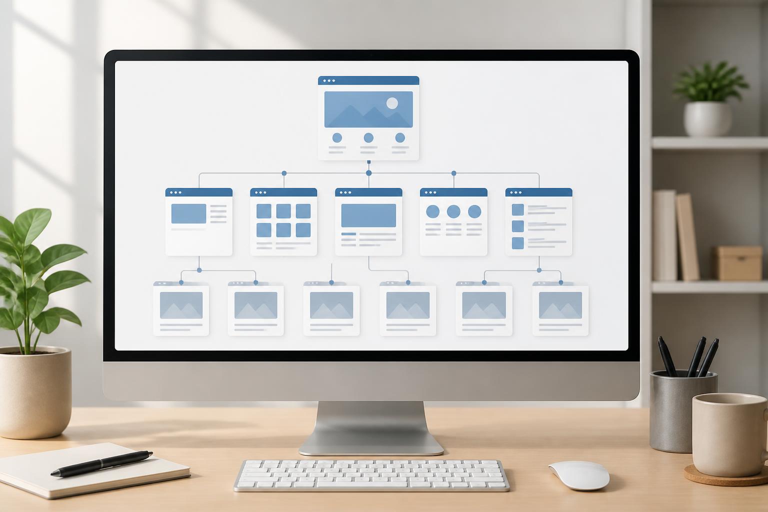
Content hierarchy shows how pages relate to one another. The homepage usually sits at the first level, leading to major groups such as about, products, services, projects, knowledge, or contact. Each group may contain more detailed pages beneath it. This structure does not necessarily have to be the same on every website, but it needs to show the relationship between general and in-depth information.
A good hierarchy helps users guess where they are and where they can go next. If a service page is placed under products, or a specialist article is mixed in with company announcements, users will find it difficult to form the right expectations. Content groups should be divided according to one consistent logic, such as by type of need, product group, or target audience. The important thing is not to mix multiple criteria within the same menu level.
Naming and Navigation Language
Menu labels should be concise but clear enough for users to understand what they contain. Broad labels such as “Solutions,” “Values,” or “Explore” may create a modern impression but do not always provide effective direction. If a business uses an industry-specific term, it should consider whether general customers will understand it.
Naming should be consistent in terms of word usage and scope of meaning. If one item uses a noun, the others should not shift to imperative sentences or slogans that are difficult to interpret. If a website chooses to use the label “Services,” the child pages within it should actually be services; articles, job postings, and support documents should not all be placed in the same area simply because they do not have another designated location.
Links Between Pages
Not every journey begins at the homepage. Users may go directly to an article from a search engine, a product page from an advertisement, or a contact page shared through social media. Therefore, every important page needs to provide enough context for readers to understand its position and know what to do next.
Related links should be placed at meaningful moments. After reading about a problem, users may need to view a solution; after viewing a product, they may want to read a guide or submit a consultation request. Internal links should not be added merely to increase the number of links on a page. Each link should answer the question: what value will the user receive by moving to this page?
How to Build the Structure Before Designing the Interface
Before choosing colors, images, and interface elements, the team should create a list of the website’s planned content. This list may include essential pages, pages that support conversion, content for SEO, and materials needed by current customers. The pages should then be grouped according to their purpose and content relationships, rather than simply according to internal departments.
The next step is to create a website map. The map does not need to be complicated; it only needs to show which level each page belongs to, where it can be accessed from, and which areas it leads to. When viewing the structure on a single plane, the team can often identify problems that are difficult to notice in fragmented discussions. For example, a menu item may have too many child pages, important content may be placed too deeply, or two categories may have almost identical scopes.
After creating the map, turn several important journeys into specific user flows. One journey may begin at the homepage and end at a contact form. Another may begin with a knowledge article and lead to a service page. For each flow, check the number of steps, the information shown at each point, and the ability to return when users make the wrong choice. The goal is not to make every journey as short as possible at all costs, but to ensure that every step has a clear reason.
Wireframes, or layout sketches, should be created after the basic structure and journeys have become relatively stable. At this stage, the team focuses on the positions of the menu, headings, main content, related links, and calls to action. Delaying decorative decisions allows everyone to evaluate the website based on usability rather than being influenced by visual impressions.
Common Mistakes That Leave Users Lost
A common mistake is having too many items on the main menu at the same level. When every piece of content is considered important, nothing truly stands out. On small screens, the problem becomes even more apparent because display space is limited. The menu should focus on the main need-based groups, while less important links can be moved to the footer or supporting areas.
The second mistake is using inconsistent names across the menu, page titles, and content within the pages. Users select “Business Solutions” but arrive at a page titled “Specialized Services,” then see buttons labeled “Products.” Constant changes in terminology make them unsure whether they are in the right place. Consistency does not mean repeating things mechanically, but core concepts need to be used consistently.
Another mistake is relying entirely on the search bar. Search is a useful tool for websites with a large amount of content, but it cannot replace navigational structure. Users may not know which keywords to enter or may use wording that differs from the way the website names its content. The search bar should complement the menu and category system, not conceal an unintuitive structure.
Allowing error pages, out-of-stock pages, or outdated content to lead to dead ends also disrupts the experience. When content is no longer relevant, the website should provide a next step, such as a link to a related category, alternative content, or a contact channel. A good website not only guides users to the right page but also supports them when the journey does not proceed as expected.
Information Architecture Needs to Be Evaluated After Publication
Website structure should not be viewed as a decision made only once. After launch, the team needs to observe signs that users are having difficulty. These signs may come from direct feedback, recurring questions for the customer service department, important pages receiving little traffic, or abandoned conversion flows. The cause should not be hastily concluded from a single metric, but recurring signs provide a basis for reviewing how information is organized.
User testing can also be conducted at a scale appropriate to the available resources. Give participants several specific tasks, such as finding a service, viewing the terms of use, or finding how to submit a support request, and then observe what they choose. Test participants do not need to explain too much while carrying out the task, because the points where they stop, go back, or ask additional questions often reveal problems in the structure.
In addition, each time a new content group is added, the team should ask whether it truly needs its own menu item or can fit within the existing structure. If the answer is always to create another new item, the website will gradually grow bloated and lose focus. A scalable system is not one that can place everything in the main menu, but one that has clear rules for deciding where each piece of content belongs.
Conclusion
Information architecture is the foundation of website design, even though users often notice it only when the structure has problems. An easy-to-use website needs to organize content around actual needs, use clear navigational labels, build purposeful connections, and support users even in less-than-ideal situations. When these decisions are made in advance and reviewed regularly, the interface will have a stronger foundation, the content will be easier to develop, and the browsing journey will become more coherent.
Instead of beginning with the question of what the website should look like, businesses should begin by asking what users need to find and what they need to accomplish. The answer will guide how content is grouped, how the menu is built, how each page is designed, and how effectiveness is measured after the website goes live. This is how a collection of web pages becomes a genuinely useful information system.