Accessible Website Design: Expanding Usability for Everyone

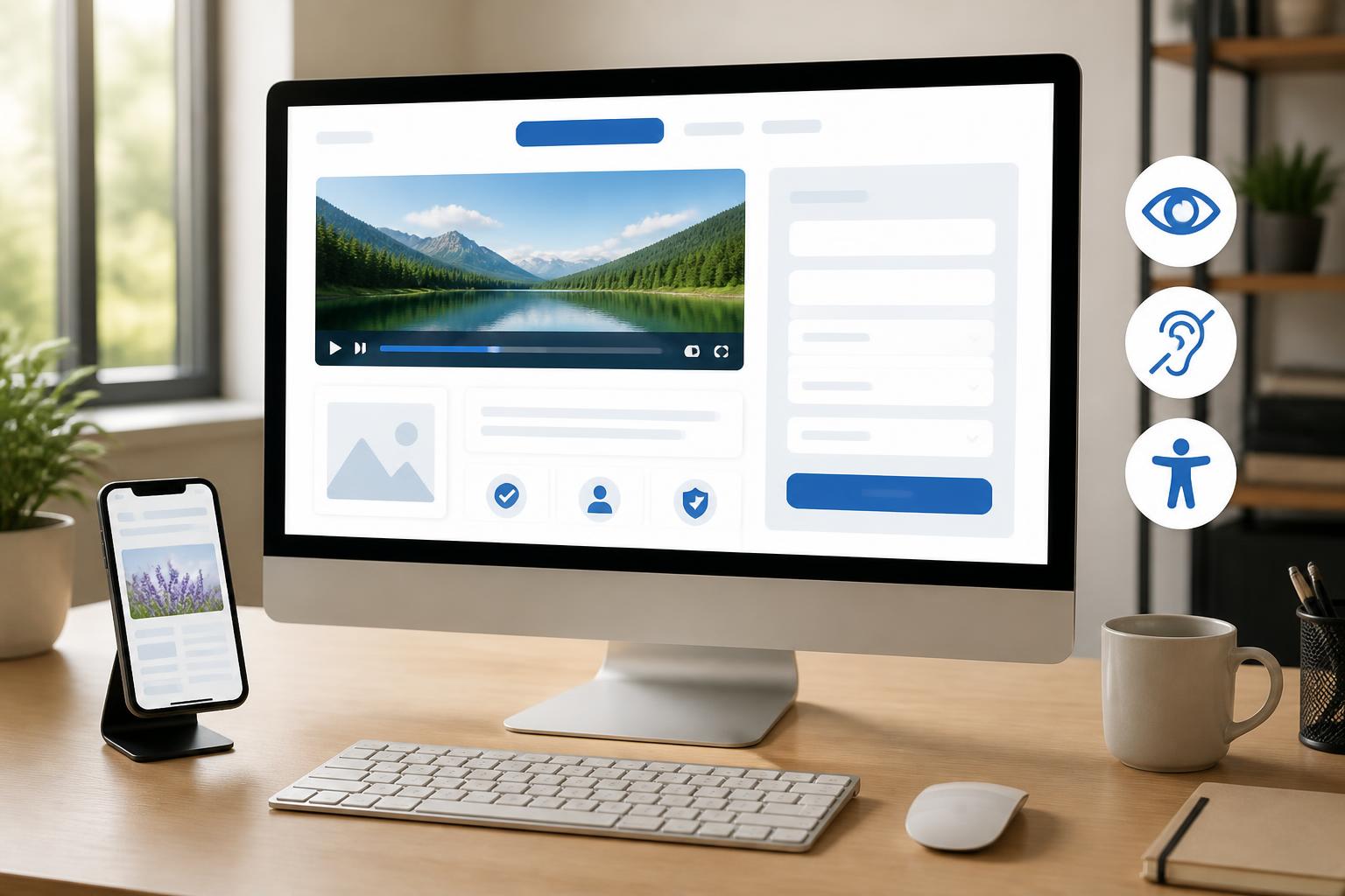
A website is considered effective when visitors can understand its content, find the right information, and accomplish their goals without facing unnecessary obstacles. In practice, however, many designs still assume that everyone can see clearly, use a mouse proficiently, hear audio, or process moving elements at the same speed. This approach inadvertently narrows the range of people who can use the website.
Accessible website design asks a broader question: can the interface be used by people with different abilities, devices, and circumstances? Users may be using a phone outdoors, dealing with an unstable network connection, controlling a computer with a keyboard, zooming in on content, or using a screen reader. When these situations are considered from the beginning, a website becomes not only more welcoming to people with disabilities but also clearer and more resilient for the majority of users.
What Is Accessible Design?
Accessible website design is the process of building structures, content, and interactions so that diverse groups of people can access and use a website as independently as possible. Accessibility is not a single feature added after an interface has been completed. It is a principle that should be present throughout the processes of defining goals, organizing content, choosing colors, writing text, developing functions, and testing.
This concept is often viewed through four basic requirements. Content should be perceivable in multiple ways, rather than relying solely on color or sound. Interface components must be operable, including when users do not use a mouse. Information and navigation should be easy to understand. Finally, the website must be compatible with a range of browsers, devices, and assistive tools.
Importantly, accessibility does not mean making an interface monotonous or removing every creative element. A design can still feature attractive imagery, appropriate motion, and a distinctive brand identity, as long as these elements do not obstruct reading, navigation, or task completion.
Interface Priorities
Clear Content Structure
Users do not usually read a website in a straight line from beginning to end. They quickly scan headings, introductory text, calls to action, and relevant sections to determine whether the page meets their needs. Therefore, content should be divided into logically ordered sections, using headings that accurately reflect the content below them.
The heading system should express the relationship between sections rather than being used merely to create larger or smaller text. A page may begin with a main heading, followed by lower-level headings for each content group. This organization helps readers orient themselves more quickly and supports tools that read content according to the page’s structure.
Paragraphs should also be of a moderate length, with clear sentences and enough spacing for easy reading. Links should describe their specific destinations instead of repeating vague phrases such as “click here.” When users see a link, they should understand what information or action it leads to.
Color and Contrast
Color is often used to distinguish states, emphasize buttons, or create a brand identity. However, color should not be used as the only signal. For example, a form should not mark an erroneous field only in red without also providing a text message. A chart should likewise include labels, line styles, or additional symbols so that viewers do not have to rely entirely on their ability to distinguish colors.
The contrast between text and background should be sufficiently clear under different display conditions. Colors that appear easy to read on a design screen may become difficult to distinguish when users reduce the brightness, use a phone outdoors, or have visual limitations. Buttons, input fields, and interaction states also need clear visual indicators when they are focused, hovered over, or affected by an error.
Using color systematically also makes a website easier for everyone to read. Users do not have to spend as much time finding calls to action, distinguishing primary content from supporting information, or identifying problems in a form.
Keyboard Operability
An accessible website should not depend entirely on a mouse or touch interactions. Users may navigate with a keyboard because of personal needs, because their input device has a problem, or because they want to work more quickly. All interactive components, such as links, buttons, menus, dialogs, and input fields, need to be reachable in a logical order.
The focused state must also be easy to identify. If the outline or focus indicator is removed without providing an alternative, keyboard users will have difficulty knowing where the cursor is on the page. The movement order should follow the logic of natural reading and avoid forcing users to skip through unrelated areas before reaching the main content.
Pop-up windows need to be handled carefully. When a dialog appears, users must be able to recognize the new content, interact within it, and find a clear way to close it. After it is closed, the cursor should return to an appropriate location rather than disappearing or moving to an unrelated area.
Images, Audio, and Multimedia Content
Images make content easier to visualize, but not everyone can see or fully perceive the details in an image. Therefore, images that convey important information should have alternative text accurately describing the image’s purpose. If an image is purely decorative, its implementation should also tell assistive tools that it does not add information that needs to be read.
Alternative text should not become a long list of irrelevant details. A good description helps users understand the role of the image in its specific context. A product image may need to mention features that help identify the product, while an illustrative image beside a paragraph may not need to repeat all of the content already written next to it.
Videos should include captions when the dialogue contains necessary information. Important audio content should also be presented in another way so that people who cannot hear can still receive it. Conversely, components that automatically play audio or move continuously can be distracting, especially for users who need more time to read or concentrate.
Forms and Error Messages
Forms are often where accessibility issues become most apparent. The label for each field should tell users what information they need to enter. Placeholder text inside an input field should not be the only way to describe the requirement, because the placeholder may disappear as soon as the user begins typing.
When an error occurs, the message should identify which field has a problem and explain how to fix it. Statements such as “Invalid information” are often not useful enough if they do not specify the required format or why the data was rejected. Error messages should appear in an easy-to-notice location and should not erase data that the user entered correctly.
Long forms can be divided into groups to reduce feelings of overload. If a process consists of multiple steps, the website should indicate which step the user is on and how many sections remain. Important changes, such as a successfully submitted form, an updated shopping cart, or an error, also need to be announced in a way that both sighted users and people using assistive tools can perceive.
Accessibility Requires Continuous Testing
A website cannot be evaluated simply by looking at a static design. Teams should test zooming in on content, changing the window size, navigating using only a keyboard, and using the site on a small screen. States such as errors, data loading, expanded menus, dialogs, and post-submission notifications also need to be examined, because these are moments when users can easily lose their bearings.
Automated tools can help detect some issues, such as missing alternative text, an illogical heading structure, or errors in interface attributes. Even so, automated testing cannot completely replace hands-on interaction. A link may have a name but still be difficult to understand in context, a keyboard order may not reflect the user’s goal, or a notification may exist but appear too late.
Feedback from users with different needs is also highly valuable. Rather than asking only whether the interface looks attractive, the evaluation process should focus on specific tasks: finding a product, reading instructions, submitting a request, correcting an error in a form, or completing a payment. Task-based testing helps identify real obstacles and establish clearer improvement priorities.
Benefits for the Brand and User Experience
Investing in accessibility enables a website to serve a wider range of usage situations. Users may be reading content in bright surroundings, operating a small screen, using a slow connection, or needing motor or visual assistance. Improvements such as clear headings, easy-to-identify buttons, well-guided forms, and well-organized content benefit far more than just the users considered the primary audience for accessibility.
Accessible websites also tend to have a clearer content and interface foundation. When every component has a clear purpose, state, and interaction method, the operations team can maintain, modify, and expand the website more easily. Addressing issues early in the planning stage is generally more effective than fixing numerous problems after launch.
More importantly, accessible design demonstrates that a brand respects its users. A website should not merely attract visits; it must also enable visitors to understand information and accomplish their goals independently. This is the foundation of a fair and trustworthy digital experience.
Conclusion
Accessible website design is not a final review step or a requirement reserved for special projects. It is a method that helps teams view a website from more perspectives, from the ability to read content and control the interface to handling errors and using assistive tools. Starting with a clear structure, sufficient color contrast, keyboard operation, appropriate alternative text, and understandable forms will produce practical improvements.
When accessibility is incorporated into the process from the beginning, a website has the opportunity to serve more people without sacrificing its design identity. A good interface does not force users to adapt to avoidable barriers. Instead, it proactively creates a clear path for everyone to receive information and accomplish what they need.