



Designing a User-Friendly Website Structure: The Foundation for a Better Experience and Sustainable SEO

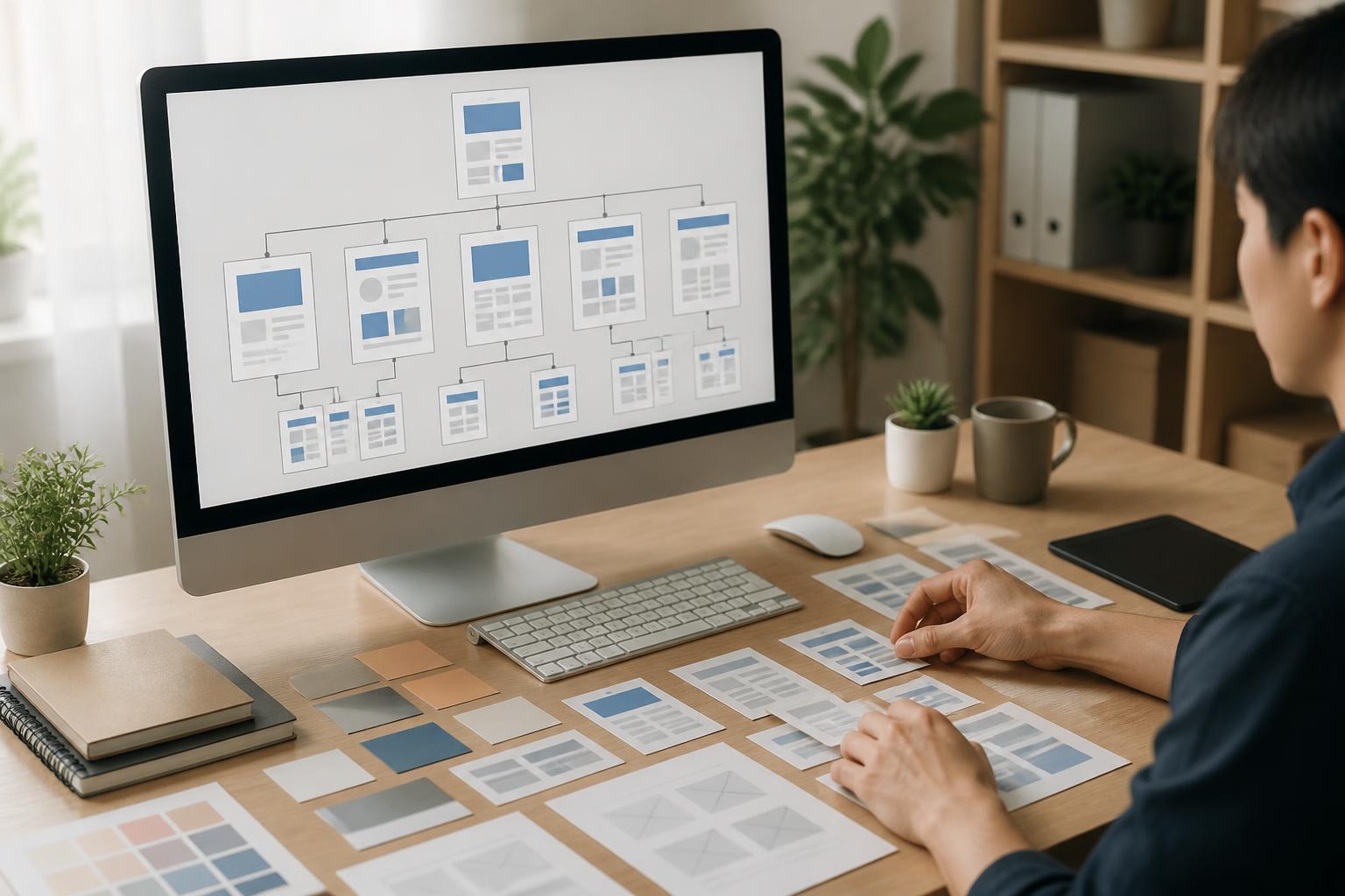
When building a website, businesses often focus heavily on colors, images, motion effects, or putting as much content as possible on the homepage. However, one factor that has a long-term impact on both user experience and the ability to grow in search engines is often overlooked: website structure. This refers to how pages are organized, linked, and presented to form a system that is easy for both people and search engines to understand.
A good structure does not necessarily have to be complex. On the contrary, visitors tend to appreciate websites that help them understand where they are, where they can go next, and what action they need to take. When information is arranged logically, businesses not only reduce customer confusion but also create a favorable foundation for expanding content, managing products, and improving SEO performance over time.
What Is Website Structure and Why Should It Be Planned from the Start?
Website structure can be understood as the relationships between pages across the entire system. The homepage usually sits at the center, guiding users to content groups such as company information, products, services, knowledge, news, contact details, or support areas. Within each group are detailed pages linked together in a certain order.
If the structure is built inconsistently, users may have to click through too many layers to find information. Some important pages may be buried deeply, while less valuable content appears too prominently in the menu or other highlighted areas. Over time, this makes the website difficult to manage, expand, and maintain a consistent experience.
Structure is also how a website communicates the relative importance of its content. A page linked from many relevant areas is generally more likely to receive attention than a page with almost no connections to the rest of the site. Therefore, creating a website map before designing the interface helps businesses see the entire system clearly instead of making isolated decisions about each page.
Start with the Actual Needs of Visitors
Website structure design should begin with the question: what are users coming here to do? Do they want to learn about the company, find a specific product, compare services, read a guide, or submit a consultation request? The answer will determine how content is grouped and where conversion points are placed.
For product-selling websites, users may need to filter by category, features, price range, or intended use. For service websites, they are often interested in the scope of work, process, suitable solutions, implementation capabilities, and contact methods. Meanwhile, a content-publishing website needs to focus on categories, related topics, update dates, and the ability to continue reading articles in the same group.
Visitors should not be expected to understand how a business is organized internally in order to find information. Menu labels should be close to the language customers commonly use. Specialized terms can still appear in detailed content, but the main navigation items should be clear, concise, and easy to predict. When users can accurately anticipate what lies behind a link, they are more likely to continue exploring the website.
Principles for Building Menus and Navigation
The main menu should reflect the most important areas of the website and should not become a list of every page that exists. If too many items are placed at the same level, users will have difficulty recognizing which options are priorities. Secondary content can be organized in submenus, the footer, or contextual links.
Each menu label should have a specific and consistent meaning. If one area uses the term “Services,” another area should not switch to a similar but confusing label if both serve the same purpose. This consistency is especially important for websites updated by multiple people.
Navigation is not limited to the header menu. Links within content, call-to-action buttons, breadcrumbs, and the footer all contribute to the user’s navigation map. A guide can lead to a related service; a product page can link to frequently asked questions; and the contact page can be accessed from locations where customers are likely to develop a need for discussion.
Breadcrumbs, usually placed above the content, also help users identify their current location within the website. This element is particularly useful for systems with multiple content levels, such as online stores, document libraries, or knowledge sections. However, every navigation element should be implemented in moderation to avoid making the interface feel cramped.
Group Content by Topic Rather Than Intuition
A common mistake is to create categories based on ideas that arise at different stages without checking whether they can remain viable over the long term. After some time, a website may contain many categories with only a few pieces of content, duplicate names, or unclear boundaries between groups.
To limit this problem, businesses should identify core topic groups before creating pages. Each group should address a distinct need and have the capacity to accommodate more content in the future. If two categories frequently lead to the same type of information, it may be worth considering merging them instead of maintaining two parallel branches.
Grouping should also take the customer’s learning journey into account. General information can be placed at a higher level and then lead to more in-depth articles or pages. This organization keeps beginners from feeling overwhelmed while still providing a clear path for people with specific needs.
Internal Links Help Users Read More Deeply
Internal links are links that lead from one page to another page on the same website. When used properly, they help users access related information without returning to the menu or starting a search from scratch. They also help establish clearer relationships between pages across the website.
Internal links should appear in natural positions within the content. Instead of placing too many links in a single paragraph, choose points where readers may need further explanation or want to take the next step. The linked text should also describe the destination content relatively clearly. Generic phrases such as “click here” should not be used excessively in every situation.
Not every page needs to link to every other page. An effective linking system should be based on genuine relationships between pieces of content. An article about choosing a solution may lead to the corresponding service page, but it does not necessarily need links to unrelated content simply to increase the number of links.
How Does a Clear Structure Support SEO?
Search engines need to analyze a website to determine the topic, relationships, and usefulness of each page. A clear structure makes this process easier to understand. When pages on the same topic are linked logically, the website demonstrates content consistency rather than presenting a collection of disconnected pages.
This does not mean that simply organizing the menu well will automatically give a website high rankings. SEO also involves content quality, the ability to satisfy search needs, technical performance, mobile experience, and many other factors. Even so, a messy structure can prevent good content from being connected properly or cause users to leave before reaching important information.
Businesses should also avoid creating multiple pages with nearly identical content simply to target different ways of phrasing the same idea. This approach can easily fragment the content system and make it difficult to maintain. It is better to build pages with clear purposes and then add links and supporting content to form a complete topic.
Issues to Check Before Putting the Website into Use
Before launching the website, try using it like someone who has never visited before. From the homepage, how many steps does it take to find an important product or service? From any given article, do you know how to return to the main category? Do the contact buttons appear in suitable places, or do users have to search for them for too long?
The menu should be checked on multiple screen sizes because its display on computers and phones may differ. A collapsed menu on mobile devices must be easy to recognize, touch interactions should be convenient, and subitems should not open in confusing ways. Important links should also be checked regularly to identify pages that have been deleted, had their addresses changed, or now lead to unsuitable content.
In addition, observe pages that receive little traffic or are frequently overlooked. A page may contain useful information but be placed in a difficult-to-find location, have an unclear title, or lack links from related content. Analyzing visitor behavior together with direct customer feedback will help businesses adjust the structure based on actual needs rather than relying solely on assumptions.
One-Time Design Is Not Enough; the Structure Needs Regular Review
Websites constantly change along with products, services, and business goals. Therefore, a structure that was suitable at launch may become inconvenient after some time. Adding new content without reviewing the system as a whole can easily lead to oversized menus, overlapping categories, and many links that no longer provide value.
Whenever a business adds a major product, service, or content group, it should reassess that group’s position in the website map. It needs to determine whether the group is an independent branch, part of an existing category, or simply a supporting page. This evaluation helps the system grow in a controlled manner instead of continuously adding new items to whichever positions are most convenient at the time.
A user-friendly website is not one with a great many features; it is one that helps users accomplish their goals with minimal obstacles. Clear information architecture, consistent menus, purposeful internal links, and sensible scalability create a solid foundation for both user experience and SEO efforts. By starting with actual needs and maintaining a habit of regular review, businesses can turn their website into an information system that is accessible, easy to manage, and valuable over the long term.


