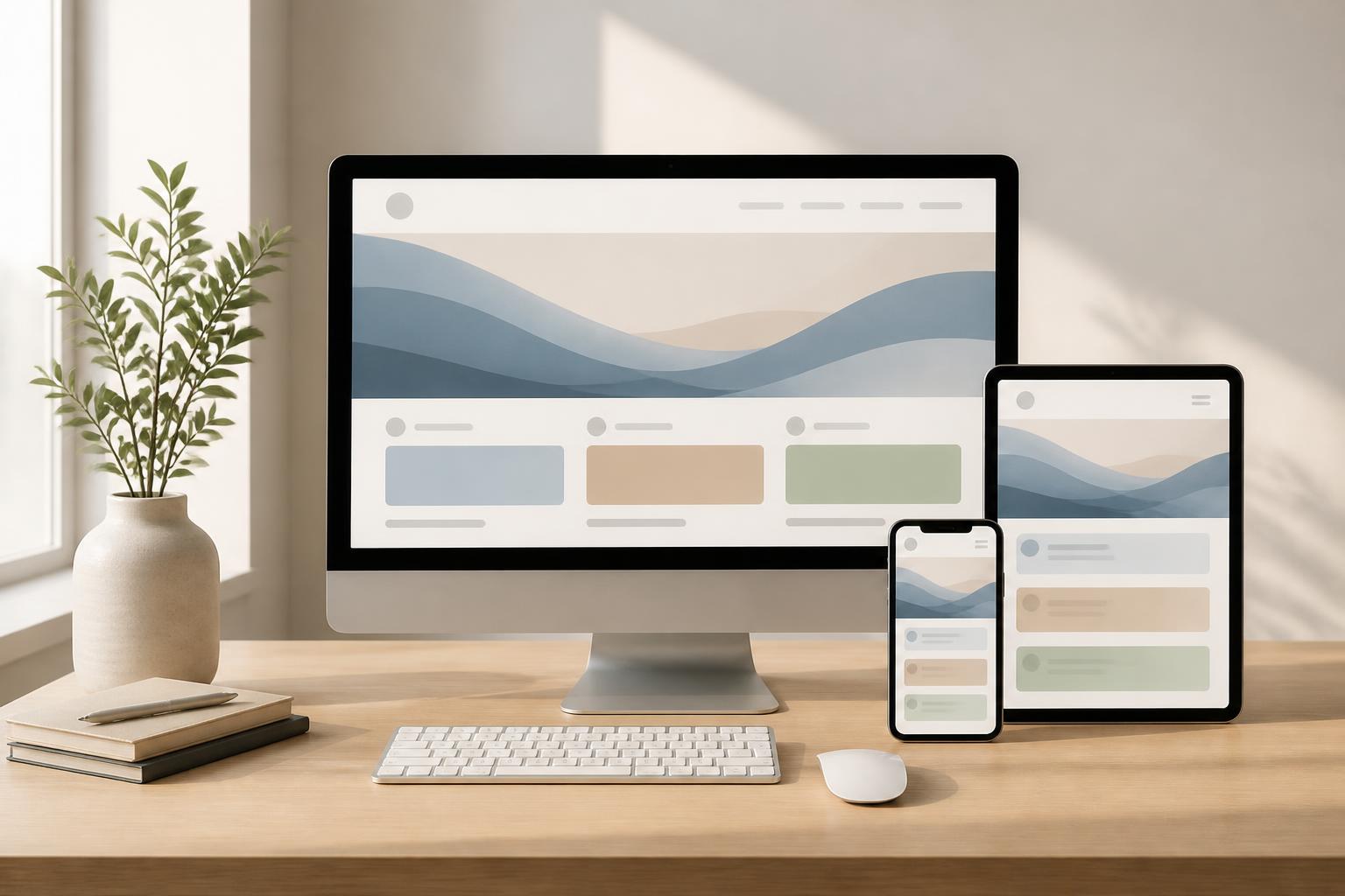



High-Performance Website Design: Optimizing Speed from the Very First Sketch


In many website projects, speed is often treated as work to be handled last. Teams focus first on colors, layout, images, and effects; only when the website is nearly complete do they begin checking loading times. This approach can easily lead to having to remove many approved elements, or accepting a visually appealing interface that responds slowly on actual devices.
High-performance website design does not mean turning every page into a minimalist, monotonous interface. It is an approach in which speed, responsiveness, and stability are considered alongside aesthetics, content, and business objectives. When performance is incorporated into design decisions from the outset, the website has a better chance of serving both visitors and the operating team effectively.
Performance Starts with Design Decisions
A website’s speed is influenced by the server, source code, database, and many other technical factors. However, interface design also has a significant impact. A page that uses many large images, autoplay videos, complex fonts, sequential effects, and externally embedded components will require more resources than a page with a streamlined structure. If these choices are introduced without a clear purpose, users may pay for them with additional waiting time.
Therefore, before sketching the interface, the project team should answer several basic questions. Which elements need to appear first so users understand what the page offers? Which images genuinely help explain the product? Which effects support task navigation, and which are merely decorative? Do visitors need to load all the content immediately when they open the page, or can they view it gradually as needed?
These questions help shift the focus from “adding things to make it look better” to “choosing only what is necessary.” A high-performance interface does not necessarily have few elements, but every element should have a reason to exist. This is also a way to limit emergency-style optimization after the website has already been completed.
Designing the Content That Appears First
When a page opens, users do not need to see all the content at once. They generally need to quickly understand where they are, whether the page is relevant to their needs, and what the next step is. The top section of the page should therefore be organized clearly, prioritizing core information instead of placing too many images or competing messages for attention.
For a service introduction page, the opening section might focus on the main benefits, the appropriate customer group, and a call-to-action button. For a product page, information such as the product name, representative image, price, or availability may be prioritized before extended descriptions. The specific arrangement depends on the objective of each website, but the general principle is that important content should be able to appear early and be easy to recognize.
Full-screen background images, opening videos, or transition effects can create a strong impression, but they can also easily become causes of delays in displaying the initial content. If they are used, the design team should have an alternative for when the resources have not finished loading, such as a suitable background color, a lighter fallback image, or a layout that retains its meaning without motion.
Beautiful Images Must Suit the Usage Context
Images are often the heaviest resource category on many websites. The issue is not only the file size but also how the images are used. An image with a very high resolution that is displayed in a small frame creates unnecessary data. Conversely, an overly compressed image can reduce brand credibility, especially for e-commerce, real estate, travel, or other fields that need to convey quality through imagery.
High-performance design needs to take actual display dimensions into account. Each position should have a stable aspect ratio to prevent the layout from shifting when the image finishes loading. Images should also be prepared in multiple sizes suited to different screens, rather than using a single file for both phones and computers. Images outside the initially visible area can be loaded as needed, provided that this loading method does not cause users to lose track of the content or required action.
Not every position needs an image. A well-written description, a simple icon, or intentional whitespace can sometimes communicate information more effectively than a heavy illustration. Reducing the number of images should not be done mechanically, but should be based on the actual role of each image in the reading and decision-making journey.
Motion Effects Should Serve the User Experience
Motion can make an interface easier to understand. A loading state that indicates the system is processing, feedback when a button is pressed, or a subtle transition between sections can make interactions feel natural. However, continuous motion across many elements at the same time can make the interface feel heavy, distracting, and potentially affect the perceived speed.
When adding effects to a design, the project team should clearly define their purpose. Does the effect help users recognize a change? Does it clarify the relationship between two states? If the effect is turned off, can users still understand how to use the interface? If the answer is no, the element may exist only as decoration.
Motion should have a moderate duration and should not prevent users from continuing to interact. On mobile devices, where display space and resources are often more limited, restraining effects is even more important. The interface should also respect the operating system’s reduced-motion preference when users have enabled it.
Mobile-First Is Not Simply Shrinking a Desktop Interface
Mobile-first design is often understood simply as creating a smaller-screen version. In reality, it is the process of identifying the most important content and actions under constrained space, then expanding the layout for larger screens. This approach forces the design team to address questions of priority at an early stage.
On a phone, a multi-level menu, a wide data table, or a long form can be more difficult to use than on a computer. Rather than merely reducing the size of the text and content blocks, the project team needs to consider more suitable presentation methods. A table can be converted into information cards; a group of filters can open in a separate area; a long form can be divided into steps with clear instructions.
Designing for large screens should also not depend on having an abundance of empty space or decorative elements. The layout needs to retain its order as the width changes, without allowing text lines to become too long, buttons to be too far from related content, or images to be stretched unnaturally. Testing at multiple screen sizes during the design process helps identify problems earlier than testing only after development.
Reduce Dependence on External Resources
Websites often connect to many external services, such as analytics tools, chat platforms, video players, advertising systems, or support libraries. Each connection can create additional loading requests, affect response times, and sometimes produce unexpected behavior. Not every service needs to be removed, but each integration should be assessed based on its actual benefit.
The operating team should make a list of the tracking codes and utilities in use, then identify the owner, purpose, and necessity of each component. Utilities that no longer support business operations should be removed. Components needed on only certain pages should not be loaded across the entire website. For embedded content, the team can consider displaying a preview image or activation button first, then loading the heavier component only when the user actively requests it.
This approach also makes the website easier to maintain. When the number of dependencies is reduced, the technical team can better control changes originating from third parties. Users are also less likely to encounter a situation in which an unresponsive utility affects the entire page layout.
Measure Performance in Real-World Contexts
Performance should not be evaluated solely by how a website feels on a high-specification computer or over a stable connection. The website needs to be tested under conditions close to those of its target users, including mobile devices, different network speeds, and pages with large amounts of content. A lightweight home page does not mean that the category page, detail page, or contact form will also perform well.
The testing process should combine measurement tools with direct observation. Tools can identify large resources, slow-loading requests, or problems during rendering. Direct observation helps answer questions that are closer to the real experience: Do users recognize the main content quickly? Do action buttons provide clear feedback? Does the layout shift when resources finish loading? Does the page make users think the system has frozen?
Performance also needs to be monitored after the website goes into operation. A new campaign, an expanded image library, or an installed marketing tool can change the initial results. Therefore, speed optimization is not something done once and then finished; it is part of the website maintenance and development process.
Performance Is Connected to Business Objectives
A faster website does not automatically produce better results if the content is unsuitable or the conversion actions are unclear. Conversely, performance optimization needs to be connected to the objective the website serves. If the goal is to receive consultation requests, the form and contact information must be easy to find, easy to use, and consistently responsive. If the goal is to sell products, viewing products, making selections, and completing payment should take priority over unnecessary effects.
The design team can establish priorities for each stage. First, ensure that users can see and understand the core content. Next, make important actions respond quickly, reduce obstructive elements, and check stability on high-value pages. When performance is viewed as part of the experience and business objective, decisions about removing or retaining an element become more well-founded.
Conclusion
High-performance website design does not begin with a technical checklist applied at the end of a project. It begins with how questions are asked, content is selected, layouts are organized, images are used, and the role of each effect is defined. Decisions that appear to belong solely to aesthetics can affect loading time, responsiveness, and users’ ability to accomplish their goals.
Businesses do not need to sacrifice their identity to have a fast website. What is necessary is to distinguish between elements that create value and those that merely make the interface more complicated. When design, content, and technology are considered together from the beginning, a website can accurately express the brand while also providing a stable experience across many devices. That is a suitable foundation for a digital product capable of long-term growth.