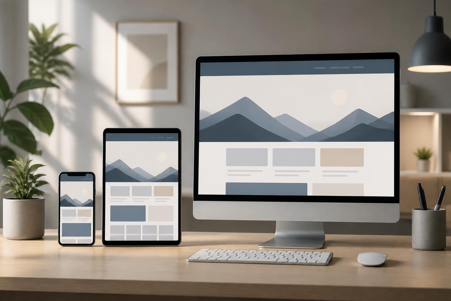
Design system for websites: The foundation for a consistent and easy-to-develop interface


A website may start with just a few simple pages, but it often quickly becomes more complex as a business adds products, content, forms, account features, or new campaigns. If each expansion uses a different presentation style, the website will end up with many buttons that look similar but are not fully consistent, irregular spacing, and forms that operate according to different rules. Users may still be able to access the site, but the experience becomes fragmented, while the development team must continually deal with recurring issues.
A design system is an approach that helps solve this problem. It is not merely a set of colors or a user interface library, but a collection of shared principles, components, conventions, and documentation that guides how a website is designed and built. When implemented appropriately, a design system creates a common language among those responsible for content, design, development, and website administration. As a result, each new page is not an isolated product but becomes part of a system with an established foundation.
What does a design system actually include?
At a basic level, a design system often begins with visual elements such as colors, typography, heading sizes, corner radii, borders, shadows, and spacing. However, if it stops at a visual style guide, the system will not be sufficient to support long-term development. A useful design system must also answer where a component should be used, how it should be used, and what should be avoided.
The first group consists of design tokens, which are commonly used to describe recurring values in an interface. For example, instead of recording individual color codes in many files or designs, a team can define the primary color, secondary color, background color, text color, and warning color using meaningful names. This structure makes it easier to control changes to the brand identity or interface, because the impact of a change can be assessed across the entire system.
The next group consists of user interface components such as buttons, input fields, menus, content cards, dialogs, notifications, data tables, and pagination controls. Each component should have clear specifications for its default, hover, selected, disabled, and error states. These states are especially important for forms and decisive actions, because users need to understand how the system is responding.
Finally, there are layout patterns and usage rules. When should a primary action button appear? When should a dialog be used, and when should the user be taken to a separate page? Should an error message be placed near the input field or in an overview area? Questions like these cannot be resolved merely by choosing colors and sizes. They need to be documented as guidelines so that different teams can make consistent decisions.
Why should a website build a design system?
The most obvious benefit is consistency. When the same action is represented by the same button style and named in the same way, users do not have to relearn the interface in each area. Consistency does not mean that every page must look exactly the same; rather, familiar components operate according to predictable principles. This helps users focus on their content and goals instead of having to decipher how to use the website.
A design system also reduces repetitive work during the design and development process. If a component has already been documented, tested, and built, the team can reuse it instead of creating it from scratch. The time saved should not be used only to launch new pages more quickly. More importantly, it creates an opportunity for the team to devote additional effort to researching needs, testing user flows, and improving content quality.
Another benefit is improved collaboration. In many projects, design and development may have different understandings of the same component. The design may refer to a “secondary button,” while the implemented interface has a different size, state, or behavior than expected. When the design system has clear documentation and is built collaboratively by both sides, this gap is narrowed. Discussions can focus on goals and real-world problems instead of debating details that have already been standardized.
The system also supports maintenance. A website typically changes gradually over time, from content updates to the addition of new features. If the interface is created from disconnected components, each change may lead to many errors that are difficult to detect. By contrast, when shared components are centrally managed, the team can assess the impact of an adjustment and systematically check the relevant areas.
Do not start by drawing a large number of components
A common mistake is to treat a design system as an interface-collecting project. The team tries to list as many components as possible, create numerous variations, and invest in documentation before clearly understanding what problems the website is facing. The result may be a large but difficult-to-use library containing many components that rarely appear in the actual product.
A more suitable approach is to start with needs that occur frequently or are causing significant inconsistency. The business can review existing pages and identify recurring patterns such as action buttons, contact forms, error messages, product cards, or navigation areas. The team should then choose a scope that is small enough to test, such as a group of pages with a shared objective or an important user flow.
During this phase, the team should observe more than just what the component looks like. It should record the circumstances in which the component appears, what users need to do with it, how long or short the content may be, what happens when an error occurs, and how its behavior changes across screen sizes. These questions help the design system reflect real needs instead of becoming a set of rules disconnected from the website.
Documentation must help others make decisions
Design system documentation should not merely be a list of color codes, sizes, or screenshots. A person who has just joined the project should be able to find the appropriate component and understand how to use it without having to ask about every detail. Therefore, each component should have a clear name, purpose, usage examples, states, recommended content, and cases to avoid.
For example, documentation for error messages might explain which errors should be displayed immediately beside an input field, which should appear in an overview area, how to write messages that guide users toward resolving the problem, and how to handle multiple errors at the same time. Button documentation might distinguish between primary actions, secondary actions, and potentially dangerous actions, while clearly stating when too many buttons should not be placed side by side.
Naming conventions are also very important. Component names should describe their role or function rather than relying only on their appearance. A component called a “blue button” may quickly become inaccurate when the visual identity changes. By contrast, role-based names help the team communicate more effectively and prevent one color from being used to represent multiple meanings.
A design system does not replace design thinking
Having components readily available does not mean that every new page should be mechanically assembled from existing blocks. A good system creates reasonable constraints while still allowing special requirements to be addressed. If a page needs a different presentation because of its content goals or user journey, the team should be able to explain why and consider whether that need is likely to recur in the future.
Conversely, allowing each team to create uncontrolled variations will weaken the system. Before adding a new component, the team should check whether an existing component could meet the need after its content or configuration is adjusted. If a new variation is truly necessary, the team should clearly describe its differences, scope of use, and maintenance plan. This is how the library can grow selectively instead of expanding in response to every short-term request.
How to put a design system into operation
A design system should be treated as an internal product with responsible owners, an update process, and a mechanism for receiving feedback. A business can begin by assigning a small team to maintain the core principles, while product or content teams continue to contribute requirements based on actual usage. This model helps keep the system connected to the problems emerging on the website.
Each change should be evaluated from three perspectives: its value to users, its impact on pages that are already operating, and its maintenance cost. A new component may solve one specific case well but create many additional rules for the system as a whole. Conversely, a small change to naming or states can significantly improve clarity if applied consistently.
Testing should also take place continuously. When a component is updated, the team needs to review the pages that use it, check the actual content, and observe unexpected situations. Feedback from content administrators, customer service staff, and end users can all reveal problems that were not anticipated in the original design.
A foundation for sustainable website development
A design system is not a set of documents that is completed once and then put away. Websites change, brands may expand, new products appear, and user behavior also creates different requirements. Therefore, the system needs to be updated deliberately, but it should not be changed arbitrarily. Each adjustment is an opportunity to review which rules are working well, which have become outdated, and which gaps need to be addressed.
For a business, the value of a design system lies in its ability to turn interface decisions into shared assets. It helps a website preserve its identity as it grows, reduces unnecessary differences between pages, and creates a clear foundation for future development. More importantly, the system encourages teams to think together about the goals of the interface instead of addressing each screen in isolation.
Starting with a manageable scope, prioritizing recurring problems, and documenting the reasons behind usage are practical ways to build a design system. When maintained as part of the website design process, it not only makes the interface more streamlined but also helps the organization work more consistently, control changes more effectively, and create a reliable experience for users.