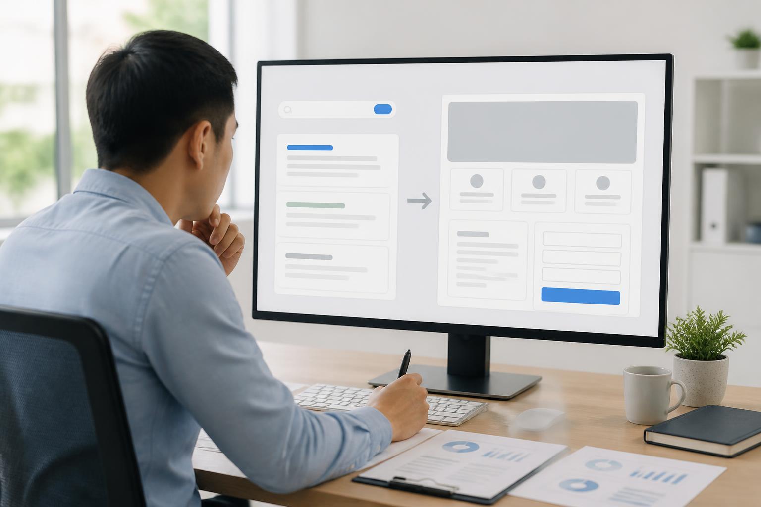



Website Accessibility: An Essential Standard for an Equitable Digital Experience

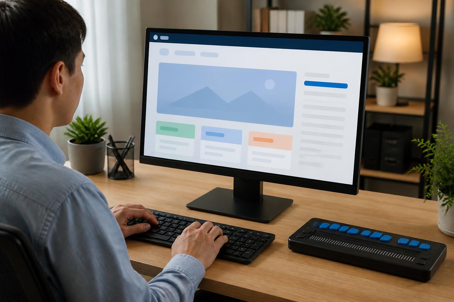
When building a website, businesses often focus on the interface, page loading speed, mobile display, and the placement of call-to-action buttons. These are all important factors, but they are still not enough to create a truly high-quality digital experience. A website also needs to be designed so that different groups of users can read content, navigate, fill out forms, and complete tasks without encountering unnecessary barriers.
Website accessibility, or accessibility, is an approach aimed at reducing obstacles for people with visual, auditory, motor, or cognitive limitations. However, the benefits of this principle are not limited to people with disabilities. Older adults, people using their phones outdoors, people with unstable network connections, or people temporarily experiencing limited mobility can also benefit from a clearer and more flexible website.
This is not a decorative layer of features to be added at the final stage. Accessibility should be regarded as part of digital product quality, beginning when content and page structure are planned and continuing through design, development, testing, and operation.
Accessibility Begins with the Way Information Is Organized
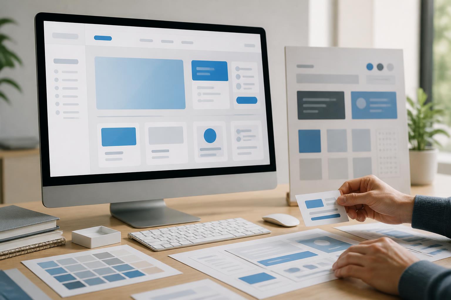
A website may use beautiful colors, professional images, and numerous motion effects, but users can still struggle if they do not understand what the page offers or the sequence in which they need to perform actions. A clear information structure is the first foundation of accessibility.
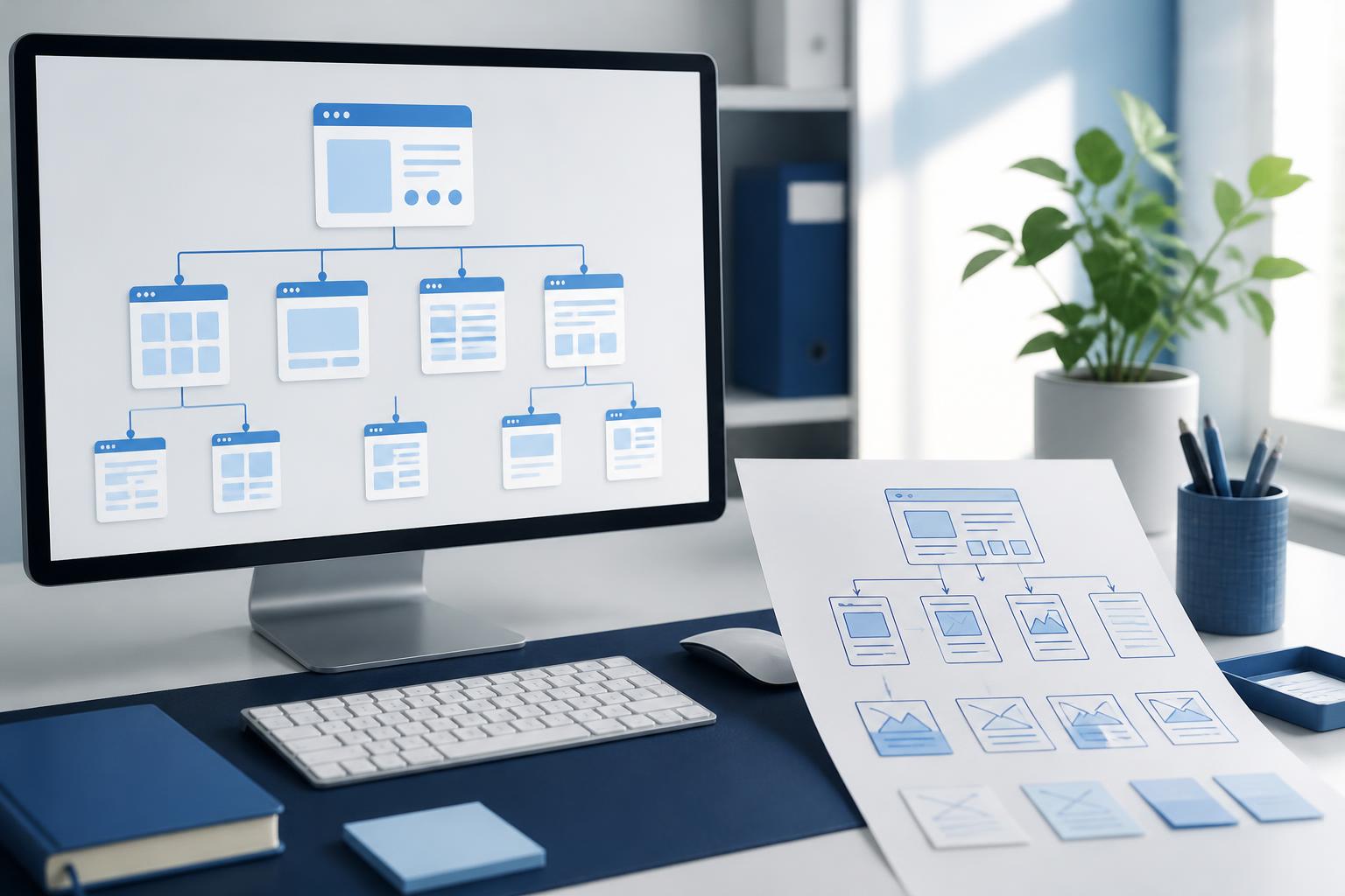
Headings need to accurately reflect the content of each section rather than being used merely to create different text sizes. An article should have one main heading, followed by lower-level headings in a logical order. Dividing content into sections with specific names helps readers quickly find the information they need. This structure also helps people who use screen readers understand the relationships between sections on the page.
Links and buttons also need specific labels. Overly general phrases such as “Learn more,” “Here,” or “Click here” do not indicate the destination when read separately from the surrounding text. Labels such as “View service pricing” or “Download the user guide” help users accurately predict the result of an action.
The navigation bar should maintain a consistent arrangement across pages. Users should not have to relearn the location of the menu, search box, or contact button each time they move to another area. If a website contains a large amount of content, search functionality, breadcrumbs, and clear internal links can reduce the time spent looking for information.
Alternative Text and Content That Does Not Depend on Images
Images can convey information quickly, but not every user can see or fully perceive the content in an image. Therefore, meaningful images need alternative text that briefly describes their role in the specific context. If the image is a product image, the description may state its name and the main characteristics that need to be known. If the image is purely decorative and adds no information, allowing assistive tools to skip it is more appropriate.
Alternative text should not become a list of keywords or a lengthy, irrelevant description. The goal is to convey necessary information, not to recount every visual detail. The same image may require different descriptions depending on where it appears. An image illustrating an article may only need to be identified as an illustration, while an image containing a process diagram needs to provide the corresponding information in text.
Important content should also not be conveyed through color alone. For example, using red to mark an incorrectly completed input field can create difficulties for people who cannot distinguish colors or people viewing the page in poor lighting. Error messages should be accompanied by clear wording, meaningful icons, and specific instructions for correcting the error.
Color, Contrast, and Readability
Design with appropriate contrast makes text easier to read across different screens and usage conditions. Light gray text on a white background may create a refined appearance, but it often causes eye strain and reduces the ability to perceive information. Elements such as main content, form labels, error states, and action buttons should be prioritized for clarity rather than being designed solely to pursue a particular visual style.
Text size, line spacing, and paragraph length also directly affect readability. A page with overly dense paragraphs is difficult to follow, especially on a phone screen. Dividing content into moderate-sized paragraphs, using subheadings appropriately, and providing enough whitespace help readers locate information more easily.
Users need to be able to zoom in on content without losing functionality or seriously breaking the layout. This requires the interface to be built flexibly and to avoid excessive reliance on fixed sizes. When testing a website, the operations team should try it on multiple screen sizes and also consider situations in which users adjust the text size.
Forms and Interactive Actions Need to Be Designed Carefully
Forms are where many websites lose users. A user-friendly form needs clear labels for each input field, an indication of which information is required, and formatting guidance when necessary. A hint placed inside an input field should not be the only way to explain what users need to enter, because the text may disappear as soon as they begin typing.
When an error occurs, the message needs to indicate which field has a problem and how to fix it. The statement “Invalid data” is often not useful enough. Users need to know whether they left information blank, entered it in the wrong format, or provided a value that is not accepted. If the form is long, the page should also avoid deleting entered data when an error occurs or when users return to a previous step.
Actions on a website need to be possible with a keyboard, not only with a mouse or touch gestures. This is an important requirement for people with motor limitations and is also useful for anyone using a computer in a situation where a mouse is inconvenient. The selected state, cursor position, and button currently receiving input need to be clear enough for users to know where they are in the interface.
Motion effects should also be used in moderation. Automatically playing videos, continuously flashing content, or pop-up windows that appear unexpectedly can be distracting and make reading difficult. If motion serves an illustrative purpose, users should have a way to pause or turn it off when necessary.
Accessibility Is the Responsibility of the Entire Process
The entire range of accessibility issues cannot be solved simply by installing an add-on on a website. Assistive tools can help adjust certain elements, but they do not replace well-structured content, correct semantic HTML, and practical testing procedures. A properly ranked heading, a clearly labeled button, and a form with an appropriate error message usually provide more lasting value than an additional interface layer.
The content team needs to know how to write headings, link descriptions, alternative text, and captions for audiovisual content. The design team needs to consider colors, text size, spacing, and interaction states. The development team needs to ensure code structure, keyboard navigation order, and compatibility with assistive tools. Those responsible for testing should combine automated tools with manual user testing, because not every issue can be detected in a single scan.
Testing should also take place regularly after every change to the interface or content. A new form, registration window, or product filter component can create barriers if it is not reviewed from an accessibility perspective. Feedback from actual users is an important source of information for identifying situations that the development team may overlook.
Investing in an Equitable Experience Is Also an Investment in Website Quality
Accessible websites generally have clear structures, coherent content, and predictable interactions. These characteristics benefit all visitors, not just one particular group. When users can quickly understand information, find a product, or complete a form, they are also more likely to continue interacting with the business.
More importantly, accessibility reflects how a business views its responsibility in the digital environment. Not everyone accesses a website with the same device, the same network speed, or the same ability to perceive information. Designing for diversity from the outset makes a product more sustainable, reduces the need for costly repairs later, and expands opportunities for more people to access information.
A good website should not ask whether users can adapt to the interface. Instead, the interface needs to be built to adapt to different usage needs. Starting with clear headings, readable colors, images with descriptions, forms with guidance, and controllable interactions, businesses can gradually make accessibility a natural standard throughout the website development process.