


Designing User-Friendly Websites: The Foundation for Helping Customers Find the Right Information


A website may receive significant investment in its visual presentation and still fail to deliver results if visitors have to spend too much time finding the information they need. In an online environment, users often arrive at a website with a fairly clear goal: viewing products, finding a price list, reading instructions, checking contact information, or submitting a consultation request. If the interface leaves them confused, unsure where to begin, or unable to identify the next step, they are more likely to leave.
Therefore, designing a user-friendly website is not merely a matter of aesthetics. It is the process of organizing content, navigation, and functions in ways that suit users’ habits. A good website should create a sense of clarity from the first few seconds while maintaining consistency throughout the visit. When users do not have to guess, they have more opportunities to read in depth, interact more, and take the actions the business wants them to take.
A User-Friendly Website Starts with Clear Goals
Before choosing colors, typefaces, or motion effects, the website owner needs to determine what purpose the website is intended to serve. A corporate website will be organized differently from an online store, a specialized blog, or a service request portal. Without clearly defined goals, the interface can easily become a collection of disconnected elements, each of which is treated as a priority while none truly guides the user.
The website’s goals should be translated into specific actions. For example, a service introduction page may guide customers toward viewing the scope of services, reviewing the process, and submitting their contact information. A product page may prioritize viewing details, comparing options, and placing an order. Once these goals have been identified, it becomes easier to arrange content and design action buttons logically.
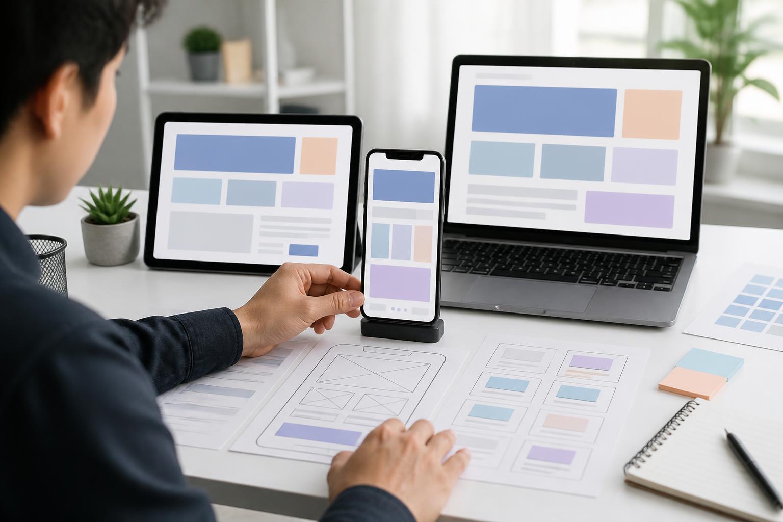
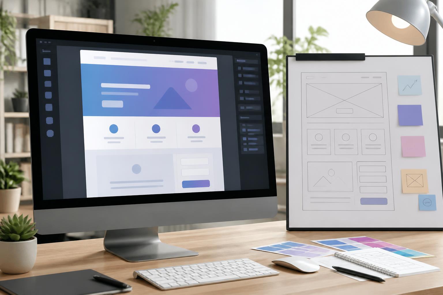
During the planning stage, it is useful to envision a typical visitor journey. What content do they see on the homepage? How many steps do they need to take to reach the service page? What information helps them make a decision, and where can they ask questions? These questions help identify breaks in the experience early, before the team begins building the interface.
Information Architecture Should Be Simple and Consistent
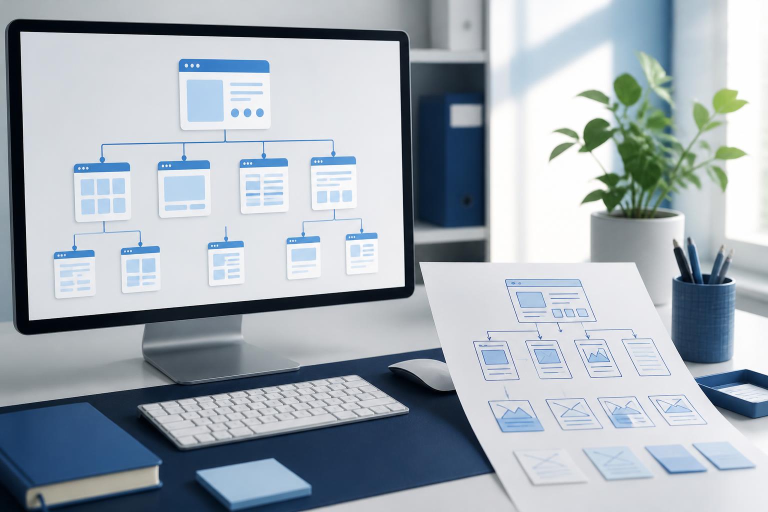
The navigation bar is one of the areas with the greatest impact on a website’s usability. Menu labels should be concise, easy to understand, and accurately reflect the content behind them. Overly creative but unfamiliar labels may force users to guess their meaning. If a website contains multiple content groups, the categorization should be based on customers’ actual interests rather than simply reflecting the company’s internal structure.
The homepage should also not attempt to place all information on a single screen. A well-structured layout often begins with the main message, followed by benefits, product or service groups, supporting evidence, and a call to action. Content sections need to have a clear order of priority so that readers can scan the page quickly while still grasping the important points.
Consistency should be maintained across many elements. Buttons with the same function should be presented in similar ways. Headings, descriptions, links, and forms should follow a common system. When each page uses a different layout and terminology, users have to relearn how to interact with each area. By contrast, consistency helps them predict where elements are located and what roles they serve.
Clear Content Matters Just as Much as the Interface
A beautiful interface cannot compensate for unclear content. Headings should tell readers what the information is about, while descriptions should focus on the benefits or answers users are looking for. Vague phrases such as “comprehensive solutions” or “leading services” are often not enough to help customers understand what the business provides or how it is different.
Website content should be divided into reasonably sized paragraphs, with subheadings and appropriate spacing. Important information can be presented first, while more detailed explanations are placed below. This format supports both readers who read carefully and those who simply want to scan the page quickly to determine whether it contains relevant information.
Internal links should also use specific labels. A link labeled “Learn more” does not tell users where they will be taken if it appears multiple times on the same page. Labels such as “View the service price list,” “Read the maintenance guide,” or “Submit a consultation request” make the action clearer and create a direct connection between the link and the visitor’s needs.
The Mobile Experience Must Be Considered from the Start
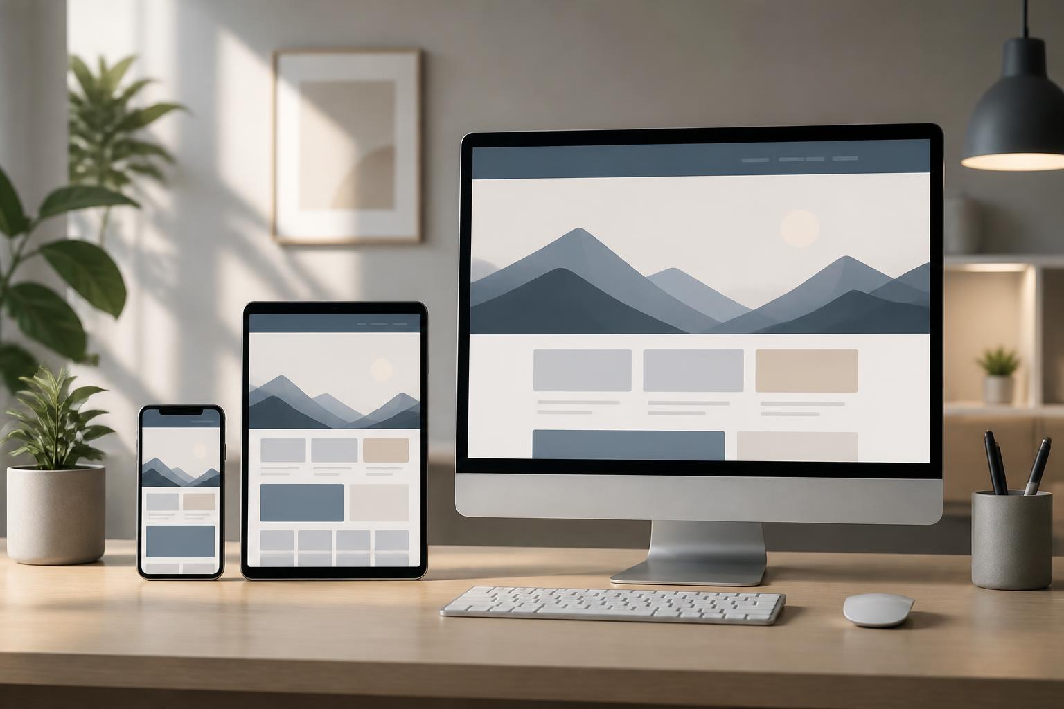
Many people access websites on their phones in a variety of situations, such as when looking up an address, checking a product, or responding to a request. Therefore, a mobile interface should not be treated as a scaled-down version of the desktop interface. Elements need to be rearranged to suit narrow screens, touch interactions, and the need to read quickly.
Text needs to be easy enough to read, buttons need to have adequate spacing, and important interactive areas should not be obscured by fixed elements. Images should also be used purposefully so that they do not push the main content too far down the page. Wide data tables, multi-level menus, and long forms need to be tested separately on phones rather than evaluated only on large screens.
Testing across multiple screen sizes helps reveal errors that do not appear in a desktop preview. The person conducting the test should try common actions such as opening the menu, changing pages, entering information, closing a window, and returning to previously viewed content. These are simple steps, but they can show whether the website is truly convenient for everyday use.
Forms and Calls to Action Should Reduce Friction
Contact forms are often the endpoint of the conversion journey, but they are also where users are likely to give up if they have to provide too much information. Businesses should consider the purpose of each data field and request only the information necessary for the next processing step. If additional data is needed, the business can briefly explain why so that users understand why they are being asked to provide it.
Field labels must be clear, and error messages should identify the problem and explain how to fix it. A vague message such as “Invalid data” is less useful than a prompt indicating which field is missing or which format is incorrect. After a form is submitted, the website should also provide a noticeable response so that users know whether their request has been received.
Calls to action should match the visitor’s level of readiness. People who are just beginning to explore may want to read more information before signing up for a consultation, while customers with a clear need may require a prominent contact button. Placing the same call to action in every location can sometimes make the experience feel less natural. Each button should relate to the content being presented and to a logical next step.
Accessibility Is Part of Website Quality
A user-friendly website needs to take into account people who receive information in different ways. Text and background colors should provide sufficient contrast so that the content does not fade into the background. Information should not be conveyed through color alone, because some people may have difficulty distinguishing certain colors. Meaningful images should include appropriate descriptions, and headings should be organized in a logical order.
These principles do not serve only one specific group of users. Clear text, a coherent structure, and easy-to-identify buttons improve the overall experience for everyone. When building a website, the team can test it with a keyboard, try zooming in on the content, observe the states of elements as users move through them, and assess whether users can understand the messages displayed on the page.
Measure and Improve After the Website Goes Live
No interface should be considered absolutely complete immediately after publication. Usage data and real-world feedback can reveal issues that the design process did not identify. Areas requiring attention include frequently visited pages, the steps where users commonly stop, recurring questions during support interactions, and forms with low completion rates.
Improvements should be made according to priority. Problems that prevent users from completing a task should be addressed before decorative changes. After that, the team can try adjusting headings, layouts, button text, or the number of fields in a form to observe the response. Each change should have a specific objective; changing too many elements at once can make evaluation difficult.
A user-friendly website does not necessarily need a complex design. Its value lies in its ability to bring visitors to the right information with minimal obstacles while creating a sense of trust at every step. From defining goals and organizing content to optimizing the mobile interface and testing forms and accessibility, every decision should begin with users’ actual needs.
When the experience is placed at the center, a website becomes more than a place to display information. It becomes a channel for supporting customers, presenting capabilities, and creating valuable interactions for the business. It also provides a foundation for content, marketing activities, and search optimization efforts to deliver more sustainable results.