


Website Information Architecture: The Foundation for Helping Users Find What They Need

A website is often judged first by its colors, images, and on-screen presentation. However, visual elements are only the most noticeable part of a digital product. When visiting a website, users also have to answer a series of very practical questions: Where am I? What content does this website have? Where should I start if I want to find a product, service, or piece of information I need? If these questions are not answered naturally, even an attractive interface will struggle to create a good experience.
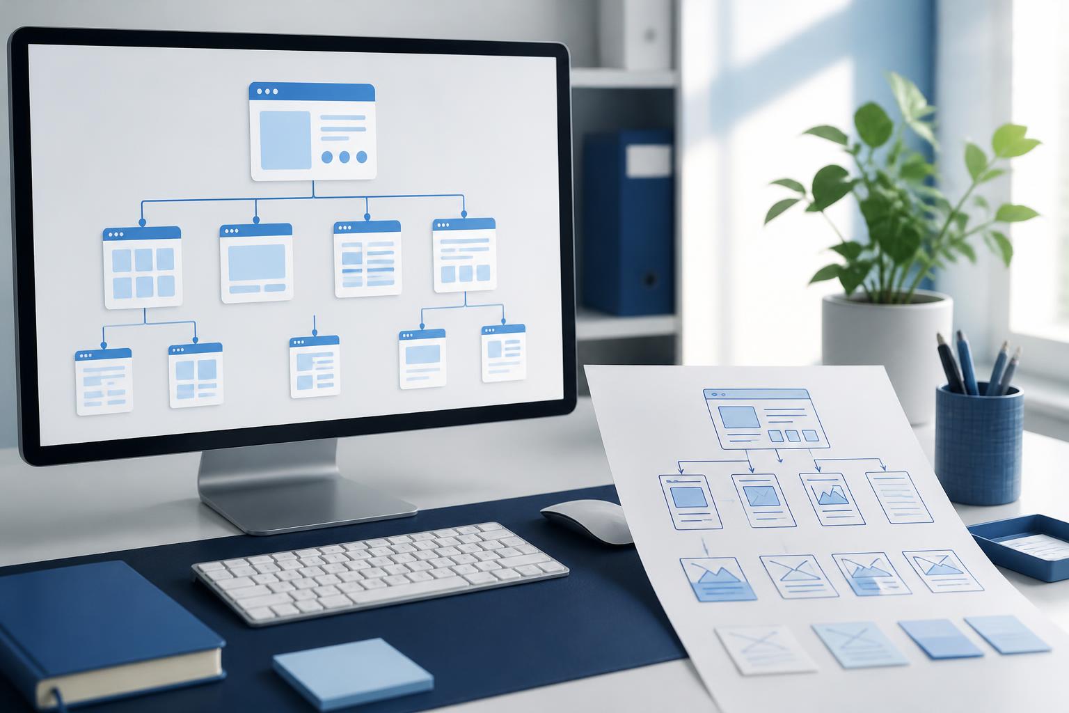
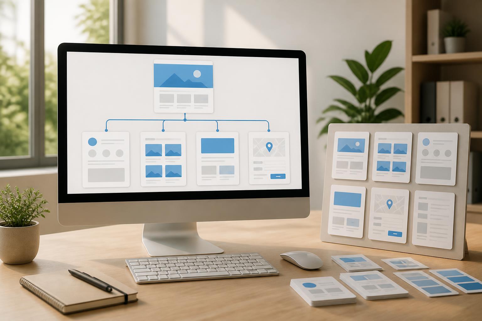
That is why information architecture plays an important role in website design. The concept refers to how content is categorized, organized, labeled, and linked so that users can understand the website’s structure, orient themselves within it, and quickly reach their goals. Information architecture is not an additional decorative layer added after the interface is complete. It is a foundational element that needs to be considered from the beginning, before the design team works out the details of each screen.
Information Architecture Determines Whether a Website Is Easy to Use
Users do not visit a website to admire its entire underlying structure. They come to perform a specific task, such as learning about a service, comparing products, reading instructions, submitting a consultation request, or checking contact information. A good structure helps them move from their initial need to the next action with little hesitation. By contrast, an inconsistent structure forces users to guess the meaning of each section, go back repeatedly, or leave the website before completing their task.
Information architecture also affects how a business communicates its value. When content groups are arranged logically, visitors can recognize which information is general background, which is evidence, which is guidance, and which is a call to action. The website is no longer a collection of disconnected pages but becomes a system with a clear content flow.
One point to note is that a company’s internal structure does not necessarily match the way customers think. A business may be familiar with department names, service codes, or operational processes, but users are usually more concerned with the problem they are facing and the result they want to achieve. Designing information architecture therefore needs to start with the needs and language of visitors, rather than simply copying the organizational chart.
Start by Auditing and Grouping Content
Before deciding how many items the main menu should have, it is necessary to know what content the website currently contains and what content is expected to be added. A content audit helps identify duplicate pages, outdated information, content without a suitable location, or sections with inconsistent naming. For websites that have been operating for a long time, this is often a time-consuming task, but it helps prevent the creation of a new interface on top of a disorganized old content foundation.
Each piece of content should be recorded along with some basic information, such as its purpose, intended audience, level of priority, relationship to other pages, and update status. Not every page needs to appear directly in the main menu. Some content can be accessed through links in articles, a resource area, the search bar, or category pages.
After the audit, content can be grouped according to criteria that fit the way users search. For a corporate website, common groups may revolve around solutions, service areas, completed projects, knowledge, and contact information. For an e-commerce website, the structure usually needs to clarify categories, filters, product information, policies, and the purchasing process. There is no single formula for every type of website. The important criterion is that each group must be easy to understand and support a specific need.
Use Clear Navigation Labels Instead of Trying to Impress
Labels in menus, buttons, and internal links are direct instructions for users. A name that is overly creative but does not clearly indicate the content may force visitors to try and fail several times. Labels such as “Solutions,” “Services,” “Products,” “Knowledge,” or “Contact” are often easier to understand than slogan-like names when the purpose of a section is to convey specific information.
Consistency is just as important as clarity. If one section uses the term “Projects” while another uses “Success Stories” to refer to similar content, users may not recognize the relationship between them. Similarly, a website should maintain consistent usage of singular and plural forms, capitalization, specialized terminology, and descriptions of actions on buttons. These small details help create a predictable navigation experience.
Navigation is not limited to the header menu. The footer, breadcrumbs, links within content, buttons leading to the next step, and search area all contribute to guiding users. A specialized article can link to a related service, a page explaining relevant terminology, or a consultation form. As a result, users are not forced to return to the homepage every time they want to continue exploring.
Design the Structure Around Journeys and Goals
Rather than simply listing the pages that need to exist, the design team should describe the main journeys users may take. Someone who has just discovered a brand may begin with a search result article, then view a solutions page, read information demonstrating the company’s capabilities, and submit a request. An existing customer may go directly to the support area or instructional materials. Each journey needs a clear starting point, intermediate information, and destination.
Describing user journeys helps reveal many issues that a menu diagram alone cannot show. For example, a service page may be correctly placed in the menu but fail to link to frequently asked questions, the implementation process, or contact options. Users can see the page but still do not have enough information to decide what to do next. By examining the entire journey, the team can add the necessary connections instead of merely changing the position of an item in the menu.
It is also necessary to distinguish between content for people who are still exploring and content for those who are ready to take action. These two groups may need different information. New visitors may need an easy-to-read overview, while people with a specific need may care about the service scope, process, response time, or contact method. A good structure allows both groups to access suitable information without making the page overwhelming.
The Role of Search, Filters, and Breadcrumbs
Websites with large amounts of content cannot rely on menus alone to support navigation. A search bar allows users to go directly to a topic they have already identified, especially when they remember a keyword but do not know which category contains the content. However, search is useful only when the data is properly indexed, titles accurately reflect the content, and results are presented clearly.
Filters are suitable for websites with many products, projects, documents, or articles belonging to multiple groups. Filters should be based on criteria users actually care about, such as industry, content type, needs, or product attributes. Adding too many filters can make the interface complex, while filters that are too broad do little to narrow the results. Each choice should make a meaningful difference to the displayed list.
Breadcrumbs help users identify their current position within the website’s structure. This feature is especially useful for pages located deep within multiple layers of content. When users know which group they are in, they can return to a nearby level without having to start again from the homepage. Breadcrumbs also provide a way to show the relationship between pages, as long as the name of each level is presented consistently and accurately reflects the structure.
Test the Information Architecture Before Finalizing the Interface
A structure that seems logical to an internal team may not necessarily be easy for outsiders to understand. For this reason, early testing is essential. One way to begin is to ask participants to find specific content within a list of proposed labels and then observe which group they choose. This method helps identify ambiguous names or groupings that differ from common expectations.
Another method is to give participants a specific task, such as finding how to submit a request for a service, locating the return policy, or finding instructional materials. The results show not only whether they reached the correct page but also where they hesitated, went back, or chose the wrong path. These observations are more valuable than simply asking users whether they “like” the menu.
Testing should be carried out across different types of pages and different states. A website may be easy to navigate from the homepage but become confusing when users enter an in-depth article, category page, or search results page. The case of users arriving at a specific page through a search engine should also be considered, because they do not always start from the homepage.
Information Architecture Must Be Maintained After Launch
Information architecture is not a document used only once during the design phase. As a business grows, new products appear, services change, or the number of articles increases, the website’s structure also comes under pressure. If each department independently adds a new section without common principles, the menu will gradually expand, pages will become duplicated, and users will have difficulty identifying the primary content.
Businesses should establish rules for naming, criteria for creating new categories, and responsibility for reviewing content regularly. Each page needs someone responsible for keeping it up to date, especially information about services, processes, and policies. Content that is no longer suitable should be revised, consolidated, or removed in a controlled manner. Maintaining a good structure is usually more effective than continually adding layers of navigation to conceal old problems.
When designing a new website or restructuring an existing one, information architecture should be treated as a shared responsibility among content specialists, designers, developers, and business representatives. Each group sees a different aspect: content specialists understand the message, designers focus on recognizability, developers understand technical limitations, and the business understands its objectives. This collaboration helps create a structure that is both easy to use and capable of expanding.
Conclusion
Good information architecture makes a website easy to understand even before users pay attention to its visual details. It ensures that content is grouped intentionally, navigation reflects actual needs, and every journey has a logical next step. Achieving this requires starting with a content audit, listening to how users name their problems, building access paths, and testing the structure before finalizing the interface.
A clear website does not necessarily need a large number of features. What matters more is that users can recognize where they are, find what they need, and accomplish their goals without having to constantly guess. When information architecture receives the attention it deserves, website design has a stronger foundation for developing content, supporting business, and maintaining a consistent experience over the long term.