


Designing Accessible Websites: A Sustainable Foundation for All Users

When building a website, businesses often focus on an attractive interface, page-loading speed, mobile display, and search performance. However, another factor that directly affects the user experience but is sometimes overlooked is accessibility. An accessible website is designed so that many different groups of users can read content, navigate, interact, and complete tasks, including when they use assistive technology or have visual, auditory, motor, or cognitive limitations.
Accessibility is not an additional layer of features intended only for a small group. It is a responsible approach to digital product design that also creates a clearer, more consistent, and easier-to-use foundation for all visitors. Someone using a phone in bright sunlight, a person temporarily experiencing limited movement in one hand, someone with an unstable internet connection, or a person unfamiliar with complex interfaces can all benefit from these design principles.
What Does an Accessible Website Really Mean?
At a basic level, an accessible website needs to allow users to perceive content, operate elements on the page, understand information, and use the website through different methods. Users should be able to access it with a mouse, keyboard, touchscreen, or screen reader without being blocked at important steps.
This does not mean that every website must have the same interface or eliminate visual elements. The goal is to ensure that images, colors, sounds, forms, and interactive effects are implemented in a way that does not remove essential information. If an image conveys important content, users need another way to understand that content. If a button initiates an action, it must be clearly identifiable even when users cannot see color or do not use a mouse.
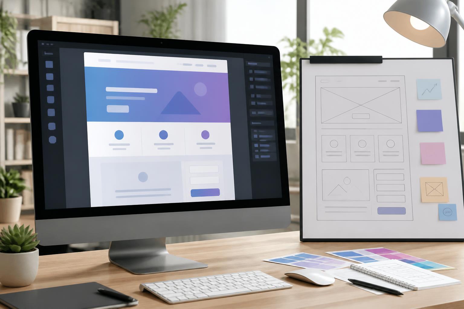
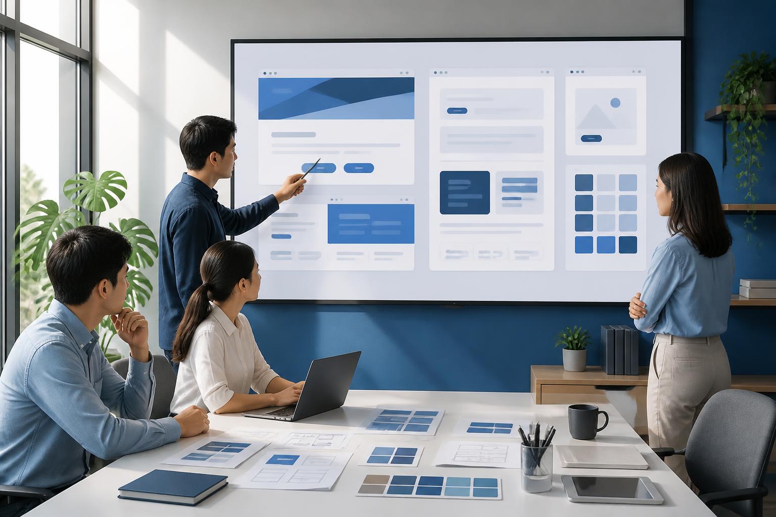
Accessibility should also be considered from the beginning of a project rather than waiting until completion to test it. When the content structure, navigation system, and interface components are designed in the right direction, subsequent development and maintenance will be more consistent. Conversely, fixing numerous problems after a website is already operating often takes more time and can affect both the design and the source code.
Foundational Elements of Design
Clear Content Structure
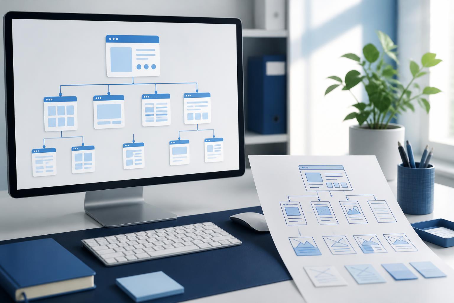
Headings help readers quickly understand the layout of a page and help assistive tools identify the relationship between sections of content. Therefore, websites should use a logically ordered heading hierarchy. The main heading should convey the topic of the page, subheadings should divide content into groups, and smaller sections can be placed under the corresponding heading level.
Using headings merely to make text larger or bolder can make the document structure difficult to understand. Similarly, a long paragraph without breaks can be challenging both for people reading on small screens and for those using assistive technology. Moderately sized paragraphs, purposeful lists, and clearly grouped content help users find information more quickly.
Color and Contrast
Color should support communication rather than serve as the only means of communicating. For example, a form error should not be indicated only in red; the system should also provide a text notification and specific instructions so users know which field needs correction. Links within text should likewise have sufficiently clear identifying cues instead of differing only slightly in color.
Appropriate contrast makes content easier to read in a variety of conditions. This issue can arise with small text, lightly colored buttons, text placed over images, or elements displayed when users move the cursor. During the design process, different button and form states need to be checked, including the normal, hover, focused, and disabled states.
Keyboard Navigation
Not every user operates a website with a mouse or touchscreen. An accessible website needs to allow users to move through interactive elements with a keyboard in an easy-to-understand order. The currently focused item should also be clearly visible so users know where they are on the page.
Dialog boxes, expandable menus, and custom interactive components are common sources of errors. If a dialog opens but users cannot move the keyboard focus into it, or do not know how to close it, the user journey will be interrupted. Therefore, each interactive component needs to be tested as a complete flow, from opening and operating it, through entering data, to closing it or moving to the next step.
Multimedia Content and Forms Require Careful Attention
Images on a website should have alternative descriptions when they convey information or help users understand an action they need to take. These descriptions do not need to be lengthy. A short, accurate sentence focused on the purpose of the image is usually more useful than a list of every visual detail. For purely decorative images, removing them from the reading flow of assistive technology can help keep the content streamlined.
Video and audio content also need to be considered. Captions support people who cannot hear audio, people in quiet environments, or those who want to follow the content without turning on the sound. Transcripts can help users search for information and consume content at their own pace. If a website automatically plays audio, users need an easy way to stop it or adjust the volume.
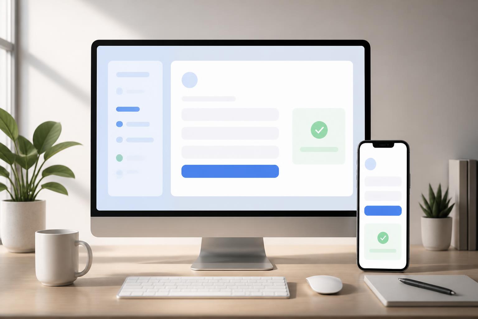
Forms are an important point of contact between a website and its customers. The label for each field needs to indicate what information users must enter, while instructions should be placed where they are easy to associate with the corresponding field. When an error occurs, the notification should clearly explain the cause and how to fix it instead of displaying only a vague statement. After a form is submitted, the website should also clearly communicate the result so users do not have to guess whether their request has been received.
Optimizing for Different Devices and Usage Conditions
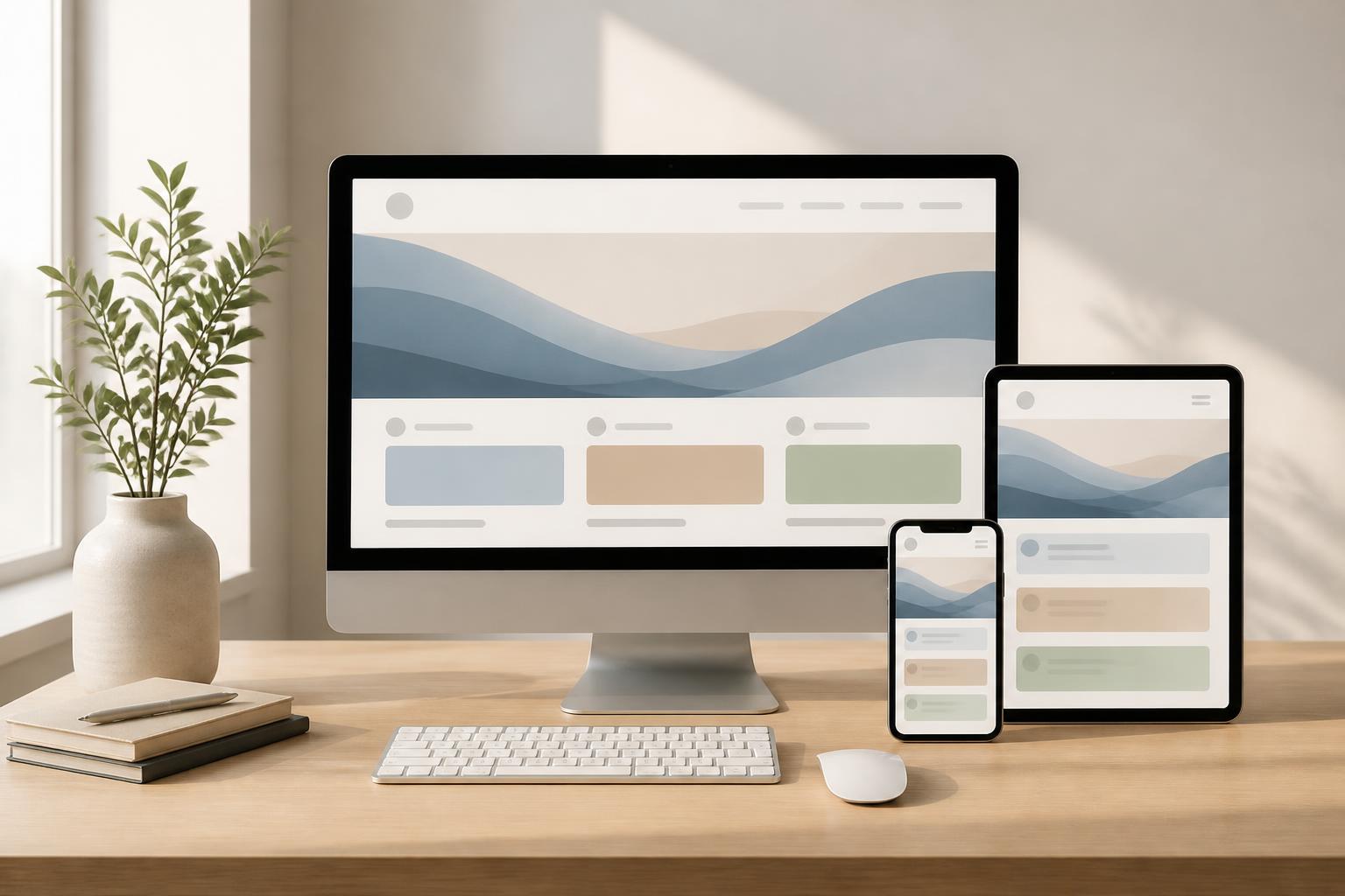
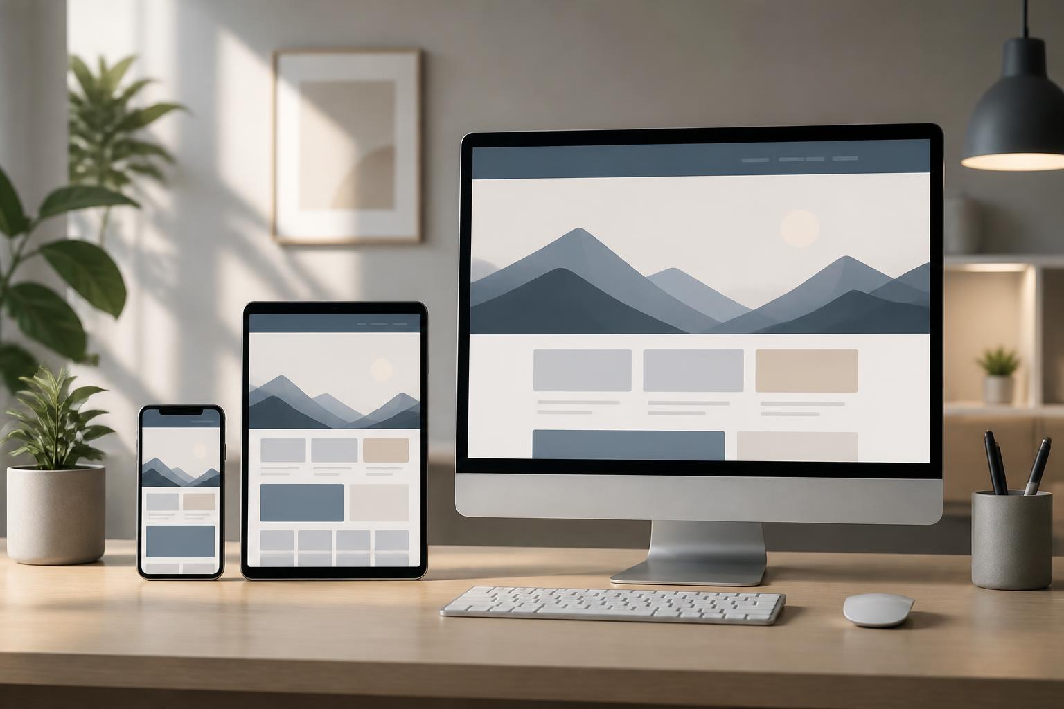
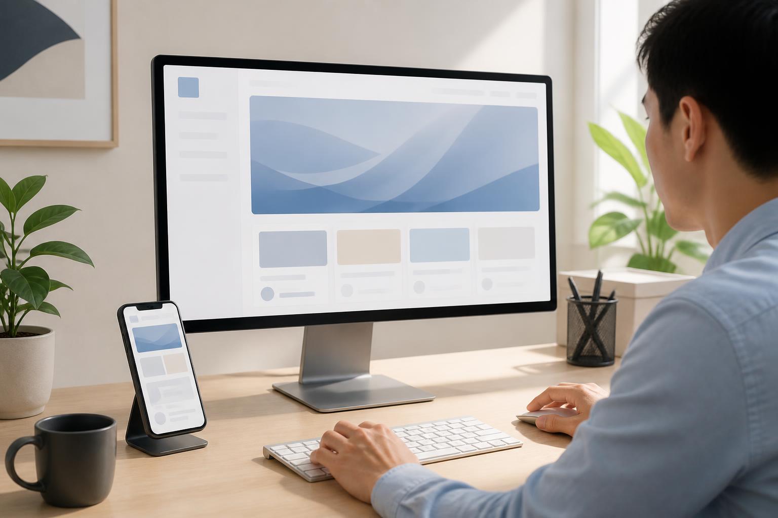
Accessibility is closely connected to responsive design across multiple screen sizes. A button may be easy to press on a computer but too small on a phone. A wide data table may have its content cut off when displayed on a narrow screen. A menu that depends on hovering may not work well on a touchscreen device. These situations need to be tested across different screen sizes and input methods.
Performance also affects accessibility. When a page loads slowly, users may not know whether their action has been registered. Oversized images, unnecessary effects, and unstable third-party components can make the experience cumbersome. Optimizing resources, displaying processing states, and avoiding sudden layout changes will help users maintain their orientation while interacting.
Content should use direct language, limit unnecessary terminology, and explain specialized concepts when they appear. Overly long sentences, dense paragraphs, or vague calls to action all increase cognitive load. A button labeled “Send consultation request” is usually easier to understand than one labeled only “Send” when there are multiple forms on the same website.
Testing Accessibility as an Ongoing Process
No single test can guarantee that a website will remain accessible throughout its lifecycle. New content, new plugins, interface changes, or an additional piece of code can all create problems. Therefore, accessibility should be incorporated into the testing process before release and checked again after significant changes.
Automated testing can help detect certain common errors, such as missing image descriptions, an illogical heading structure, or form-related issues. However, automated tools cannot fully assess how understandable the content is, whether the navigation order is logical, or how convenient a lengthy process may be. Manual testing with a keyboard, zooming the interface, changing screen sizes, and trying multiple browsers remains essential.
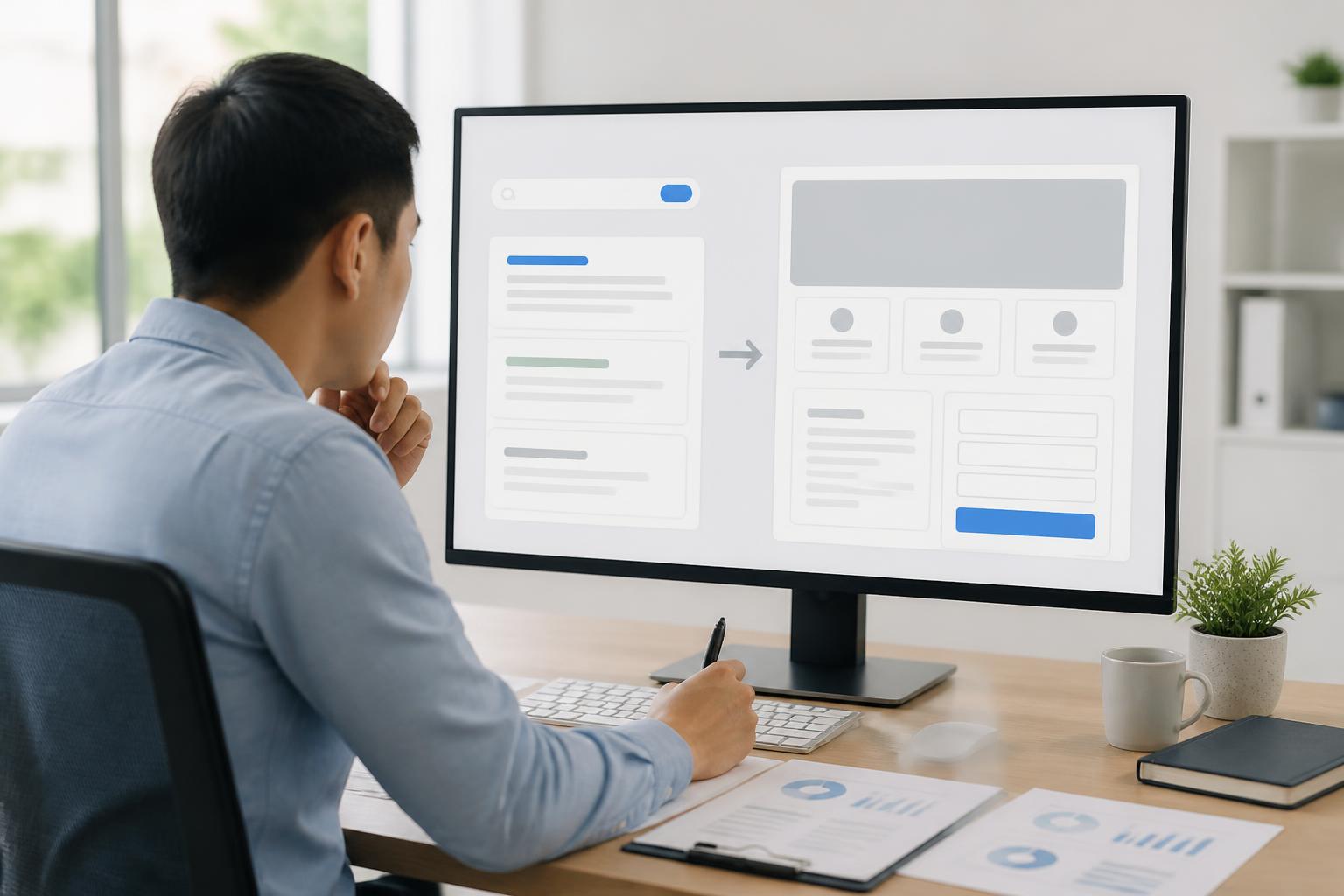
More importantly, development teams should observe the website from the user’s perspective rather than only checking whether the source code works. A registration process may produce no technical errors but still be confusing because it asks for too much information, provides unclear messages, or does not allow data to be edited at the final step. Feedback from actual users will help identify barriers that ordinary checklists may overlook.
Long-Term Benefits for Businesses
Accessible design contributes to a consistent experience and reduces the number of cases in which users abandon a process because they do not know what to do next. A clear content structure also makes it easier for management teams to update content, while a component system built according to clear rules limits differences between pages.
A well-organized website is generally easier to develop for multiple devices and maintain in terms of content quality. Principles such as structured headings, links that accurately describe their purpose, appropriate alternative text, and clear forms also support natural searchability, although accessibility and search engine optimization are not identical concepts.
From a brand perspective, caring about usability for diverse groups of visitors demonstrates professionalism and respect. Users may not be able to name the technical principles behind it, but they will notice when a website is easy to understand, causes little confusion, and allows them to complete tasks without unnecessary obstacles.
Start with Changes That Have the Greatest Impact
Businesses do not necessarily need to change an entire website all at once. They can begin by reviewing the most important pages, such as the homepage, service pages, contact page, registration page, and checkout process. Check the heading structure, link clarity, keyboard operability, error messages, text size, and display on small screens.
Next, the team can create a priority list based on the level of impact. Issues that prevent users from submitting a form, reading the main content, or completing a transaction should be addressed before purely aesthetic concerns. Each change should be documented, retested, and incorporated into the management process so it does not recur on new pages.
An accessible website is not a fixed destination but a standard that needs to be maintained with every update. When accessibility is treated as part of product quality rather than as an additional requirement, businesses can build experiences that are clearer, more sustainable, and better suited to the diversity of users in the digital environment.