



Responsive Website Design: Building a Consistent Experience Across All Screens

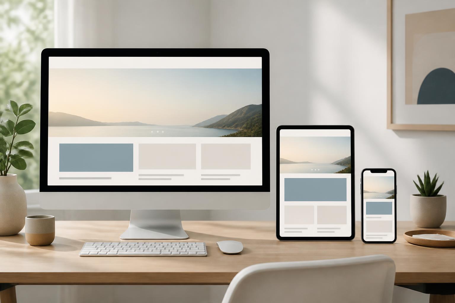
Users may access a website from a phone, tablet, laptop, or large office monitor. Each device has a different display size, interaction method, and usage context. If an interface is optimized for only one type of screen, the experience for other user groups can easily become inconsistent: text may be too small, buttons difficult to tap, images improperly cropped, or important content may fall outside the visible area.
Responsive website design was developed to address this challenge. Instead of creating a separate version for each device, responsive design uses the same content system and interface structure, with the ability to adapt to the available display space. However, responsive does not mean shrinking the entire website. A truly responsive website requires careful consideration of information arrangement, text size, interaction areas, image loading, and testing under various usage conditions.
What Is Responsive Design?
Responsive web design is an approach to building interfaces that can change flexibly according to screen width and device characteristics. On wide screens, multiple content columns can be placed side by side to make use of the available space. When switching to a narrow screen, these columns are usually arranged vertically, navigation is condensed, and less important elements can be moved further down.
The important aspect of responsive design is its ability to preserve the page’s purpose. Visitors still need to be able to read the content, find the necessary information, complete the primary action, and understand the website’s status regardless of which device they are using. Therefore, layout changes should serve user behavior rather than merely accommodate a few common screen sizes.
During development, responsive design is typically built with flexible layouts, relative units of measurement, scalable images, and appropriate interface change breakpoints. These breakpoints do not necessarily need to be rigidly tied to the names of specific devices. They should appear when the layout begins to feel cramped, text becomes difficult to read, or interactive elements no longer have enough space.
Why Should Websites Be Designed for Multiple Screens?
A website is a point of contact between a business and its users in many different circumstances. A customer may view product information on a phone while traveling, then reopen the website on a laptop to compare options or complete a form. If the interface changes inconsistently between devices, users have to relearn how to use it or may abandon their journey.
A responsive interface also helps businesses manage content in a more centralized way. When content, images, and structure are organized within an adaptable system, updates become less dependent on multiple separate interface versions. Content teams do not have to edit the same information in too many places, while technical teams can control the website’s behavior through a unified process.
The ability to display properly on small screens also affects perceptions of trustworthiness. A website with overflowing content, buttons placed too close together, or a requirement for users to zoom in repeatedly will create an impression of being poorly considered, even if the information it contains is valuable. Conversely, a tidy layout and clear feedback help users feel that the website was built to suit real needs.
Elements to Consider When Designing Responsively
Start with the Content and the Page’s Objective
A common mistake is to design the desktop interface first and then try to force the entire layout onto a phone screen. This approach often creates many unnecessary details and makes it difficult to prioritize information. A more appropriate mindset is to determine which content needs to be seen early, which action is most important, and which parts can appear lower down.
For a service introduction page, information about benefits, service scope, and contact methods may be prioritized. For a sales page, the product name, image, price, availability, and action button usually need to be easy to access. Once the priorities are clear, the design can change its layout without losing the primary purpose of each page.
Layout and White Space
A responsive layout needs to use space flexibly. On large screens, white space makes content easier to scan and creates balance between different areas. On narrow screens, spacing should be reduced but not eliminated entirely. If paragraphs, buttons, and content blocks are placed too close together, users will have difficulty distinguishing which elements are related.
Columns should be able to shift into vertical rows when there is no longer enough width. Tables with many columns need to be handled separately, for example by allowing horizontal scrolling within a controlled area or by presenting the data in a more readable format. Allowing the entire page to scroll horizontally often causes users to lose their sense of direction and miss content.
Text Size and Readability
Text on a phone screen needs to be clear enough to read without forcing users to zoom in. However, mechanically increasing text size alone is not enough to create a good experience. Line length, line height, contrast, and spacing between paragraphs also directly affect the ability to absorb information.
A paragraph that is too long on a wide screen can force the eyes to move continuously, while a paragraph that is too short on a narrow screen creates too many line breaks. Therefore, content should have a reasonable maximum width, headings should have a clear hierarchy, and paragraphs should be divided according to meaning rather than arbitrarily according to available space.
Buttons and Interaction Areas
On touch devices, users control the interface with their fingers instead of a mouse pointer. Links, buttons, and menu items need to have sufficiently large interaction areas while maintaining appropriate spacing from neighboring elements. If two buttons are too close together, users may tap the wrong one, especially when operating the device with one hand.
The primary action button should also be identifiable through specific wording and a stable position. Labels such as “Send,” “Continue,” or “View details” should match the result users will receive. Color can support recognition but should not be the only indicator, because display conditions and each person’s ability to perceive them vary.
Images, Videos, and Multimedia Content
Images need to adapt to the display frame while preserving the important subject. If the same large image is used for every device, a page on a phone may have to load unnecessary data or display only part of the image, cutting off important details. Therefore, an image delivery approach suited to the display size should be prepared, and the format should be optimized before the image is uploaded to the website.
Not every image should retain the same aspect ratio in every layout. A product image may need to be shown in full, while an illustration for the opening section may use different cropping methods to preserve its focal point. Videos, maps, and embedded content blocks also need to be tested so that they do not cause horizontal overflow or slow down page loading.
Responsive Design Is Not Only an Interface Issue
A website with a beautiful layout on a phone still does not provide a good experience if it loads slowly. Design needs to work together with performance by reducing unnecessary resources, compressing images appropriately, limiting background processes, and loading content only when needed. These decisions should be considered from the planning stage rather than postponed until the website is complete.
Forms also need to be designed to adapt. On small screens, placing many input fields side by side often creates difficulties and increases the likelihood that users will miss information. Fields should be arranged in a natural order, have clear labels, and display errors close to the location that needs correction. If a form is long, it can be divided into steps with a clear progress indicator, but every step must genuinely be necessary.
Navigation is another component that requires careful consideration. Placing the entire desktop menu inside an expandable button can make the interface more compact, but it should not hide important links or leave users unsure whether the menu is open. At every screen size, the open state, closed state, and current location need to be clearly indicated.
Process for Building an Effective Responsive Website
First, the project team needs to identify user groups, business objectives, and the main journeys on the website. This step helps avoid optimizing the interface for unimportant situations while overlooking frequent actions such as searching, viewing details, submitting a request, or making a purchase.
Next, the content should be listed and categorized by priority. Wireframes can be created for narrow and wide screens to check how the content changes before moving on to colors, images, and effects. This is an appropriate stage for identifying issues such as too many menu items, headings that are too long, or an action that needs to be placed in multiple locations.
After a prototype is created, it needs to be tested across multiple display sizes and interaction methods. Testing should not only involve changing the browser window width; it should also include interaction with a mouse, keyboard, and touchscreen. Details such as an obstructed menu, an unresponsive button, distorted images, or clipped content often appear only in specific situations.
The final stage is monitoring after the website is deployed. Usage data, customer feedback, and support requests may reveal that some areas are not truly convenient. Responsive design is not a task that is completed once and then finished, because content, devices, and user behavior can always change.
Common Mistakes
The first mistake is testing only on a few familiar devices. An interface may look fine on the designer’s phone but encounter problems at a different width, when users increase the text size, or when the browser displays its toolbar differently. Testing needs to be based on layout states and real behavior, not just on a list of devices.
The second mistake is retaining too many elements from the desktop version. A small screen should not become a place where all content is kept at reduced sizes. Some sections can be condensed, rearranged, or moved further down, as long as users can still access the necessary information and do not lose context.
The third mistake is using motion effects to conceal structural problems. Effects can make an interface more dynamic, but they cannot replace a clear content order, accurate button labels, and understandable feedback. Every effect should have a purpose, should not obstruct interaction, and should not unnecessarily increase waiting time.
Conclusion
Responsive website design is the process of building an adaptable experience, not simply shrinking a desktop interface for a phone. A good website needs to begin with objectives and content, and only then determine the layout, typography, images, interaction areas, and behavior on each screen.
When responsive design is viewed as part of product strategy, businesses can create websites that are more consistent, easier to manage, and better suited to a variety of usage contexts. Investing early in content structure, real-world testing, and performance optimization will help ensure that the interface is not only attractive in a presentation but also useful throughout users’ daily visits.