


Accessible Website Design: Expanding Opportunities for Every User


A website is considered effective not only because it has an attractive interface, fast loading speeds, or stable search rankings. A website must also help diverse groups of users access information and accomplish their goals without facing unnecessary barriers. People may access it by phone, computer, keyboard, or screen reader, or under less-than-ideal lighting, sound, and network conditions. When design overlooks these differences, some visitors may be unable to read the content, understand a form’s status, or complete an important action.
Accessible website design, often referred to as inclusive design, places the usability needs of many groups at the center. It is not an additional decorative layer applied after the interface is complete. It involves content structure, navigation organization, colors, text, interactive components, and even the way the product team tests the product. A website built in this way is often clearer for all users while also providing a stronger foundation for long-term development.
What Does Accessible Design Really Mean?
Accessibility means that users can perceive content, interact with components, and understand the results of their actions in ways that suit their needs. The concept is often mentioned in relation to people who are blind or visually impaired, deaf or hard of hearing, have limited mobility, or experience cognitive difficulties. However, its scope is much broader. Someone with a sore hand may find it inconvenient to press buttons that are too small. A user in a brightly lit place needs good contrast to read content. Someone using a slow network also needs a page that does not depend entirely on images or resource-heavy effects.
Therefore, accessible design does not separate a website into a special version for a particular group. A better goal is to build a primary experience that is flexible enough for many people to use in different ways. When content is clearly structured, buttons have understandable names, forms provide specific instructions, and error messages appear in the right places, the website becomes more user-friendly without losing its brand identity.
Four Foundations That Require Attention
Perceivability
Users must have a way to receive information that suits their circumstances and tools. Images that convey information need concise alternative descriptions focused on their meaning rather than merely repeating the file name. If an image is purely decorative, the appropriate HTML structure and attributes should help assistive technologies ignore it to avoid creating additional noise.
Videos containing spoken content should be considered for captions, while important information should not appear only through color. For example, a “completed” status should not be represented by an isolated block of color; an icon or text label can make the information clearer. The contrast between text and its background must also be sufficient for users to read in a variety of conditions. Choosing readable typefaces, reasonable font sizes, and generous line spacing generally benefits everyone, not only people with limited vision.
Operability
Not everyone uses a mouse or touchscreen in the same way. Therefore, important functions must be operable by keyboard. Users need to know which component they are currently on, whether the order of movement between components is logical, and whether they can open, close, or submit a form without becoming trapped in an interactive area.
Buttons and links also need suitable sizes and spacing to reduce accidental taps. Button names should describe specific actions; for example, “Download the pricing table” is more useful than a generic label such as “Click here.” Automatic animations, carousels, and pop-up windows need ways to pause, close, or skip them. If an effect moves too quickly, users may not have time to read it or determine what to do next.
Understandability
An interface may function correctly from a technical perspective and still be difficult to use if its content is unclear. Designers should organize information in a familiar order, use headings that accurately reflect the content, and maintain consistent names for the same function. When a form requests a phone number, email address, or attachment, users need to know which data is required, what format is accepted, and what needs to be corrected if there is an error.
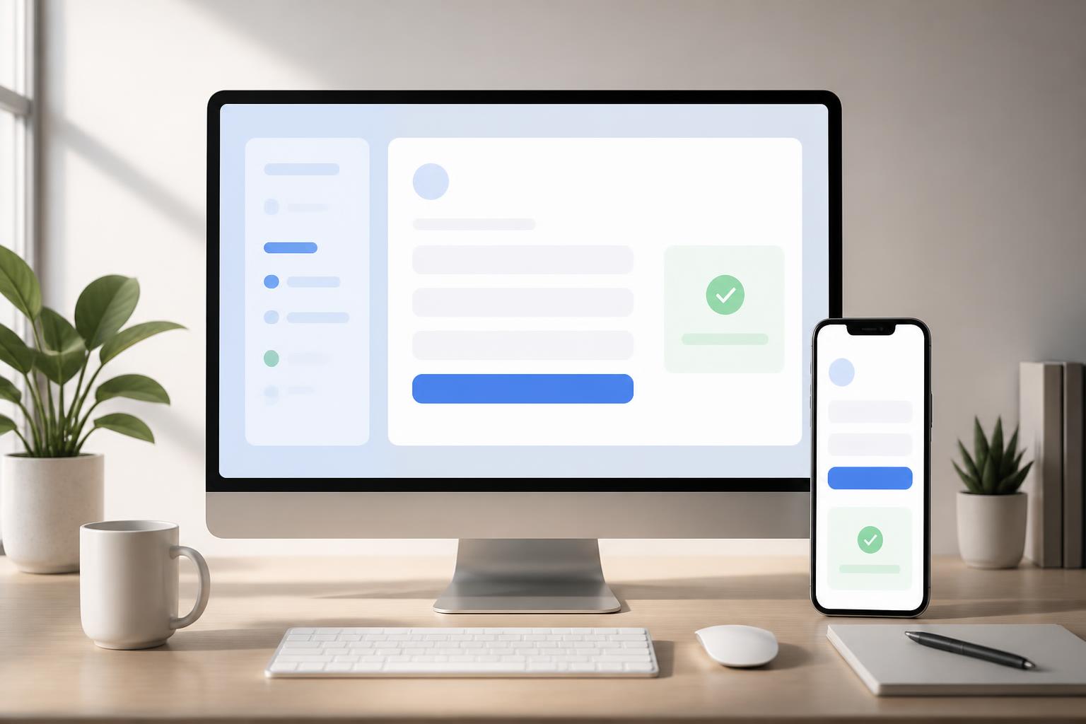
Error messages should appear near the relevant field, use specific language, and explain how to fix the problem. The phrase “Invalid information” is not very helpful if users do not know which field is causing the issue. By contrast, an instruction such as “Enter an email address in the format name@domain.com” provides a clearer action. For multi-step processes, the website should indicate which step the user is on, how many steps remain, and whether the data already entered will be retained.
Compatibility
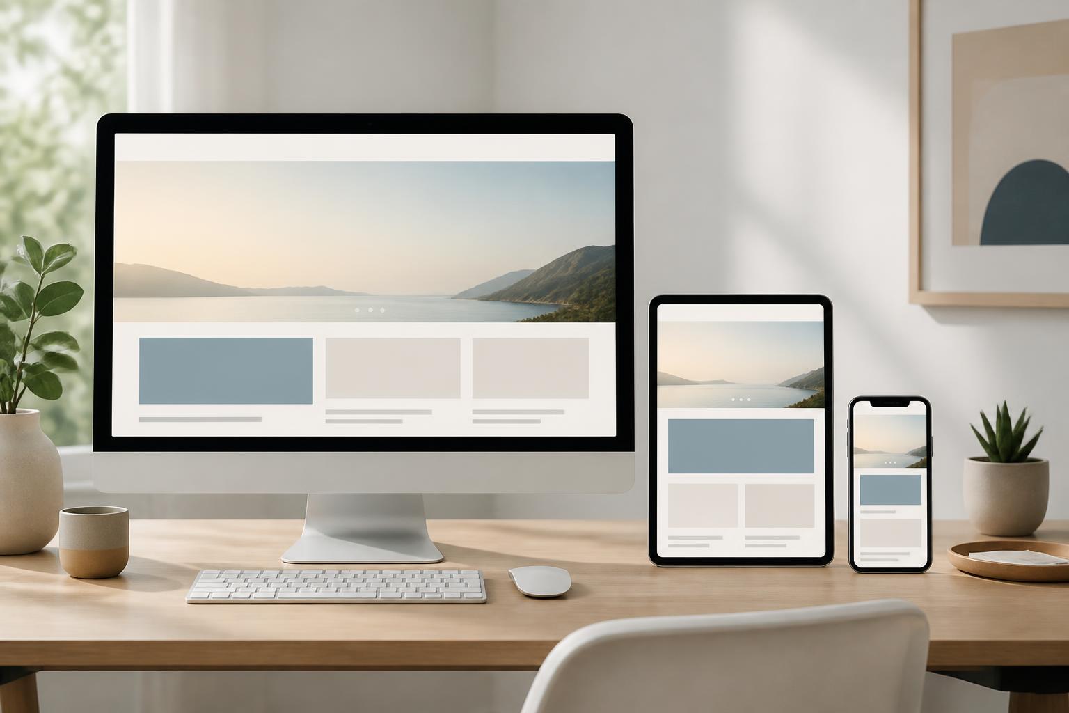
A website is not opened only in one browser or on a single device. Its content structure and interactive components need to be reasonably compatible with common browsers, assistive technologies, and various input methods. This requires the team not only to inspect the design visually on a single screen but also to test keyboard navigation, zoomed content, images turned off, or screen reader tools when appropriate.
Prioritizing meaningful HTML and using interface components for their intended purposes often helps prevent many problems. A heading should be marked as a heading, a link should lead somewhere else, and a button should perform an action. When custom elements are used instead of standard components, the team needs to check their states, names, and interactivity as well. Short-term convenience during interface development should not create major maintenance and bug-fixing costs later.
Integrating Accessibility into the Design Process
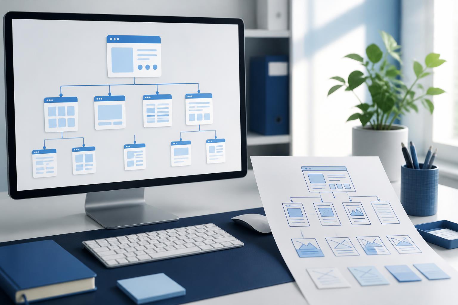
A common mistake is to check accessibility only at the final stage, when the system already contains many complex components. At that point, changing the HTML structure, altering the form flow, or adjusting brand colors can take considerable time. A better process is to introduce accessibility questions at every stage.
During user research, the design team should record different usage circumstances instead of describing only an ideal user. At the content-planning stage, the team needs to identify heading levels, relationships between sections, and information that must not be conveyed through images alone. When creating the interface, the team should establish rules for colors, typography, focus states, form errors, and the behavior of interactive components. During development, keyboard testing and automated tools can detect many basic errors early.
Automated tools are useful for reviewing certain issues, such as missing component names, illogical heading structures, or contrast that requires further consideration. However, they cannot completely replace real-world testing. A tool may confirm that a button has a label, but it cannot determine whether that label is genuinely understandable in context. The team still needs to perform specific tasks, observe users’ paths, and invite people with different needs to participate in testing when conditions allow.
Balancing Brand Identity and Inclusivity
Many businesses worry that accessible design will make an interface less distinctive or force the brand to abandon its familiar color palette. In reality, accessibility does not mean that every website must have the same appearance. A brand can still express itself through imagery, layout, content tone, and identifying details, as long as basic requirements for reading, navigation, and interaction are met.
If a brand color is too light when used for text, the business can retain it in decorative areas and choose a higher-contrast variation for primary content. If an interface requires transition effects, those effects can be shortened or disabled when users request reduced motion. This is a process of deliberate adjustment, not the removal of creativity. A trustworthy brand must also demonstrate respect for the time, abilities, and diverse circumstances of its visitors.
Benefits Beyond Compliance
Accessible website design reduces dependence on a single way of using a website. Well-structured content is often easier to scan on small screens, easier to maintain, and more convenient to reuse across other channels. Clear forms can reduce the number of times users enter incorrect information. Coherent navigation helps visitors find the information they need without having to try repeatedly.
More importantly, this approach leads the team to view the website from the perspective of real tasks rather than evaluating it only by appearance. A product page needs to help users understand features, compare options, and take the next step. A contact page needs to clarify the appropriate channel, the data that must be provided, and how a response will be received. When every decision is connected to the user’s goal, the quality of the experience often improves naturally.
Starting with High-Impact Changes
Businesses do not have to wait for a complete redesign before addressing accessibility. They can begin by reviewing pages with high traffic or business value and then creating a list of issues according to their impact. Common priorities include fixing heading structures, adding clear names to buttons and links, checking focus states, improving error messages, reviewing contrast, and providing suitable descriptions for meaningful images.
After each round of revisions, the team should record the cause, the solution, and the rules that need to be applied to new pages. A component library with clearly defined interactive states will help teams work more consistently. Training content writers, designers, and developers is just as important as choosing testing tools, because many barriers originate in content decisions or product requirements rather than in the source code alone.
Accessible website design is an ongoing commitment to the quality of the user experience. It does not turn a website into a product that is unattractive or lacking in distinction; instead, it helps the values embodied in its content and brand reach more people. When perceivability, operability, understandability, and compatibility are treated as criteria from the outset, the website becomes more resilient to the diversity of devices, assistive technologies, and usage circumstances. It also provides a foundation for businesses to build a more equitable, clear, and trustworthy digital space.