


Accessible Website Design: When a Good Experience Is for Everyone


A Good Website Should Not Create Unnecessary Barriers
When building a website, businesses often focus on an attractive interface, fast page-loading speeds, display on mobile devices, and factors that support conversions. These are all important priorities, but another question also needs to be asked: is the website truly easy to use for many different groups of users?
Visitors may use small screens, a keyboard instead of a mouse, a screen reader, or have difficulty distinguishing colors. Some people may need additional time to read and process information, while others may access a website in an environment with poor lighting, loud noise, or an unstable connection. If an interface is designed only for one ideal type of user, the website may unintentionally create barriers that prevent some visitors from taking in the content or completing an action.
Accessible website design is an approach aimed at reducing these barriers from the stages of planning the structure, writing the content, and developing the interface. It is not a separate layer of features added at the end of a project, nor does it mean making the design less modern. On the contrary, when implemented properly, accessibility often makes a website clearer, more orderly, and easier for most visitors to use.
Accessibility Begins with Structure and Content
A genuinely accessible website first needs an easy-to-understand information structure. Users must be able to recognize where they are, what the current page is about, and what step they can take next. Areas such as the header, navigation bar, main content, sidebar, and footer should be organized consistently across pages. When the arrangement changes too much, visitors have to spend extra time finding their way, especially when they cannot view the entire interface at once.
Headings also need to be properly hierarchical. The main heading indicates the topic of the page, while lower-level headings divide the content into related sections. This structure not only helps readers scan quickly but also supports people who use screen readers in understanding the layout before going deeper into the content. Using a larger font size or bold text visually is not enough if the heading structure in the source code does not reflect the correct order of information.
Written content should use direct language, sentences of moderate length, and fewer vague expressions. Buttons such as “Submit,” “Learn more,” or “Continue” need to be placed in a clear context so users understand the action they are about to take. On pages with many similar links, link names should describe their destination instead of merely repeating a generic phrase.
Colors and Contrast Should Serve the Information
Color is often a prominent component of brand identity and interface design. However, color should not be the only signal used to communicate a status or distinction. For example, a form should not use only the color red to indicate an error without a text message. A chart should not distinguish data groups only through similar colors without supporting labels or symbols.
The contrast between text and its background needs to be clear enough for the content to be read in a variety of conditions. Thin text placed over an image, light gray text, or buttons with colors close to the background often cause difficulties, even for people without visual impairments. When selecting colors, design teams should check the normal state, hover state, selected state, and error state. A component that is easy to see initially can still become difficult to identify when it changes to an interactive state.
Increasing contrast does not mean that every interface must use black and white. Designers can still maintain a brand color palette as long as they distinguish the main content, secondary content, and important actions. Information areas that need priority should have sufficiently clear differences in color, size, spacing, or shape.
Design Interactions for Mice, Keyboards, and Touchscreens
Many interfaces are tested primarily with a mouse and touch gestures, but an accessible website also needs to consider keyboard navigation. Users should be able to move through links, buttons, input fields, and interactive components in a logical order. The currently selected position should also be clearly indicated, rather than disappearing completely because the design has removed the default outline.
The navigation order should follow the page’s reading logic. If users have to pass through a promotional window, a group of hidden options, or an unrelated component before reaching the main content, the experience becomes unpredictable. Dialog boxes that open on the screen also need a clear way to close them and must not trap users inside when they cannot operate them with a mouse.
For touchscreens, tap targets need to be easy to identify and have suitable spacing to reduce accidental actions. Buttons that are too small, links placed too close together, or unlabeled icons can cause difficulties in mobile environments. When an action may change data, submit a form, or cause users to leave the process they are carrying out, the interface should provide clear feedback so they know the result.
Images, Videos, and Forms All Need Additional Information
Images on websites are often used to convey emotion, illustrate products, or help explain content. However, if an image contains important information without an alternative description, some users will not be able to fully receive the message. Alternative descriptions should focus on the meaning of the image in its specific context and do not need to list every irrelevant detail.
For images that are purely decorative, appropriate marking helps assistive technologies skip them and focus on the main content. By contrast, product images, diagrams, charts, or images that contain an action need to be described more clearly. Videos should also include captions when spoken content plays an important role. If a video cannot fully convey its message through sound or visuals alone, alternative content can help users access the information in another way.
Forms are an area where barriers commonly arise. Each input field needs a clear label and should not rely only on placeholder text inside the field, because that text may disappear when users begin typing. Error messages should indicate which field has a problem and how the user should correct it. When a form is long, it can be divided into reasonable steps, with progress displayed and entered data preserved to reduce the feeling of losing control.
Accessibility Should Not Be Treated as End-of-Project Work
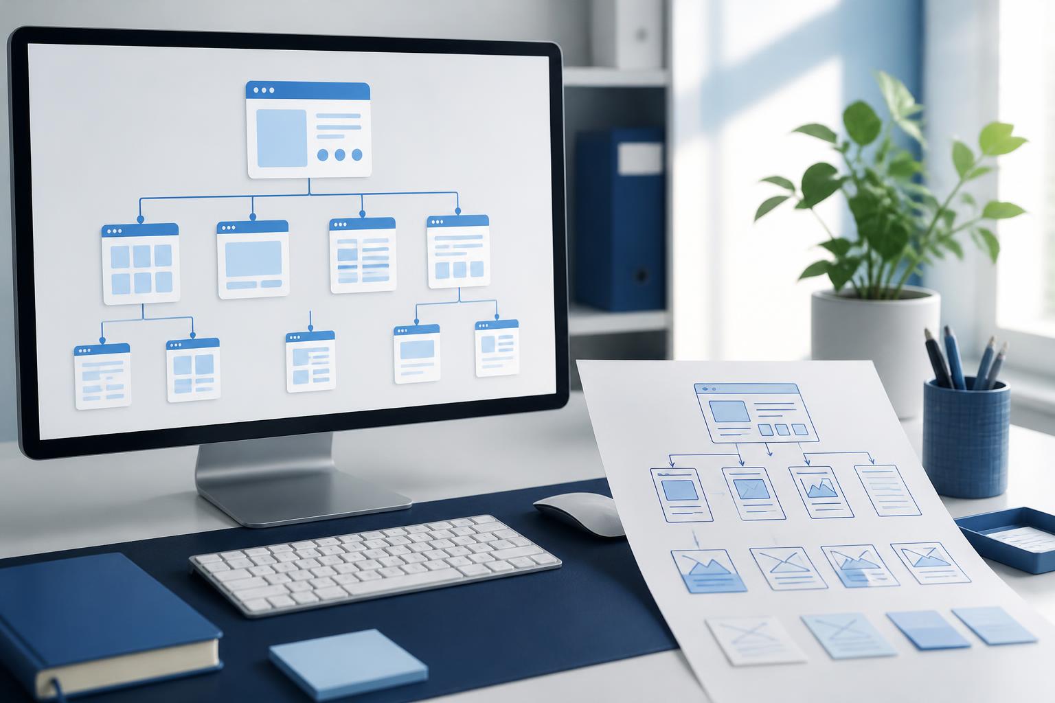
If accessibility is checked only after the interface has been completed, fixing problems can take a great deal of time and affect the original structure. A more effective process is to incorporate these criteria at every stage. When mapping the website, the team needs to determine how users move between pages. When writing content, they need to check headings, links, image descriptions, and wording. When designing the interface, they need to consider colors, interactive states, text size, and the ability to zoom in on the content.
Testing should also combine multiple methods. Automated tools can detect some common problems in the source code, but they cannot completely replace real-world use. Using only a keyboard, zooming in on the page, disabling images, checking on a small screen, or trying a screen reader can reveal issues that visual inspection may easily overlook. More importantly, the development team should test real tasks such as finding a product, reading an article, completing a form, booking an appointment, or completing a transaction, rather than looking only at individual components.
Businesses also need to treat this as an ongoing process. After a website goes live, new content, new campaigns, and additional features can create new barriers. Each interface or content-management-system update should include a review step to ensure that accessibility improvements are not lost.
Benefits That Extend Beyond One Group of Users
Accessible design is often discussed in relation to people with disabilities, but its benefits are not limited to this group. A clear structure helps new users quickly understand a website. Easy-to-identify buttons support visitors using small devices. Captions allow video content to be followed in environments where playing audio is inconvenient. Text with good contrast remains easier to read outdoors or when users are working with screens of varying quality.
Clear content organization also supports search engine optimization in many ways, because both users and search engines need to understand the topic, the relationships between sections, and the purpose of each page. However, accessibility should not be implemented solely in the hope of achieving a marketing metric. The main goal remains helping visitors complete tasks with fewer obstacles and providing enough information for them to make decisions.
Building an Inclusive Experience Through Small Decisions
An accessible website does not necessarily need a complex interface or numerous options. Its important foundation lies in decisions that may seem small: using headings at the correct level, writing meaningful button names, not conveying information through color alone, keeping focus states easy to see, providing appropriate image descriptions, and displaying errors with guidance. When these details are implemented consistently, the website becomes more reliable in a wide range of usage situations.
Website design, therefore, is not only about arranging images and components on a screen. It is also the process of anticipating how different people receive information, navigate, and interact with content. By placing accessibility at the center of structure, content, interface design, and testing, businesses can create a friendlier website, reduce unnecessary barriers, and better serve a broad community of users.