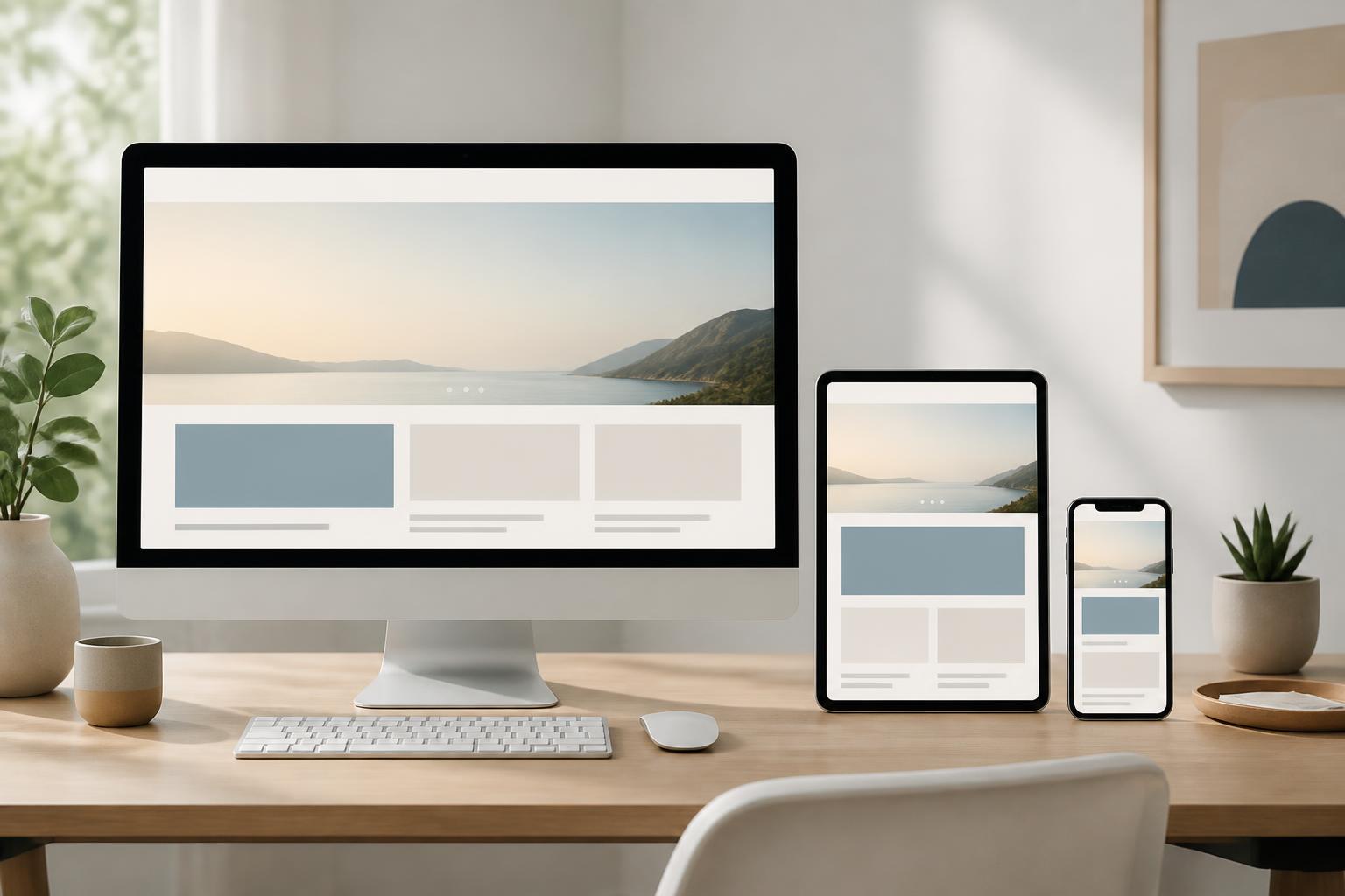



Mobile-First Website Design: Starting with the Small Screen


Mobile phones have become one of the most important touchpoints between users and websites. A customer may see a brand on social media, search for information on their phone, read reviews while on the go, and only then visit the website to view products or submit an inquiry. In this context, an interface that works well only on large screens creates a significant gap between user expectations and the actual experience.
Mobile-first website design places the small screen at the center of the decision-making process. Instead of fully building for computers and then cutting things down to fit phones, the design team begins by identifying the most important content and actions within a limited space. The interface is then gradually expanded for tablets and larger screens. This is not a decorative trend, but a method that helps make websites clearer, more focused, and easier to use.
How is mobile-first different from building a responsive website?
Responsive design is the ability of an interface to adapt to multiple screen sizes. A responsive website can change the number of columns, image sizes, element positions, or the way a menu is displayed when the browser space changes. This is an important technical requirement for modern websites.
Mobile-first, however, is more about the order of thinking in the design process. With this approach, the team does not regard the phone version as a shortened version of the computer version. They start with the practical limitations of a small screen, touch interactions, unstable connections, and the context in which users often have little time to find information. Once the interface has addressed the core needs, larger spaces can be used to add information or improve presentation.
The two concepts are closely related but not identical. A website can be technically responsive yet still be difficult to use on a phone if the content is too long, the buttons are too small, the menu is complicated, or the form requires too many actions. Mobile-first requires consideration of the entire experience, from content structure to how users complete a goal.
Start with the user’s most important goal
A small screen does not allow a website to present everything at once. Therefore, the first step should not be choosing colors, creating effects, or arranging interface blocks. The more important question is what users need to do when they access the website on a phone. They may want to view contact information, find a product, read instructional content, book an appointment, fill out a form, or check an order status.
Each primary goal should be translated into a short and understandable sequence of actions. If the goal is to submit a consultation request, the call-to-action button should appear in an easy-to-notice position, the explanatory content should be clear enough for users to understand what they will receive, and the form should ask only for information that is truly necessary at the initial stage. If the goal is to find a product, the search tool, filters, and pricing information should be organized so that users do not have to move back and forth constantly between multiple screens.
Identifying priorities also helps address a common problem: trying to bring all the content from the computer website onto the phone. Not every element needs to appear in the first position, but hidden content should not disappear in a way that is difficult to understand. Additional information can be placed in expandable areas, tabs, or collapsible content blocks, as long as users can recognize how to access it.
Organize content for limited space
On a small screen, content structure directly affects readability. A long paragraph, a vague heading, or multiple layers of information appearing one after another can make it difficult for users to determine what is important. Good design needs to create a clear hierarchy through specific headings, moderate-length paragraphs, appropriate spacing, and intentional emphasis.
Headings should help readers predict the content that follows rather than merely create a sense of prominence. Important descriptions should be placed near the related action. For example, if a button leads to a quote request, the introduction directly above it should briefly explain the process or the information users need to prepare. When the connection between content and action is sufficiently clear, users will have less need to guess.
Images should also be selected based on their role in the content. A large image that adds no meaning can push important information too far down the page. Conversely, an appropriate product image, diagram, or illustration can help users understand more quickly. For each content block, consider whether the image is supporting the user’s decision or merely making the interface look fuller.
Design interactions suited to touchscreens
Phone users navigate with their fingers rather than a mouse pointer. This changes how interactive elements should be arranged. Buttons, links, checkboxes, and filters must be easy enough to identify so that users do not accidentally tap the wrong one. Important actions should also have clear feedback states, such as changing appearance when selected or displaying a notification after a form has been submitted.
Links placed too close together are a common reason why the phone experience becomes frustrating. This is particularly noticeable in menus, price tables, product lists, and footers containing many links. Appropriate spacing not only makes interactions more accurate but also makes the interface look less cluttered.
Navigation menus should be designed based on the number and importance of their items. A multi-level menu may be suitable for a large website, but if the ways to open it and return are unclear, users can easily lose their sense of direction. Item names should be concise, consistent with the content of the destination page, and should avoid terms familiar only to people within the business.
Forms are an area that requires careful testing. On a phone, entering information takes more effort than on a computer, especially when users have to move back and forth between fields. Obstacles can be reduced by dividing the form into clear groups, using the correct types of input fields, displaying errors close to the location that needs correction, and preserving entered data when an error occurs.
Performance is part of the design experience
Mobile-first design cannot be separated from performance. Users may access a website under many different conditions, from stable networks to intermittent connections. An interface with many large image files, complex effects, or unnecessary components will make loading and interaction feel burdensome.
Image optimization is one of the tasks that should be carried out from the design stage. The display size, format, level of detail, and role of each image all need to be considered. An excessively large image should not be loaded and merely reduced with CSS if the actual need does not require it. Images that do not immediately appear on the screen can also be handled appropriately so they do not compete for resources with important content.
Motion effects should also serve a clear purpose. A subtle transition can help users recognize a change in state, but too many effects will make the page respond slowly or cause distraction. In all cases, the main content and core actions should take priority over presentation elements.
Do not test on only one device
An interface may look fine on the designer’s device but develop problems on other screens. Therefore, the testing process should include multiple screen sizes, operating systems, browsers, and device orientations. Testing should not stop at the homepage. Product pages, articles, forms, search pages, checkout pages, and contact pages often contain more situations that can expose errors.
Testers should perform tasks similar to those of actual users rather than merely observe the interface. Try finding a product, opening the menu, reading a long piece of content, filling out a form, returning to the previous page, and handling an error message. Through these actions, the team can identify problems such as obscured buttons, unusually wrapped headings, horizontally overflowing content, or unclear states after a form is submitted.
User feedback is also valuable during the refinement stage. A detail that seems obvious to the internal team may confuse a new user. Repeated questions received by the support department, steps that users often abandon, or areas they frequently access by mistake can all provide suggestions for adjusting the structure and content.
What benefits does mobile-first bring to businesses?
When a website is built around core needs, a business has a better opportunity to communicate its message clearly. Users do not have to go through too many layers of content to learn what the product is, who the service is suitable for, or what step they should take next. This clarity can support many objectives, from increasing the number of inquiries to reducing support requests caused by information that is difficult to find.
This approach also helps keep the development process more focused. Instead of designing a large interface with many components and then trying to condense it, the project team must discuss content priorities early on. These decisions create a foundation for expanding the website later, because every new component must be considered according to its practical value rather than added simply because space allows it.
However, mobile-first does not mean overlooking the computer experience. Large screens remain suitable for tasks that require comparing a great deal of information, working with data tables, or viewing detailed images. When expanding the interface, the goal is to use the available space effectively without changing the usage logic established on the phone.
Conclusion
Mobile-first website design begins with a simple but important question: what does the user need to accomplish with the fewest possible obstacles? From this question, the team can organize content, design interactions, select images, and control performance in a consistent direction.
A good mobile-first website does not necessarily need an interface that is so minimalist that it becomes impoverished. The essential point is that every component has a reason to appear, is placed in the right location, and works reliably in real-world usage contexts. When the small screen is treated as a starting point rather than a limitation to overcome, the website has a better chance of becoming more focused, flexible, and friendly to a wider range of users.