


Accessible Website Design: When a Good Experience Is for Everyone

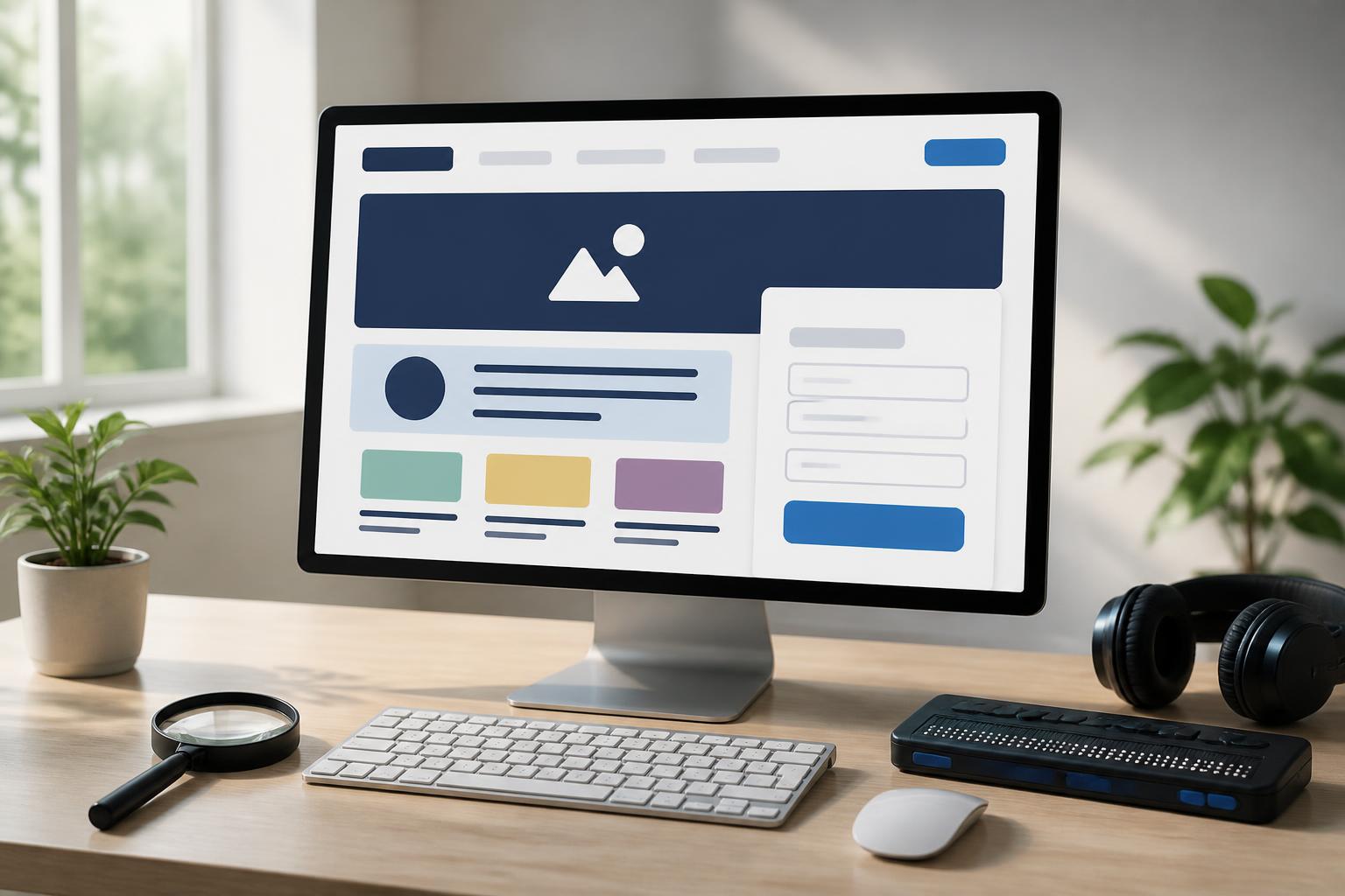
A website is considered good not only when it has an attractive interface, loads quickly, or displays reliably across multiple devices. It must also help people from different groups read content, find information, and complete tasks without encountering unnecessary barriers. This is the foundation of accessible website design, an aspect that is often overlooked when businesses focus too heavily on appearance or short-term conversion metrics.
Accessibility is not a separate feature intended for a small group. Older adults may have difficulty reading text that is too small, people using phones in poor lighting may be unable to distinguish colors, and those whose hands are occupied may still need to navigate with a keyboard or voice-assisted tools. A clear, well-organized, and easy-to-use design therefore often benefits all visitors.
What Is Accessible Design?
Accessible website design is the process of building interfaces and content so that users with different abilities, devices, and circumstances can still perceive information, navigate, and interact with a website. This includes people who are blind or visually impaired, deaf or hard of hearing, have limited mobility, or experience cognitive difficulties, but its practical scope is much broader.
An accessible website does not necessarily have to be visually simple or give up its brand personality. On the contrary, when designers organize content logically, create appropriate contrast, use clear labels, and reduce unnecessary steps, the overall experience often becomes more coherent. Creativity can still be maintained, as long as decorative elements do not interfere with usability.
Important Layers of Accessible Website Design
Content Structure Must Have an Order
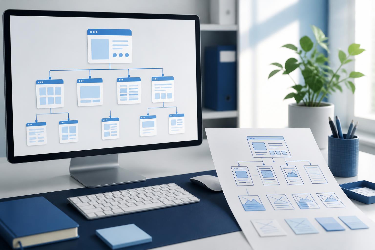
Users do not all read a web page in the same way. Some quickly scan the headings, some use screen readers, while others look for only one specific piece of information, such as a price, address, or contact method. Content therefore needs to be organized in a logical order, beginning with the main heading, followed by content groups and detailed explanations.
Using the correct heading levels helps readers understand the page structure before examining each paragraph in depth. A subheading should not be created merely to make text larger, nor should heading levels be skipped halfway through for presentation reasons. When the HTML structure accurately reflects the relationships between sections, both ordinary users and assistive tools can understand the content more easily.
Color Should Support Information, Not Be the Only Signal
Color plays an important role in brand recognition and directing attention, but it should not be used as the only way to communicate a status. For example, a form should not mark an incorrect field only in red without an accompanying specific message. Users who perceive colors differently will not have the same experience, and even people with typical color vision may miss a warning when the screen brightness is low.
Contrast between text and its background needs to be clear enough for content to remain readable in a variety of conditions. Buttons, links, and interactive states should also have signals beyond a color change, such as a border, shape, or descriptive text. Before publication, the team can check common color combinations with contrast evaluation tools, then confirm the results through real-world use.
Image Content Must Have Appropriate Descriptions
Product images, charts, icons, and illustrations can all contain important information. If an image is simply inserted into a page without a description, some users will not know what the visual content is communicating. Alternative text should describe the image’s purpose in its specific context, rather than mechanically listing every visible detail.
Not every image needs a long description. Purely decorative images can be handled so that assistive tools ignore them, while product images or diagrams need to describe essential information. If an image contains text, that text should not exist only within the image; it also needs to be provided in a readable and searchable text format.
Tasks Must Be Possible Without Using a Mouse
Not every user controls a website with a mouse or touchscreen. Some use a keyboard, switch devices, or other assistive tools. Therefore, interactive components such as menus, buttons, links, dialogs, and forms need to be accessible in a logical order using the keyboard.
The currently selected state must also be easy to identify. If the outline around a button disappears when the user moves to the next element, it will be difficult for them to know where they are on the page. An illogical movement order, skipped interactive areas, or dialogs that cannot be closed through an appropriate action can make a function almost unusable for some groups of visitors.
Forms Need to Clearly Tell Users What to Do
Forms are where many accessibility issues become most apparent. Each input field should have a specific label and should not rely solely on placeholder text inside the field. Placeholder text may disappear when users begin typing and generally cannot replace a fixed label.
Error messages need to identify which field has a problem, what the cause is, and how to fix it. A vague error message such as “Invalid information” does not help users complete the form. For multi-screen processes, the website should also indicate where users are, which sections they have completed, and whether they can return to edit their information.
Accessibility Needs to Begin with the Process, Not the Final Check
If accessibility is checked only after the interface has been completed, the cost of making changes is usually higher, and many initial decisions have become difficult to alter. It is better for the project team to incorporate these requirements from the planning stage. When identifying user groups, the team needs to ask how they read, search, enter information, and receive feedback on the website.
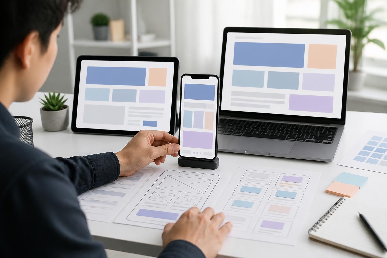
During the design stage, mockups can be reviewed for text size, contrast, heading presentation, label placement, and button consistency. During development, programmers need to ensure that the code structure, interactive states, and information intended for assistive tools are implemented correctly. In the testing stage, automated evaluations can help detect some common errors, but they should not replace manual testing.
Testing with a keyboard, zooming content, resizing the window, and using a screen reader can reveal issues that are not apparent from the visual interface. More importantly, the team should observe how a person performs a real task, such as finding a product, submitting a request, or reading a policy. The goal is not to complete a checklist, but to identify where users are interrupted and the reasons behind those interruptions.
Common Mistakes
A common mistake is to view accessibility as work that belongs only to programmers. In reality, content, design, and technology all affect the experience. A button with attractive colors but confusing text is both a content and interface problem. An article with a disorganized structure cannot be fixed simply by adding technical attributes.
Another mistake is overusing pop-ups, motion effects, or automatically playing content. These elements can disorient users, obscure information, or make control more difficult. Motion effects should serve to explain states and relationships between elements rather than merely create visual appeal. When necessary, websites should allow users to reduce or turn off nonessential motion.
Providing only one way to make contact can also create a barrier. A long form, a requirement for precise actions, or complete reliance on phone calls will not suit everyone. Providing clear instructions and several reasonable contact methods gives users more control while also reducing pressure on the support team.
Benefits for Brands and Business Operations
An accessible website helps businesses expand their opportunities to reach customers without unintentionally excluding people with genuine needs. When content is easy to read, navigation is clear, and forms are less confusing, visitors have a stronger basis for trusting the brand and accomplishing their goals.
These principles also often improve the overall quality of the platform. Clear content structure makes management more convenient. Alternative text gives images additional context. Specific link labels help users understand where they will go before clicking. Consistent buttons and forms reduce interaction errors. These are not benefits intended only for one group of people, but the foundation of a responsible digital experience.
Making Accessibility a Design Standard
Accessible website design should not be viewed as an extra decorative layer added after a website has been completed. It is a way of thinking that influences the choice of colors, the writing of content, the construction of structure, and the testing of features. When incorporated into the process early, accessibility helps teams make clearer decisions instead of continually dealing with emerging problems.
A good website needs to respect the diversity of its users and the circumstances in which they access it. Not every barrier can be removed immediately, but businesses can start with practical steps: use headings in an orderly manner, write understandable labels, do not rely entirely on color, provide descriptions for images, and test interactions with a keyboard. From these foundations, a website will become friendlier, more reliable, and more useful to more people.