


Designing Accessible Websites: A Better Foundation for All Users

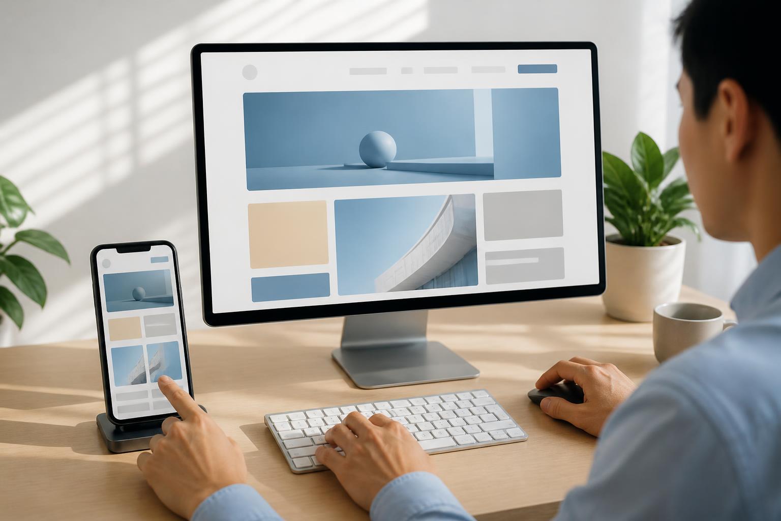
When building a website, businesses often focus on an attractive interface, loading speed, mobile display, and search rankings. These are all important factors, but there is another question that needs to be asked earlier: is the website truly easy to use for different groups of users?
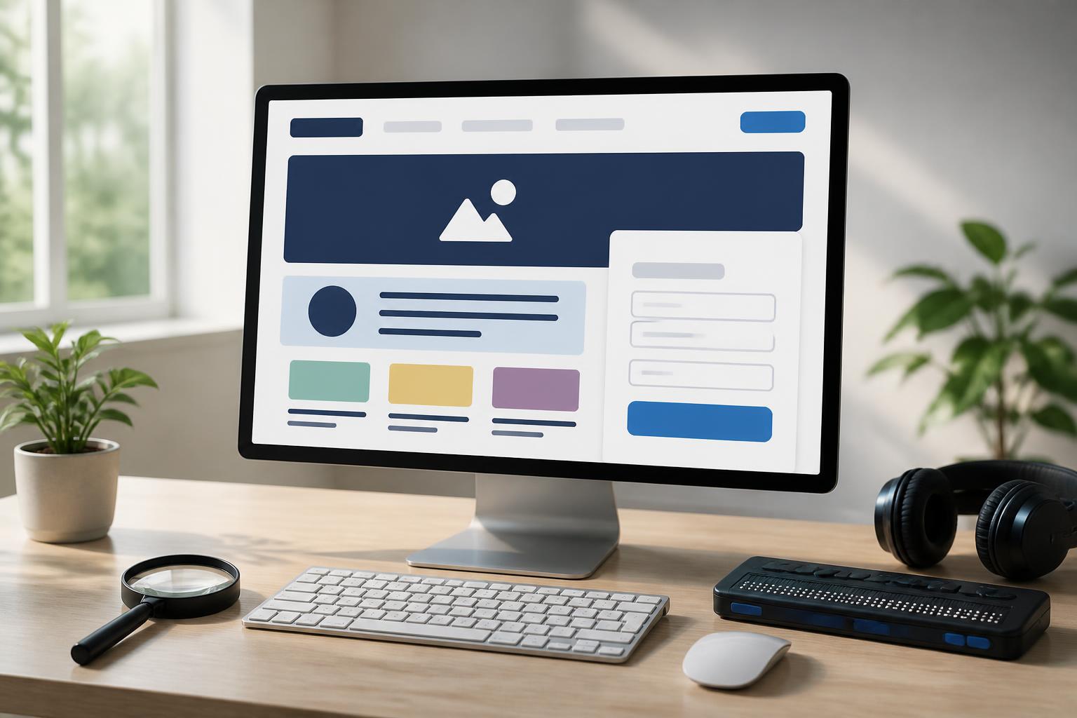
An accessible website is designed so that as many people as possible can read, understand, navigate, and complete tasks without facing unnecessary obstacles. Users may access it on a large screen, tablet, or phone; use a mouse, keyboard, or assistive technology; and see, hear, and interact under different conditions. Accessibility is not an additional decorative layer added after a website is completed, but a way of thinking that makes digital products clearer and more sustainable.
Accessibility Begins with Everyday Needs
When people think of accessible websites, many only consider solutions for people with visual impairments or mobility limitations. In reality, the scope is broader. A user may be in a brightly lit place, using a small screen, dealing with an unstable connection, unable to turn on sound, or operating with only one hand. Another user may have difficulty reading overly long paragraphs, distinguishing colors, or remembering multiple steps in a form.
These situations show that user experiences are never exactly the same. Accessible design reduces dependence on a single sense, device, or method of interaction. When information is presented clearly, buttons are easy to identify, and processes can be completed in multiple ways, a website can serve more people without necessarily having to create a separate version.
Clear Content Structure Is the Foundation
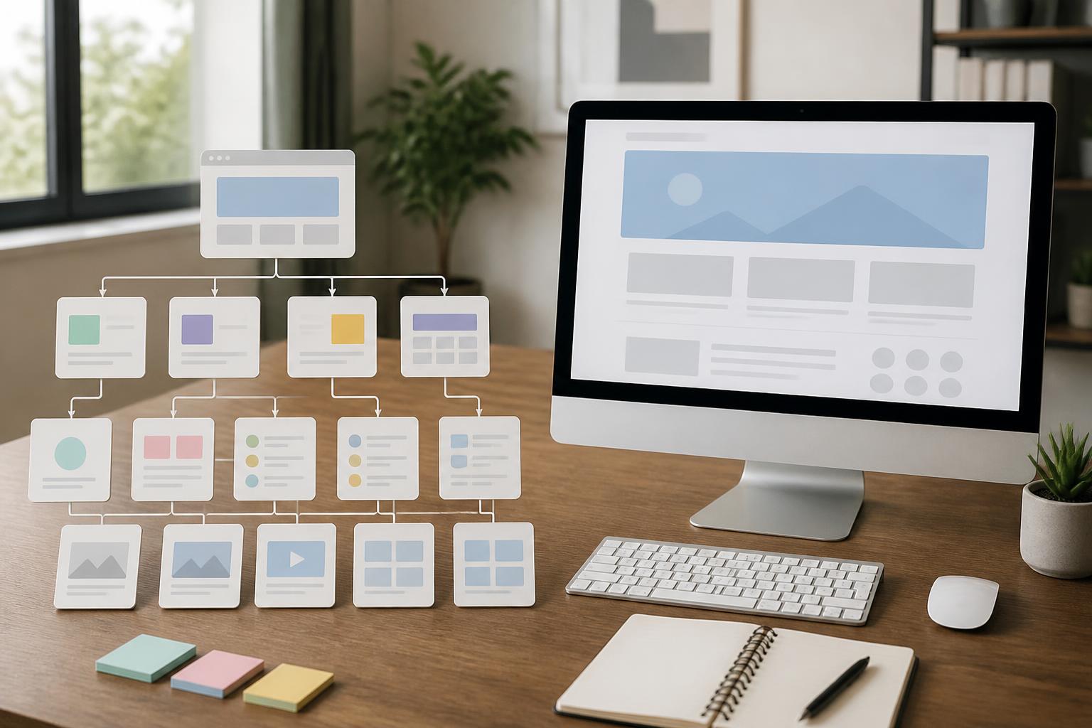
Users generally do not read websites from beginning to end as they would a printed article. They quickly scan headings, opening paragraphs, lists, call-to-action buttons, and sections that appear relevant to their current needs. Therefore, the content structure should accurately reflect the relative importance of the information.
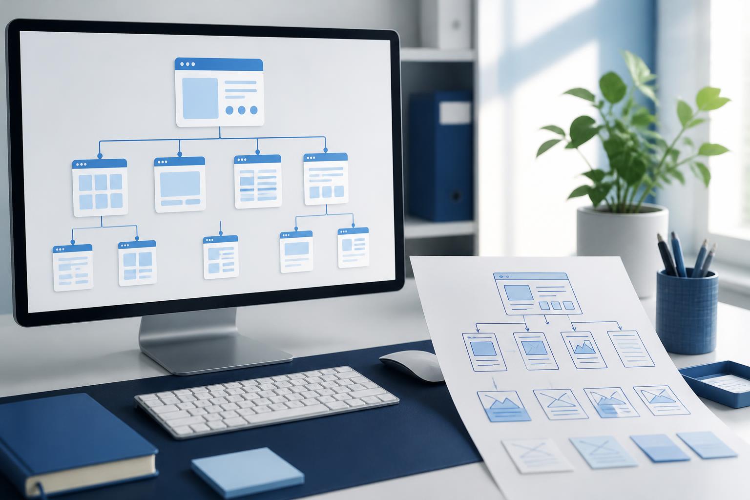
Each page should have one main heading that expresses its topic, followed by subheadings arranged in a logical order. Paragraphs should focus on one main idea instead of putting too much information into a long block of text. Lists can be used when presenting conditions, steps, or groups of related features, but the entire article should not be turned into disconnected pieces of information.
Language also plays an important role. A button labeled “Submit” may not be clear enough in a complex form, while “Submit a consultation request” tells users exactly what will happen. Specific descriptions that avoid internal terminology and limit indirect wording help both new and familiar users complete tasks more quickly.
Do Not Use Color as the Only Signal
Color is an important part of brand identity, but it should not be the only way to communicate a status or provide guidance. If a form uses only red to indicate an error, people who cannot distinguish certain colors may not recognize where the problem is. A better approach is to combine color with a text message, an appropriate icon, or a visible border.
Similarly, links within a paragraph need sufficiently clear identifying cues and should not rely only on very subtle color differences. Primary and secondary buttons should have a consistent hierarchy in terms of position, size, and wording. The goal is not to make the interface more colorful, but to help users understand the state of the page even when display conditions are less than ideal.
Contrast between text and the background should also be considered throughout the design system. Light gray text on a white background may look refined in a mockup, but it can be difficult to read when users lower their screen brightness or access the site outdoors. Accessible design prioritizes readability over visual effects that are purely decorative.
Keyboard and Form Experiences Need to Be Tested Separately
Not everyone uses a mouse or touchscreen. Therefore, important components on a website need to be accessible by keyboard in an easy-to-understand sequence. Users should know where they are, which element is selected, and how to move to the next step. If the selected state is nearly impossible to see, navigation becomes difficult even for simple tasks.
Forms are an area where accessibility weaknesses often become especially apparent. The label for each input field must tell users what they need to enter. If a special format is required, such as a particular way of writing a phone number or email address, instructions should appear before users submit the form. When an error occurs, the message should clearly state which field has a problem and how to fix it, rather than displaying only a vague sentence such as “Invalid data.”
The longer the process, the more important it is to preserve entered data. Users should not have to fill in all the information again simply because of an error at the final step. Dividing a form into logical steps, displaying progress, and allowing users to review their information before submitting also helps reduce pressure during the process.
Images, Videos, and Dynamic Content Need Alternatives
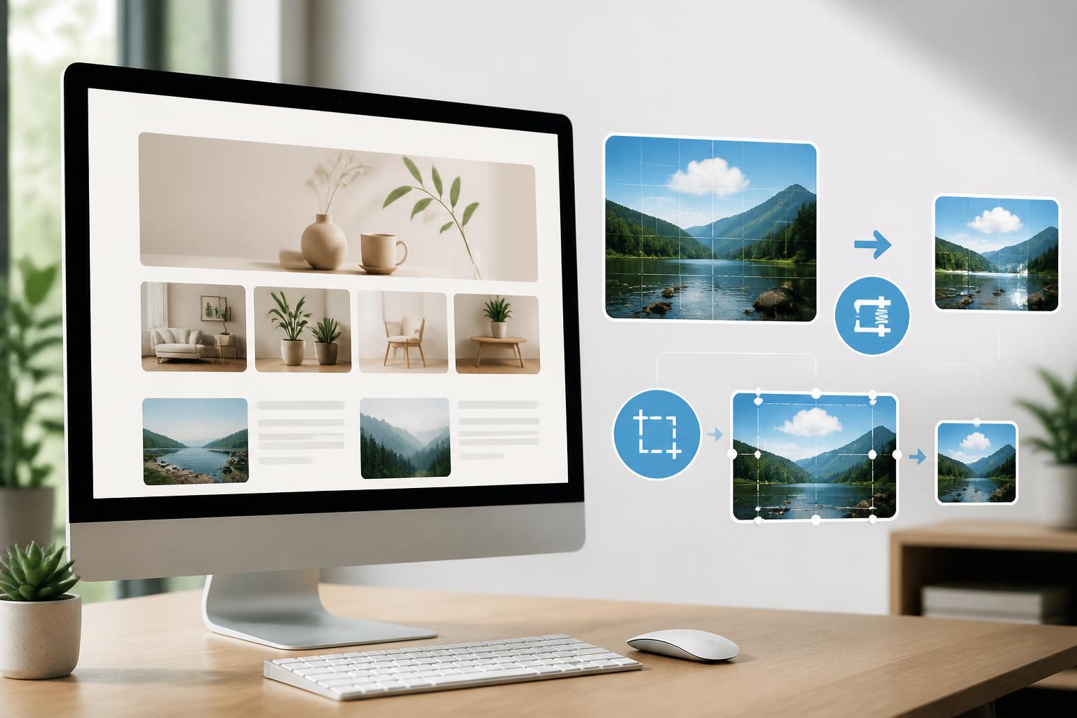
Images make content more engaging, but they should not be the only place where important information is contained. Every meaningful image needs an appropriate description so that users who cannot see it can still understand its role on the page. For purely decorative images, the description should be handled in a way that does not create noise for assistive technologies.
Videos need captions when content is conveyed through speech. If a video contains visual information that is not repeated in the audio, the description or accompanying content should help users access that information. For automatically playing components, websites should allow users to pause or stop them completely. Continuous motion can be distracting and make it more difficult to read the surrounding content.
Pop-up windows, notification bars, and dynamically loaded content also need to be designed carefully. Users must be able to recognize newly appearing elements, know how to close them, and avoid losing their place while reading. Transition effects should support orientation rather than slow down or obscure the primary action.
Accessible Design Benefits the Entire Website
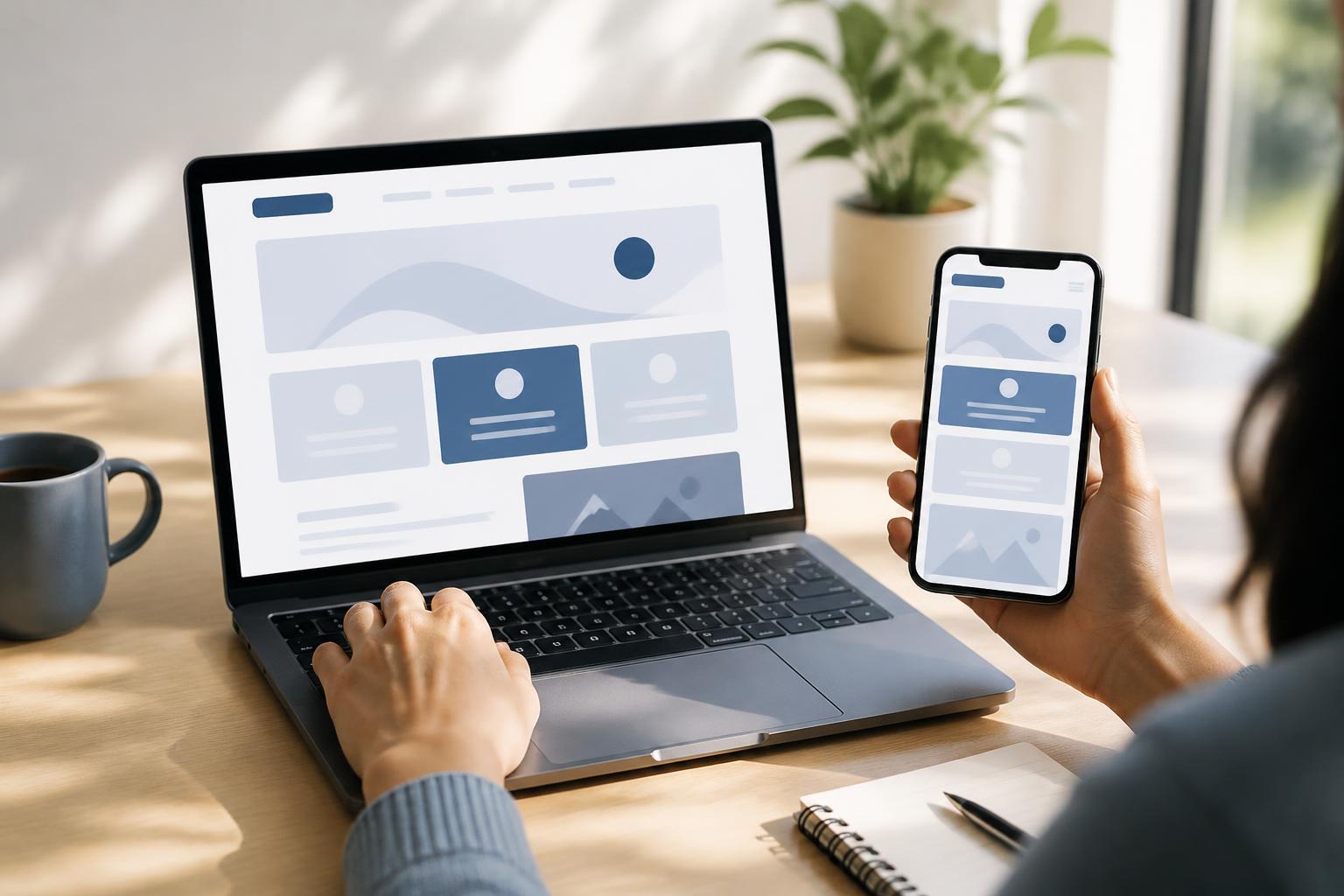
Accessibility is often viewed as a responsibility toward users, but its benefits are not limited to one particular group. A clear structure helps people on phones find information more quickly. Buttons that are large enough and spaced appropriately make touch interaction more convenient. Content with headings, descriptions, and a logical order is also easier for search engines to understand.
Accessible websites tend to rely less on complex effects, create less confusion in their processes, and be easier to maintain when content changes. When a page is built from components with clear rules, editorial teams can continue creating new content without having to fix individual interface problems each time. This is a valuable long-term benefit, especially for websites that frequently update products, services, or instructional information.
How to Incorporate Accessibility into the Website-Building Process
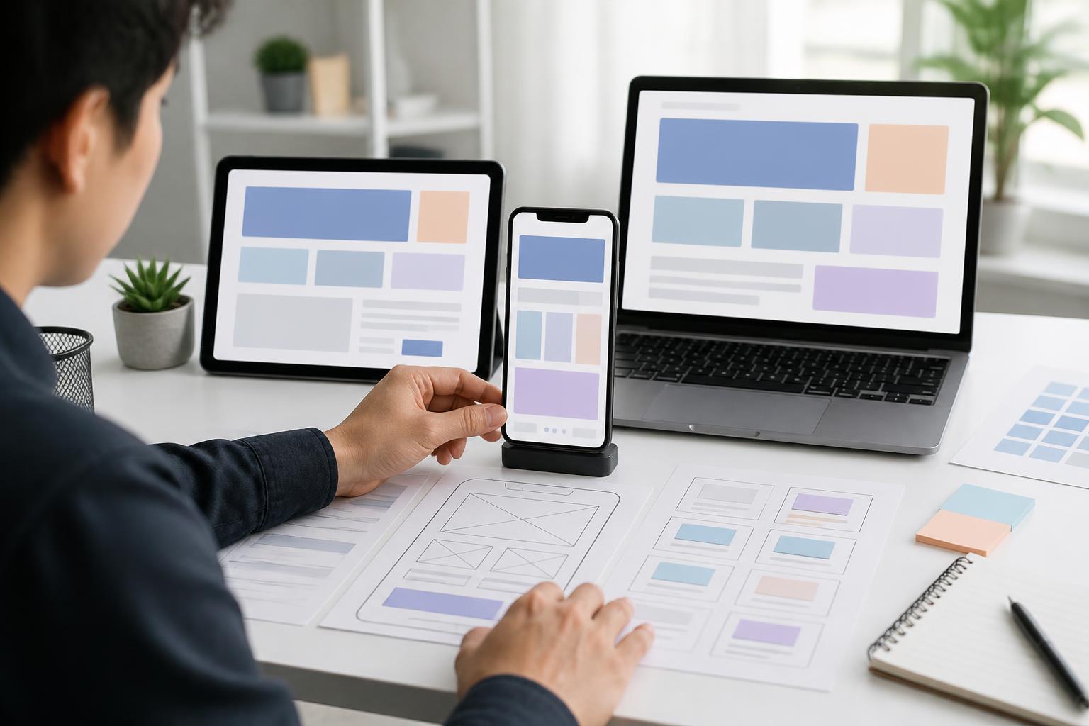
Instead of waiting until a website is complete to test it, businesses should incorporate accessibility into every stage. During requirements definition, the responsible team should list the most important tasks and consider the ways users might complete them. During design, the team should establish consistent rules for colors, headings, buttons, forms, error messages, and interaction states.
During development, each component should be tested independently before being assembled into a complete page. After that, the team can try navigating by keyboard, zooming in on content, turning off sound, using a small screen, and accessing the site under unstable connection conditions. These tests do not replace listening to real users, but they help identify many common obstacles early.
Testing should also be carried out after every major change. An update to the interface, a plugin, a form, or the content management system can remove labels, change the navigation order, or make error messages unclear. Recording the issues, their impact, and how they were addressed will help the team maintain quality instead of fixing problems only in response to random feedback.
Accessibility Is an Ongoing Commitment
No single test is enough to ensure that a website will always remain accessible. New content, new devices, changes in user behavior, and system adjustments can all create new problems. Therefore, accessibility should be treated as a regular criterion in content editing, design, development, and customer support.
The starting point does not have to be a major project. A business can first review an important process such as registration, submitting a request, or making a purchase. Based on the specific issues found in that process, the team can develop general principles for the entire website. A step-by-step approach allows resources to be used practically while creating improvements that users can feel immediately.
A good website does more than put information on a screen; it also enables users to understand and take action. When accessibility is placed at the center, design becomes more intentional, content becomes easier to follow, and processes create fewer obstacles. This is the foundation that helps a website serve more people, operate more reliably, and provide a trustworthy experience over the long term.