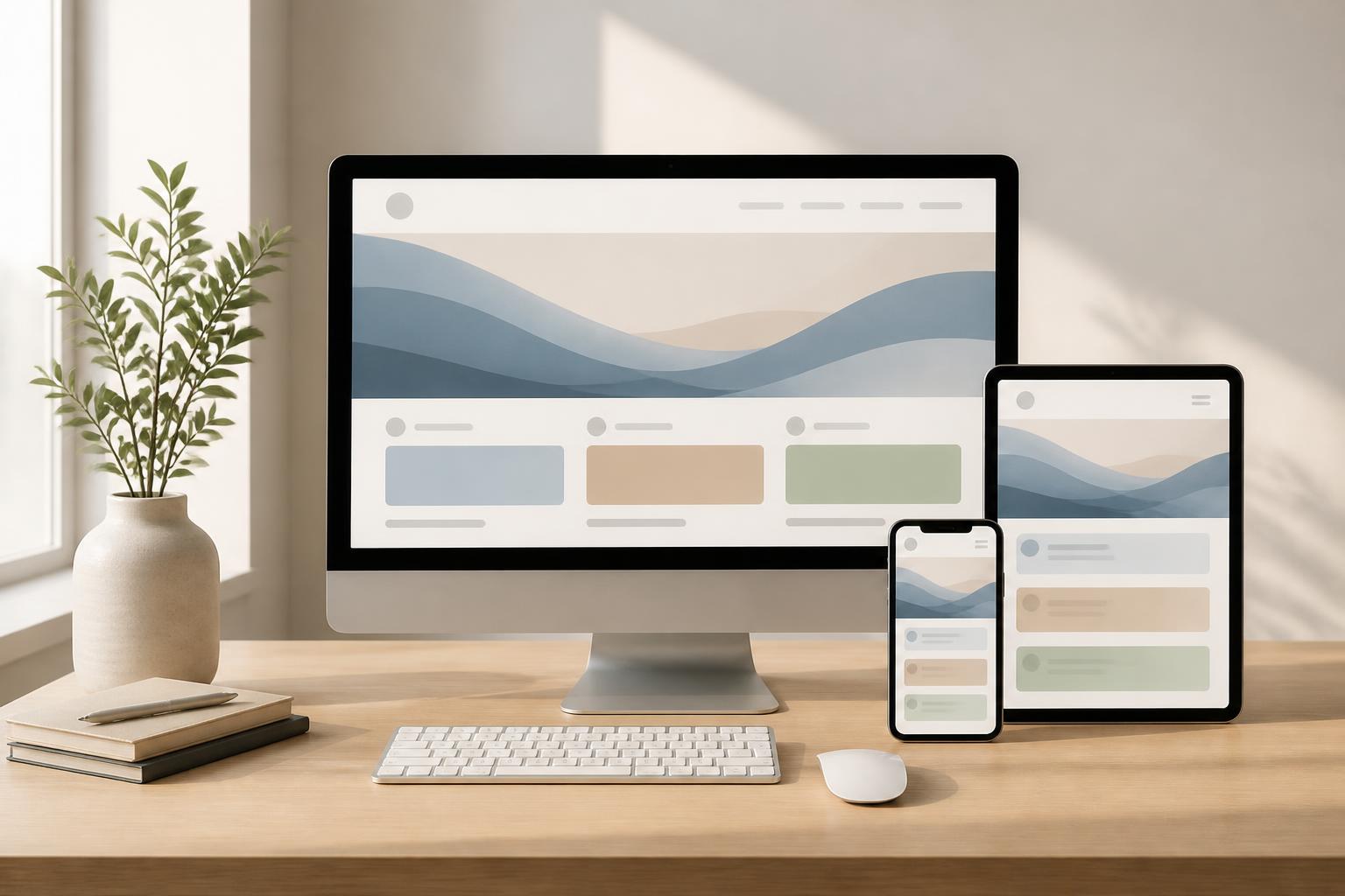



Responsive Website Design: Building a Consistent Experience Across Every Screen


Users may access a website on a desktop computer, laptop, tablet, or phone. Each device has a different screen size, way of being held, and usage context. If an interface is designed well for only one type of screen, the experience for other user groups will quickly become inconvenient. Content may overflow, buttons may be too small, images may make the layout load slowly, or menus may make it difficult for users to find what they need.
Responsive website design was created to address this problem. However, responsive design is not simply about making a website automatically shrink to fit the screen width. It is a design approach in which the layout, content, images, and interactive elements can adapt to the display environment. A good responsive website still preserves the page’s primary purpose while creating a clear and easy-to-use experience across different devices.
What does a responsive website really mean?
In website design, responsive commonly refers to the ability to respond to the size and characteristics of the device being used to access the site. When the screen changes, the system can adjust the number of columns, spacing, font sizes, image positions, and menu presentation. On a wide screen, a product page may display an image beside the description. On a phone, these two areas are often arranged vertically so that the content does not become too narrow.
The important point is that responsive does not mean displaying everything exactly the same way on every device. Some elements may be shortened, rearranged, or hidden when they are no longer necessary. For example, a desktop navigation menu may display many items at once, while on a phone it may need a more compact menu button. These changes must be calculated based on usage needs, rather than simply depending on making the interface fit the screen.
Responsive methods commonly use flexible layouts, scalable images, and breakpoints to change how content is presented. Even so, these techniques are only tools. The core value still lies in understanding what users need to do on each type of device and designing the interface to support those tasks directly.
Why does a website need to adapt to multiple devices?
Website access habits are not fixed within a single context. Someone may view service information on a phone while traveling, research it more thoroughly on a computer at work, and then return to the website on a tablet before making contact. If each visit presents an inconsistent interface, users will have to relearn how to navigate and may lose patience before completing their goal.
Adaptability also directly affects perceptions of a brand. A website with overflowing content, difficult-to-read text, or a requirement for users to constantly zoom in and out often creates an impression of insufficient investment. In contrast, an interface that is properly arranged on a small screen shows that a business cares about how customers actually use its services.
Responsive design also reduces the need to maintain multiple separate website versions for different devices. When content and structure are organized on an adaptable platform, updates to information, images, or forms can be managed more centrally. This does not eliminate the need for testing, but it makes the operating process clearer and limits situations in which different versions display inconsistent information.
Elements that need to be designed flexibly
Layout and column systems
Layout is the most noticeable part when a website shifts from a wide screen to a narrow one. An appropriate design does not try to preserve the same number of columns in every situation. Content blocks need to be able to change position, adjust their width, or stack on top of one another according to the available space.
When designing a layout, it is necessary to determine the priority order of the content. Important information should appear early and be easy to recognize on a small screen. Supporting areas such as related content, advanced filters, or secondary information can be moved lower down or opened through a separate action. This arrangement helps users avoid scrolling through too many elements before seeing the main information.
Typography and readability
Changes in screen size lead to changes in how people read. A paragraph with a suitable length on a computer can become a dense block of text on a phone if the font size, line height, and width of the reading area are not adjusted. Therefore, responsiveness needs to be considered as part of the typography system, rather than handled only in the layout framework.
Headings, descriptions, calls to action, and captions should have a clear relationship. The spacing between elements must be sufficient for users to distinguish them, but not so large that the page feels disjointed. Paragraphs should also be divided by meaning so that readers can quickly scan the content on a small screen.
Images and multimedia content
Images on a responsive website need to retain the necessary quality while also fitting the available display space. An image that is too large can waste resources when loaded on a small device, while a low-quality image can reduce the page’s credibility. In addition to file size, the way an image is cropped also needs to be considered. A wide image frame on a computer may cut off the main subject when narrowed on a phone.
Videos, charts, and interactive content also need their own display strategies. Not every element should retain the same proportions or every detail on every screen. When data is complex, it may be better to prioritize the most important information first while providing a way to view expanded content when users need it.
Buttons and touch interactions
On computers, users typically interact with a mouse or keyboard. On phones, touch interactions require clickable areas to be arranged clearly and not placed too close together. Buttons such as submit forms, call, view details, or add to cart must be easy to recognize, provide feedback states, and not be obscured when the virtual keyboard appears.
A common mistake is placing too many links within the same small area. This not only makes tapping difficult but also leaves users unsure whether they have selected the correct target. Responsive design should prioritize primary actions, reduce competition between buttons, and use meaningful labels rather than relying solely on icons.
Is mobile-first the right choice?
Mobile-first is an approach that starts with the small screen and then gradually expands to larger screens. This method requires the design team to determine which content and functions are essential before adding elements that can take advantage of additional space. It is a useful way of thinking, especially for websites with a significant number of users accessing them by phone.
The strength of mobile-first lies in its ability to create focus. When there is not much empty space, the team must carefully consider headings, forms, menus, and calls to action. These decisions can then be expanded for computers while still preserving a clear structure.
However, mobile-first does not mean designing only for phones. A website with a complex workflow, a data table with many columns, or a specialized tool still needs to be carefully studied on large screens. The appropriate approach is to start with users’ core needs and then build an experience suited to each context, rather than mechanically applying a single formula.
The process of building an effective responsive website
Before designing the interface, it is necessary to list the main device groups and usage situations. It is not necessary to simulate every screen size, but cases that could affect the layout and interactions should be tested. This information helps the team determine appropriate breakpoints based on the content, rather than choosing sizes out of habit.
The next step is to build the content structure and layout patterns for important pages. The homepage, service page, product page, article, and form may have different needs. Early testing with sketches helps identify problems with content order before the team invests in colors, images, and effects.
Once the interface is available, different states need to be tested rather than viewing only a single screenshot. Try long headings, multi-line descriptions, images with different proportions, forms with error messages, and menus in an open state. These situations reflect how content changes during actual operation.
Testing should also include scrolling, tapping, data entry, and returning between pages. An interface may look attractive but still be frustrating if users do not know whether a form has been submitted, cannot close an information window, or are taken to an unrelated position after performing an action. Responsive design therefore needs to be evaluated as a complete experience, not merely as a technical feature.
Common mistakes in responsive design
The first mistake is shrinking the entire desktop interface down to a phone screen. This approach often results in small text, difficult-to-tap buttons, and content blocks with no clear order of priority. The second mistake is checking only the homepage while overlooking pages with more complex structures, such as checkout pages, search pages, or contact forms.
Another mistake is overusing effects and animated elements. Effects can make an interface more lively, but if they obscure content, extend waiting times, or make interaction on small devices uncomfortable, their aesthetic benefits are no longer proportionate. Similarly, menus with too many levels can be confusing if there is no clear way to go back.
Ignoring real content also creates significant risks. Interfaces are often designed with short headings and paragraphs of an ideal length, but the content published later may be much longer. Therefore, testing should use data that is close to real-world content, with writers, designers, and the development team working in alignment.
Responsive is a foundation, not the finish line
A well-adapted website needs to continue being monitored after publication. New content, new features, third-party tools, or changes in business processes can all cause interface problems. Every update should be checked on important screen groups, especially on pages that directly affect contacting the business, signing up, or making a purchase.
Businesses should also consider responsive design in relation to the website’s overall goals. An adaptable interface needs to help users read content, find information, take action, and recognize the brand consistently. When these elements are balanced, the website not only fits multiple screens but also becomes a reliable communication tool in many usage situations.
Responsive website design is therefore a process that combines content thinking, interaction design, and implementation technology. Starting from real needs, prioritizing important information, testing with multiple scenarios, and continuing to review the site after launch will help a website serve users better. The ultimate goal is not to create an identical interface on every device, but to ensure that everyone can access and use the website conveniently in their own context.