


Designing Accessible Websites: Expanding the Experience for Every User

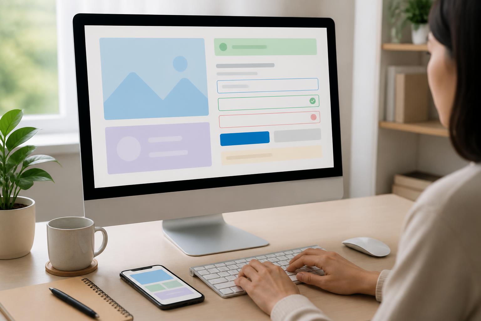
A website is considered effective not only because it has an attractive interface, fast loading speeds, or displays well across multiple screen sizes. It must also allow diverse groups of users to access information and accomplish their goals without encountering unnecessary obstacles. This is the foundation of accessible website design, an approach that incorporates diversity in abilities, devices, usage contexts, and interaction habits into the process of building digital products.
Accessibility is often mentioned in relation to people who are blind or visually impaired, deaf or hard of hearing, have limited mobility, or experience difficulty understanding content. However, its scope is much broader. Someone using a phone in bright sunlight, someone with an injured hand, someone with an unstable internet connection, or someone unfamiliar with a complex interface can also benefit from similar principles. When a website is designed clearly, with a structured layout and support for multiple interaction methods, the overall experience often becomes better for everyone.
Accessible Design Begins with Understanding Users
A common mistake is to treat accessibility as an additional layer of testing at the end of a project. In that case, teams often fix a few color issues, add attributes to images, or try to make buttons easier to see. These adjustments are valuable, but they are not enough if the content structure, task flows, and organization of functions were built on the assumption that everyone uses the website in the same way.
The right process should begin by identifying the groups of people who will use the website and the barriers that may arise in each situation. An e-commerce website needs to account for users who read product information with a screen reader, users who operate only with a keyboard, users who have difficulty distinguishing colors, and users who need to enlarge content. A service website may need to support customers who are unfamiliar with specialized terminology or who need to complete forms on a small screen. Bringing these scenarios into the research phase helps the design team make appropriate decisions from the outset instead of applying piecemeal fixes after the product has been completed.
Content Structure Must Be Clear Before Appearance Is Considered
Accessibility depends heavily on how content is organized. A page may contain eye-catching images yet still be difficult to use if readers cannot tell which is the main heading, which sections contain related content, and which action needs to be taken. Therefore, a website should have a logical heading hierarchy, paragraphs that are easy enough to read, and groups of information divided according to meaning rather than merely by spacing or background color.
Headings should accurately reflect the content that follows them. Using multiple heading levels solely to create different text sizes can make the page structure confusing when users quickly browse with assistive tools. Lists, data tables, quotations, and instructional sections should also be represented using appropriate structures. When content has semantic order, search engines, screen readers, and ordinary users can all understand it more easily.
Language is also part of design. Overly long sentences, unexplained terminology, or messages that omit the subject increase cognitive load. Buttons such as “Submit,” “See more,” or “Continue” sometimes do not clearly indicate where the action will lead. More specific labels, such as “Submit a consultation request” or “View product specifications,” help users understand the purpose even when they do not read all the surrounding content.
Color, Contrast, and Visual Cues
Color can give a brand personality, group information, and direct attention, but it should not be the only means of communicating meaning. If a form uses only red to mark an invalid field, people who have difficulty distinguishing colors may not recognize the problem. In addition to color, the interface should include text messages, meaningful icons, or other presentation methods so that the status can be recognized more clearly.
The contrast between text and background needs to be considered throughout the design process, including hover, focus, disabled, and display states on devices with different brightness levels. Small text on a heavily patterned background or text placed directly over an image is often difficult to read, especially in unstable lighting conditions. An intermediate background layer, suitable spacing, and adjustable text size can make content more accessible without sacrificing visual identity.
Motion effects should also not be overused to attract attention. Animations that are too fast, play automatically, or repeat continuously can be distracting and uncomfortable for some users. If motion serves to explain something or provide feedback on an action, it should proceed moderately, be stoppable when necessary, and not obscure the main content.
Ensure That the Website Can Be Used with a Keyboard
Many users interact with websites using a mouse or touch, so keyboard usability is often overlooked. However, a website without full keyboard support creates a significant barrier for people with limited mobility or those who use assistive tools. Users need to be able to move through interactive elements, open links, select options, close dialogs, and submit forms without becoming trapped in one location.
The Tab key sequence should correspond to the reading order and content logic. The focused area must have a clear visual indicator rather than being removed through interface rules intended only to create a minimalist appearance. Custom components such as expandable menus, pop-up windows, product filters, and sliders need to be tested in multiple states. If a function works only on mouse hover or when touching a very small area, the website may become difficult to use even for people without disabilities.
Images, Video, and Multimedia Content
Images need appropriate alternative descriptions based on their role on the page. An image containing important information should not be described merely as “product image.” Conversely, decorative images can be handled so that they do not interrupt the reading of the content. A good alternative description is not a list of every visual detail, but a way of conveying the information needed in the specific context of the page.
Videos with dialogue should include captions so that people who cannot hear the audio can still follow the content. For instructional videos containing important visual information, descriptions or transcripts help people who cannot see the screen access the content more fully. Autoplaying audio should also be limited, especially when users have no immediate option to turn it off.
In addition, file sizes and media formats need to be considered so that accessibility does not become a slow-loading experience. Properly optimized images, structured content, and videos with multiple display options will better serve users in different network conditions.
Forms and Error Messages Need to Guide Users
Forms are often where accessibility shortcomings become most apparent. Each input field should have a specific label; placeholder text inside the field should not be used as the only label. When users enter incorrect information or leave a required field blank, the error message should identify which field has a problem, explain the reason, and indicate how to fix it. A vague message such as “Invalid data” does not help users know where to make the correction.
Error checking should occur at an appropriate time. If the system continuously reports errors before users have finished entering information, the experience becomes stressful. If errors are reported only after the entire form is submitted, users may have to search through multiple locations to make corrections. The appropriate approach depends on the type of form, but the general principle is to provide clear feedback, preserve entered data, and avoid making users repeat unnecessary steps.
Success, processing, and failure states also need to be communicated in ways that users can recognize. A change conveyed only through color or through a message that appears too briefly may be missed. Visual feedback, understandable content, and consistent placement reduce uncertainty during interaction.
Incorporate Accessibility into the Testing Process
No automated tool can detect every accessibility issue. Code and interface testing tools are useful for finding common errors, but they cannot replace observing how users perform tasks. A complete testing process should combine automated evaluation, keyboard testing, content zooming, screen reader use, and review across multiple devices.
The team should also test important flows rather than looking only at individual pages. Try finding a product, filling out a contact form, filtering results, logging in, reading an error message, and returning to the previous step. These flows can reveal problems with focus order, button labels, loading states, obscured content, or information that is not fully communicated.
If possible, inviting users with different abilities and interaction methods to participate in testing will provide a practical perspective. Their feedback not only helps identify technical errors but also reveals points that cause fatigue, confusion, or loss of trust. Findings should be documented as specific requirements, categorized by level of impact, and tracked throughout the website’s life cycle.
Accessibility Is a Long-Term Quality Criterion
Accessible website design is not a distinct visual style, nor does it mean making an interface monotonous. When done correctly, it creates a product that is clear, flexible, and less dependent on a single interaction method. Businesses can start with practical steps such as improving heading structure, writing specific button labels, testing keyboard interactions, optimizing forms, and providing suitable descriptions for multimedia content.
More importantly, accessibility needs to be regarded as a quality criterion throughout research, design, development, content editing, and maintenance. Every interface change, new article, or added feature can create new barriers if it is not carefully tested. When the entire team shares responsibility, the website will not only serve more people but also provide a more consistent, understandable, and reliable experience in real-world usage situations.