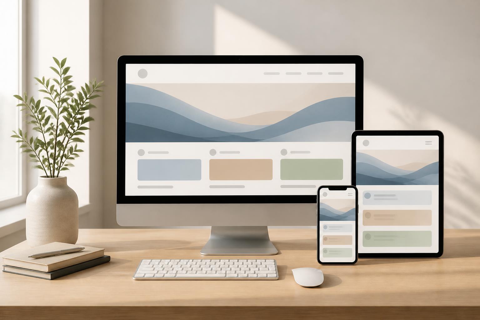



Responsive Design: How Websites Adapt to Every Screen

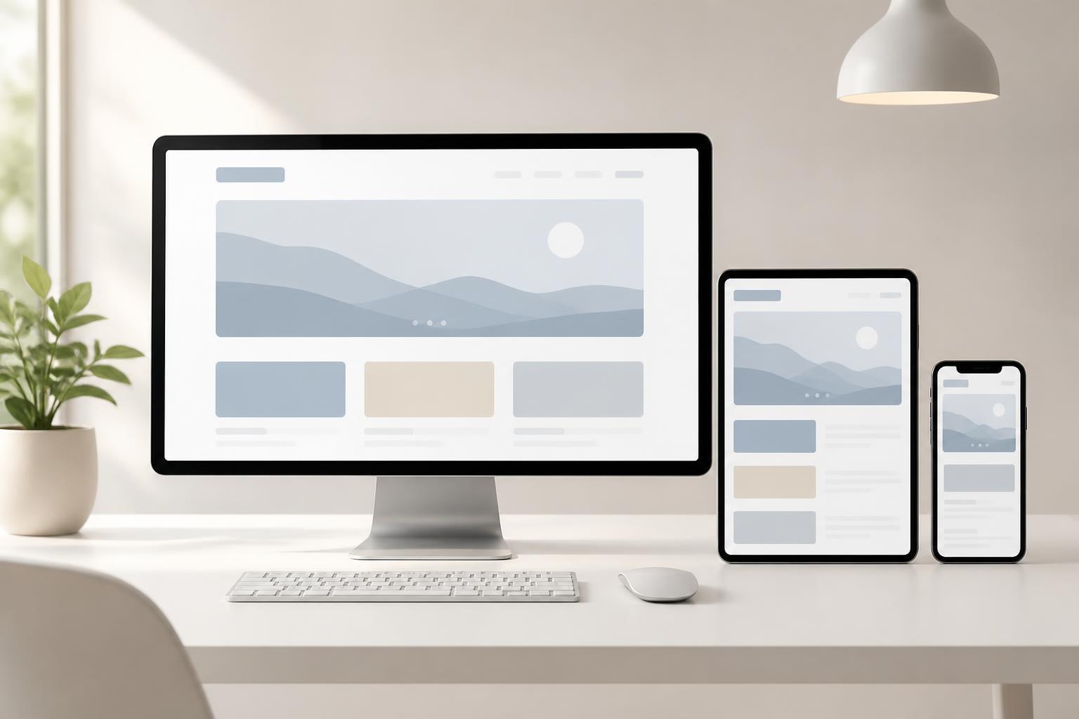
A website may look polished on a computer screen but become difficult to use when opened on a phone. Text that is too small, buttons placed too close together, cropped images, menus that take up all the available space, or the need to scroll horizontally to read the content are common warning signs. As the range of devices used to access websites continues to grow, designing an interface that works with only one screen size is no longer a sustainable choice.
Responsive design addresses this problem by allowing the interface to adjust itself to the display space and interaction method of each device. However, responsive design is not simply about making a website smaller on a phone. It is a process of reconsidering the layout, content order, touch-target sizes, image presentation, and even the important actions users need to perform.
What Is Responsive Design Really?
Responsive design is an approach to building interfaces so that a website can adapt to different screen widths. On a computer, the interface may use multiple columns, a full navigation bar, and wide content areas. When it shifts to a tablet or phone, the columns may stack, the menu may be collapsed, images may change size, and secondary elements may be rearranged according to their priority.
The important point is adaptability, rather than a few fixed size breakpoints. A good design is not tested only on one popular phone model or one specific type of computer monitor. The interface needs to respond appropriately when users change the width of the browser window, rotate the device, zoom in on content, or use different input methods.
For this reason, responsive design should be viewed as an overarching design principle rather than a final adjustment step. If the initial layout is built only for large screens, shrinking it later often leads to many compromises: content is hidden, interactions become roundabout, and important elements no longer have enough space to function.
Why Do Websites Need to Adapt to Multiple Devices?
Today, users may begin a journey on a phone, continue researching on a tablet, and complete a form on a computer. Each device creates a different usage context. Phones are often held in one hand and used for short periods. Computers provide more space for comparing items, reading documents, or completing long forms. A website that does not adapt creates disruption even when the content itself is valuable.
Good display performance across multiple screens also affects how users perceive a brand’s quality. When users have to repeatedly zoom in, zoom out, or scroll horizontally, they may judge the website as unprofessional and inattentive to real-world experience. In contrast, a clear, readable, and easy-to-use interface helps users focus on the product, service, or information the website aims to convey.
Responsive design also helps businesses avoid maintaining multiple separate interface versions for different device groups. A unified platform is generally more convenient for updating content, testing functionality, and maintaining consistency across pages. However, this does not mean every device must display exactly the same thing. Consistency should be reflected in the identity, core content, and usage logic; the arrangement can change to suit each available space.
Components That Need to Be Redesigned
Layout and Content Order
A multi-column layout on a wide screen often needs to become a single column or several stacked sections on a narrow screen. This is not simply a matter of placing content blocks on separate lines. Designers need to determine which information appears first, what can be condensed, and which elements should be moved toward the bottom of the page.
For example, a service page might display an introduction, benefits, process, and contact form side by side on a computer. On a phone, users need to see orientation information and a clear call to action before having to read lengthy explanations. If the content order is not carefully considered, users may have to scroll through too much information before finding the primary action.
Menus and Navigation
A horizontal menu with many items often works well on a wide screen but can take up the entire space on a phone. When collapsing the menu, the important consideration is not just replacing it with an icon. The way the menu opens, the position of its items, the ability to close it, and whether users can understand where they are all need to be considered.
Menus on small screens should prioritize the website’s main sections instead of placing every link in one long list. Less important items can be grouped together, while primary actions such as calling, signing up, or submitting a request should be easy to recognize. If the website has multiple levels of content, those levels must also be presented clearly enough that users do not get lost while navigating.
Text, Images, and Interactive Areas
Text size needs to be adjusted so that content can be read without forcing users to zoom in. However, simply increasing the text size is not enough. Line length, spacing between paragraphs, line height, and contrast also directly affect readability.
Images need to scale within an appropriate range while preserving their proportions and important content. An image that is cropped attractively on a computer may lose its subject when displayed on a phone. Therefore, it is necessary to identify the image’s focal point, choose an appropriate cropping method, and test it at multiple aspect ratios. For images that are purely decorative, their priority can be reduced on small screens so that the main content stands out more.
Buttons, links, and input fields also need enough spacing to prevent accidental actions. On touch devices, users do not have a mouse pointer with which to select each small point precisely. A button may look suitably sized on a computer but become difficult to tap when it appears next to another button on a phone. This is why interactive areas need to be tested through actual use, not just by visual inspection.
Is Mobile-First a Mandatory Choice?
Mobile-first is an approach that begins by designing for small screens and then gradually expands the design for larger screens. This method requires the team to identify core content and actions from the start, because space on a phone is limited. When moving to a wide screen, additional sections can be added without affecting the primary functionality.
Mobile-first is not a mandatory rule for every project. A website designed for professional work on computers may need to prioritize data tables, filters, and complex actions on large screens. Even so, thinking about the experience on small devices early can help identify secondary content, unnecessary actions, and unreasonable organizational approaches.
What should be avoided is confusing mobile-first with removing too much information. Designing for a small screen does not mean making a website rudimentary. The goal is to present information according to priority, allowing users to access what they need first and expand further when necessary.
How to Test a Responsive Interface
Responsive testing should begin with important user flows rather than simply observing the homepage. Identify the tasks users need to complete, such as finding a service, viewing product information, submitting a form, booking an appointment, or making contact. Then carry out these flows at multiple screen sizes to identify points where the experience breaks down.
During testing, attention should be paid to issues that are often overlooked. Does content overflow its container? Do users have to scroll horizontally? Do long headings break the layout? Can the menu be opened and closed easily? Do forms display all labels and error messages? Is the action button pushed too far down? Do images cover important information?
Testing should not be limited to emulators. Real devices make it possible to evaluate how the interface feels in the hand, how it responds to finger interactions, its response speed, and how it operates under ordinary usage conditions. In addition to visual inspection, it is useful to ask someone unfamiliar with the website to perform specific tasks. The errors users encounter often lie in parts of the interface that the team has become accustomed to.
Common Mistakes When Creating Responsive Designs
A common mistake is designing the computer version first and then shrinking all the elements. This approach often preserves the same order, density, and amount of content even though the screen has changed. As a result, phone users have to scroll for too long or search for a small action among many unnecessary elements.
Another mistake is testing only a few familiar screen sizes. An interface may work well at the two extremes but break at intermediate widths. Long headings, data tables, pop-up windows, and forms with many fields often reveal problems in these situations.
Relying too heavily on pop-up windows can also be frustrating on phones. A dialog that occupies nearly the entire screen, is difficult to close, or covers the confirmation button will interrupt the interaction. If content can be placed directly on the page while remaining clear, that is usually the more usable option.
In addition, responsive design should not be treated as the sole responsibility of developers. Content writers need to understand the available display space so they can create suitable headings and paragraphs. Designers need to communicate with business stakeholders to identify important actions. Testers need to simulate real-world usage scenarios. Responsive quality is the result of cooperation among multiple roles.
Responsive Design Is the Foundation of a Consistent Experience
A good responsive website does not try to force every device to display the same interface. It preserves core elements such as the message, identity, important content, and usage guidance, while adjusting the presentation to suit the circumstances. Users may see fewer elements on a phone, but they still need to understand what the website offers and what the next step is.
To achieve this, businesses should incorporate responsive design from the stages of defining objectives, structuring content, and mapping the user journey. When an interface is built with an adaptive mindset, later development and maintenance become clearer. Each change to content, images, or functionality also has a basis for evaluation across multiple screens rather than being checked in only one context.
Responsive design is not a decorative trend, but a way for a website to respect differences in users’ conditions of use. When content is easy to read, actions are easy to perform, and the layout does not create obstacles, the website has a better chance of fulfilling its intended role. Whether the goal is to introduce a brand, provide information, or support sales, the ability to adapt to every screen remains an important part of website design quality.