


Designing Accessible Websites: Why Every User Needs to Be Considered

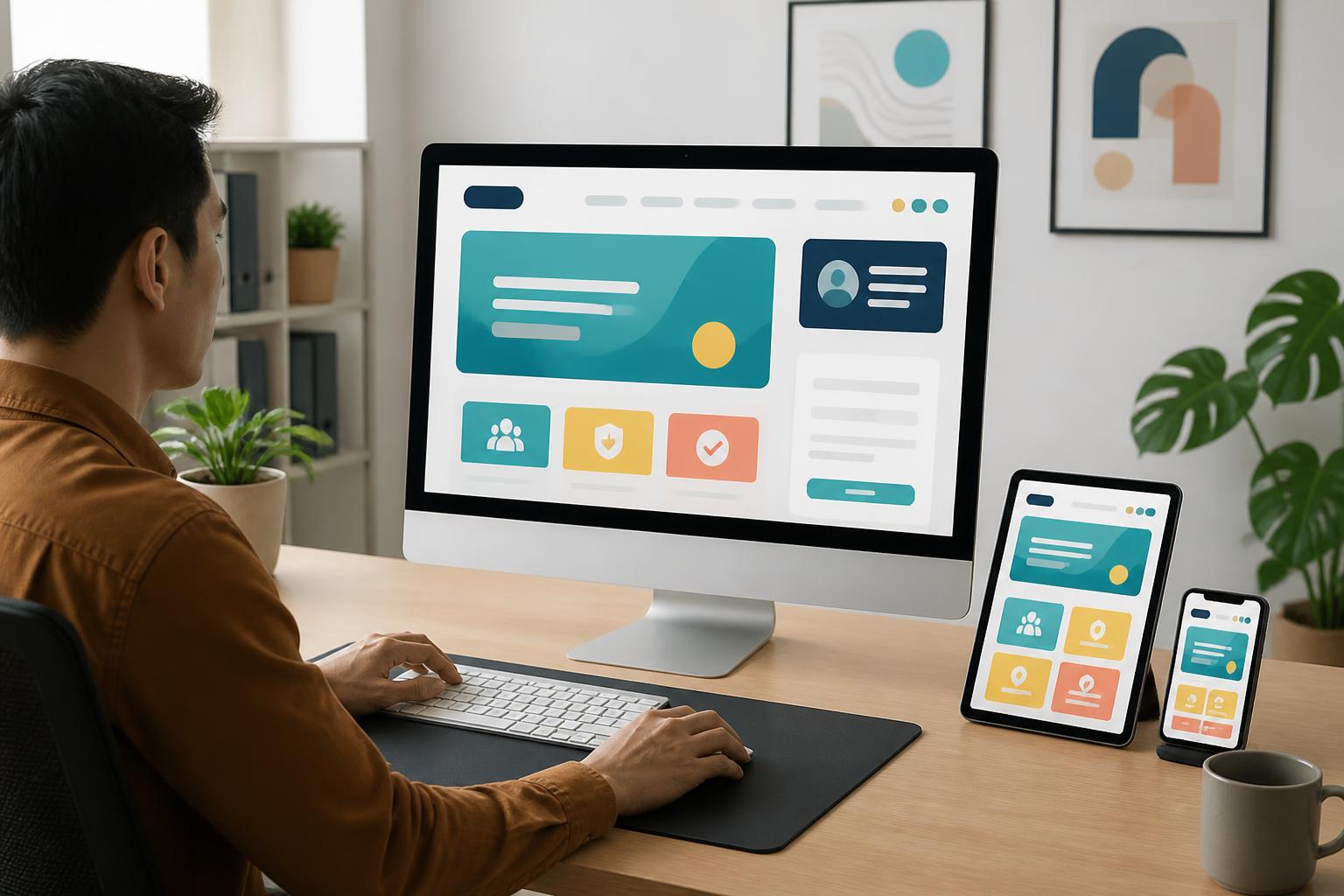
In many website projects, design teams tend to focus first on visual appeal, loading speed, and the ability to display properly across different screen sizes. These factors are very important, but another question still needs to be asked: Is the website easy to use for a wide range of people? Someone with limited vision, someone who uses only a keyboard, someone who has difficulty using touch controls, or someone in a poorly lit environment may all experience a website in very different ways.
Accessible website design, often referred to as accessibility-focused design, is not a layer of features added at the end of a project. It is a way of thinking that enables content, interfaces, and functions to be used by as many people as possible in as many circumstances as possible. When implemented properly, accessibility does not make a website less modern. On the contrary, it often creates a clearer, more coherent, and more convenient experience for all users.
Accessibility Begins with How We View Users
There is no single user group whose abilities, devices, and usage contexts are all the same. Some people access websites with a computer and mouse, some use a phone with one hand, some enlarge content, and some need a screen reader to understand the structure of a page. Even an average customer may temporarily experience difficulties when dealing with glare outdoors, an injured hand, or an unstable connection.
Therefore, accessible design should not be narrowly understood as design intended only for people with disabilities. It is a method for reducing unnecessary barriers when accessing information and completing tasks. Clearly recognizable buttons help older users interact with greater confidence. Well-structured content helps busy people find information more quickly. Forms with specific instructions help reduce errors for anyone, not only those with limited motor abilities.
This perspective also changes how businesses define the quality of a website. An attractive interface that prevents users from finding the form submission button cannot yet be considered complete. A page with numerous effects but no keyboard navigation is also leaving some visitors behind. Quality should be assessed by the ability to accomplish a goal, not just by the initial impression.
Clear Content Structure Is the Foundation
Users do not usually read a website in a straight line from beginning to end. They scan headings, look for keywords, review highlighted sections, and then decide whether to continue. For people who use screen readers, heading structure also helps them understand the main sections of a page and move quickly to the area they need. Therefore, organizing content in a logical hierarchy is an important part of design.
Each page should have one main heading that accurately reflects its subject, followed by subheadings for each group of information. Headings should not be created merely to make text larger or change its color. They need to reflect the relationship between sections of content. An introduction to a service could begin with the main benefits, followed by the process, scope of services, frequently asked questions, and a call to action. This organization helps readers quickly understand what the page is about and what the next step is.
Paragraphs should also be of a reasonable length, use direct wording, and have sufficient spacing. Dense blocks of text make reading more difficult, especially on small screens. Lists can be used when presenting requirements or steps, but the entire article should not be turned into disconnected fragments of information. Good design always requires a balance between quick scanning and content depth.
Color Should Support Information, Not Replace It
Color can create emotion and direct attention, but it should not be the only signal used to communicate meaning. If a form uses only red to indicate an error, people who have difficulty distinguishing colors may not realize where the problem is. A safer approach is to combine color with a written message, an appropriate icon, or a clearly defined border.
The contrast between text and its background should also be considered as early as the color-palette selection stage. Light gray text on a white background may create a refined feel in a design mockup, but it can be difficult to read on a device with low brightness or in a brightly lit environment. Primary text, secondary text, links, and button states need to be distinct enough without undermining the consistency of the interface.
Color should not be checked only on one screen or under one lighting condition. A practical design needs to be evaluated at different brightness levels, sizes, and usage contexts. When important information remains clear even if users cannot fully perceive color, the interface will be able to serve a broader audience.
Navigation and Interactions Need Clear Signals
An accessible website must let users know where they are, what they can do, and whether the action they just performed has produced a result. Navigation bars should use specific names instead of overly general labels. A link such as “Learn more” appearing multiple times on the same page can be confusing if it is not accompanied by context. Link names can describe the destination, such as viewing pricing, learning about a service, or reading registration instructions.
Buttons need to be large enough for convenient use on touchscreens and spaced appropriately from nearby elements. Users should not have to tap precisely within an overly small area to open a menu or submit a form. States for hovering, selection, loading, and disabling should also be displayed consistently. These changes help users recognize the system’s response instead of having to guess whether their action was successful.
For people who use only a keyboard, the order in which they move through the elements on a page must be logical. The currently selected position needs a visible indicator and should not be removed merely to make the interface look minimalist. If users cannot see the navigation cursor, they can easily lose their bearings as they move through menus, links, buttons, and input fields.
Forms Are Where Many Barriers Appear
Registration, ordering, and inquiry forms are often important conversion points on a website. However, they are also areas where users can easily give up if the design is unclear. The label for each field should remain in a stable position and accurately describe the information that needs to be entered. The design should not rely solely on placeholder text inside the input field, because that text may disappear as soon as the user starts typing.
If a field is required, the website needs to communicate that in a way that is easy to recognize. When an error occurs, the message should identify which field has a problem and explain how to fix it, rather than displaying only a generic statement such as “Invalid data.” These instructions should be placed near the relevant field so users do not have to search the entire page.
Forms also need to take into account the amount of information they request. Each additional field creates another step to complete and may become a reason for users to stop. Businesses should determine what data is truly necessary at that point and what information can be requested later. A concise process with clear instructions usually provides a better experience than a long form with no clear purpose.
Images, Videos, and Multimedia Content
Images should have alternative descriptions when they play a role in conveying information. The description does not need to be lengthy, but it should help people who cannot see the image understand its meaningful content. For purely decorative images, appropriate handling prevents screen-reader users from having to process unnecessary information.
Videos with spoken dialogue should have captions so that people who cannot hear the audio can still follow the content. If a video presents instructions visually, accompanying narration or a description can help people who cannot observe the screen understand the main steps. Audio files should also have a text transcript when the information they contain is important to users’ decisions.
Content that plays automatically, moves continuously, or changes too quickly should be used with caution. Effects can make a page more lively, but they can also be distracting or cause discomfort for some people. Users should be able to pause, turn off, or skip moving content when necessary.
Test Accessibility Throughout the Entire Process
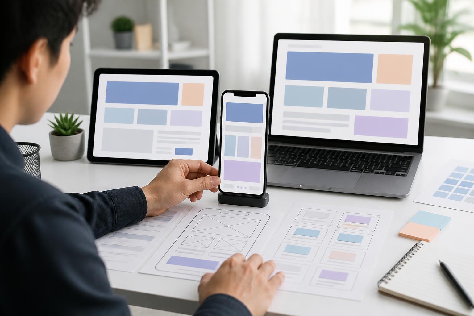
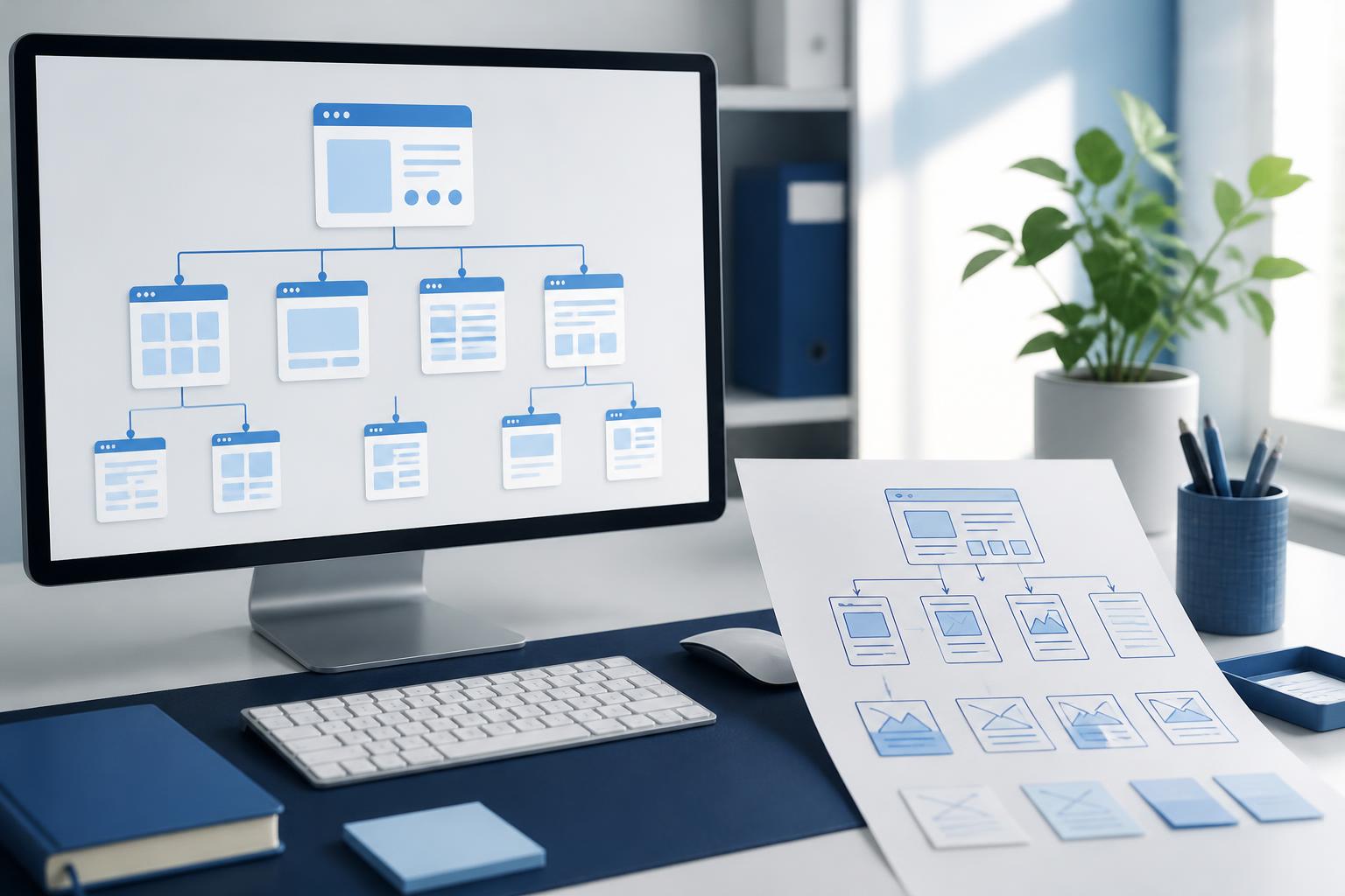
Accessibility should not be tested only after a website is complete. During the wireframing stage, the team can consider the order of content, the names of actions, and the clarity of the user journey. Once there is a design, color, text size, interaction states, and the ability to enlarge content should be checked. During development, testing with a keyboard, a screen reader, and different display sizes can help identify issues that a static design cannot show.
Automated tools can help detect some common errors, but they cannot completely replace practical testing. A tool may identify an image without a description, but it cannot independently assess whether that description is actually useful. A tester may discover that an ordering process technically works, but that users do not understand what to do next. Therefore, feedback from different user groups remains highly valuable.
Businesses should also treat accessibility as a long-term maintenance criterion. Every time a page is added, content is changed, a widget is installed, or the interface is adjusted, new barriers may be created. Including review questions in the publishing process helps ensure that quality does not depend on one individual or a single round of testing.
Benefits Extend Beyond Specific User Groups
Accessible design makes a website easier to understand and use in many everyday situations. Users can read content while on the move, listen to information when it is inconvenient to look at a screen, enlarge text when needed, or navigate quickly with a keyboard. A good structure also helps search engines understand the content, although accessibility and search optimization are not exactly the same concept.
More importantly, this approach demonstrates respect for visitors. A website should not force users to adapt to confusing design decisions when those barriers could have been removed from the outset. When businesses proactively build inclusive experiences, they expand opportunities for people to access information, services, and products more fairly.
Conclusion
Accessible website design is not about adding as many features as possible, nor does it mean sacrificing aesthetics. At its core, it involves creating a clear structure, understandable content, consistent interaction signals, and multiple ways for users to receive information. Decisions such as choosing sufficient color contrast, labeling forms accurately, providing captions, and preserving clear keyboard focus states can all make a significant difference.
When accessibility is considered from the moment goals are defined and the website architecture is built, the cost of later adjustments will decrease, while the overall experience will become more consistent. A good website does more than attract visitors; it also helps them complete what they need to do with as little confusion as possible. That is a meaningful standard for any website design project aimed at delivering long-term value.