Designing Accessible Websites: Expanding Opportunities for All Users

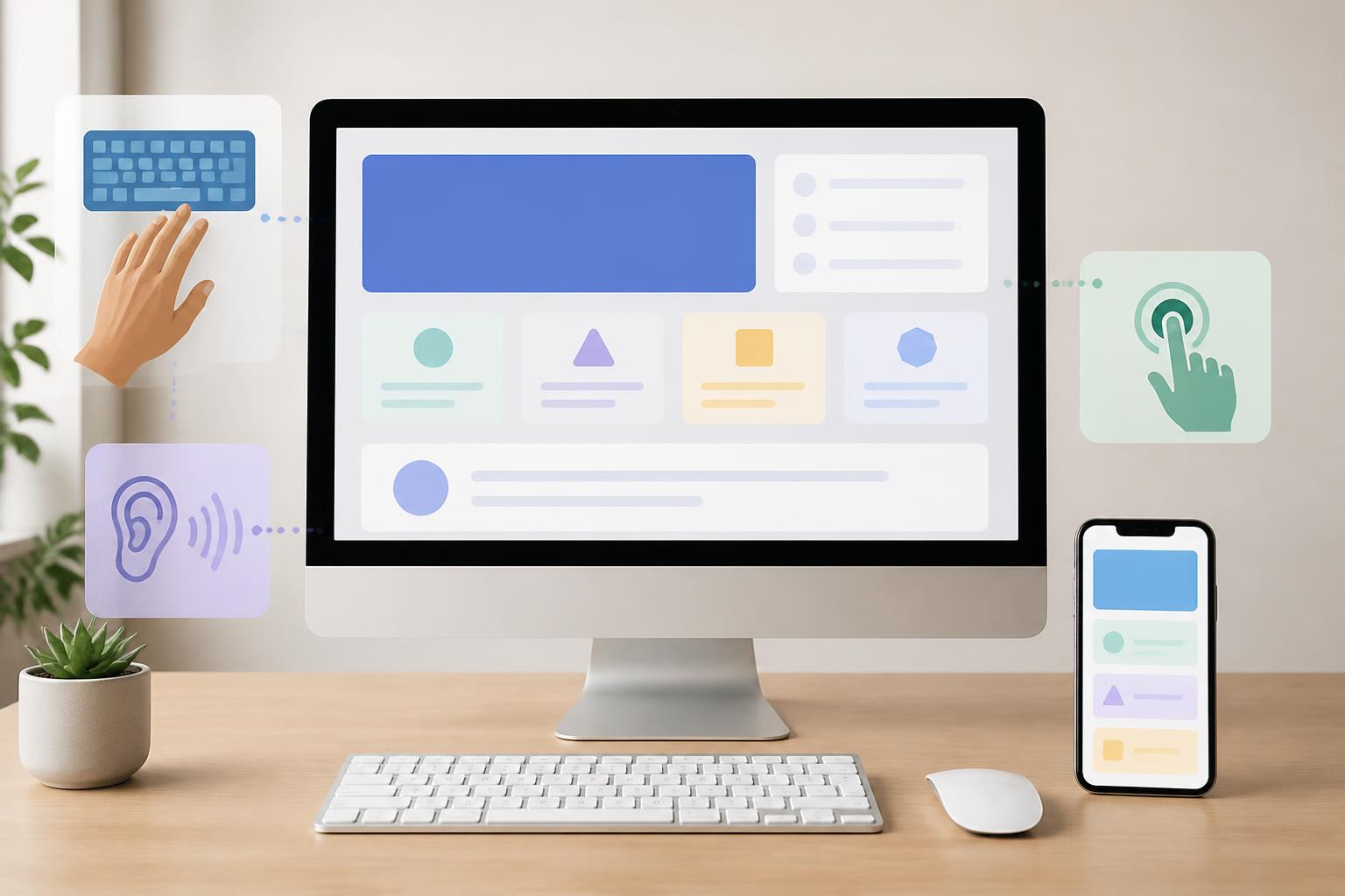
A website can be beautiful, modern, and stable, yet still create barriers for some users. Low-contrast text makes reading difficult for people with impaired vision, videos without captions reduce access to information, and forms that can only be operated with a mouse create difficulties for keyboard users or people using assistive technologies. These problems often do not appear in demonstrations prepared for development teams, but they directly affect the real user experience.
Accessible website design means organizing the interface, content, and interactions so that more people can use a website under different conditions. This may include people with disabilities, older adults, people using a phone outdoors, people with unstable internet connections, or people temporarily experiencing limitations in hearing, vision, or mobility. Accessibility therefore should not be viewed as an additional feature to be added at the end, but as an important criterion from the moment the website’s structure is defined.
Accessibility Begins with How We View Users
When designing a website, teams often imagine a user with a new device, a clear screen, a stable connection, and the ability to interact precisely. In reality, usage contexts are far more diverse. Some people use only a keyboard to move between elements on a page. Some enlarge content to read it more easily. Some need a screen reader to convert text into speech. Others access a website on a phone while moving, with their hands occupied, or in overly bright surroundings.
Accessible design does not mean creating a separate version for each group of people. A better goal is to build a flexible experience in which core content and functionality remain usable when users change devices, input methods, or ways of receiving information. A button with a clear label, a logical heading structure, and forms with specific instructions often benefit everyone, not only people with particular support needs.
Four Foundations of an Accessible Website
Content Must Be Perceivable
Information on a website needs to be presented in ways that users can see, hear, or access through assistive technologies. Meaningful images should have appropriate alternative descriptions, while purely decorative images can be handled so that they do not create noise for screen readers. Alternative descriptions should not become keyword lists; they need to convey the role of the image in its specific context.
Video and audio content also require consideration. Captions help people who are deaf or hard of hearing follow the content, while also being useful when viewers cannot turn on the sound. Transcripts can support searching and reviewing information. For complex graphics, the main content should not be conveyed only through color or imagery, but should also be explained in text.
Color is another important factor. Color should not be used as the sole indicator of a status, error, or selection. For example, an invalid form field should not simply turn red; it should also display a written notification. This approach helps users recognize the problem even if they cannot distinguish colors well or are viewing the screen in unfavorable lighting conditions.
The Interface Must Be Operable
All primary functions should be usable through multiple input methods, especially the keyboard. Users need to clearly identify which element is selected, whether the order of movement between elements is logical, and how to open, close, or dismiss a dialog. The focus state of a button or link should not be removed simply to make the interface look minimal.
Interactive areas also need to be sufficiently clear and easy to select. On touch devices, buttons that are too small or placed too close together can lead to accidental actions. Links should have names that describe their destinations instead of repeating generic phrases such as “learn more” in multiple places. When users skim with a screen reader or keyboard, specific link names help them understand where they will go before activating the link.
Automatic animations, pop-up windows, and continuously updating content need to be used carefully. An automatically changing banner can make it difficult for users to concentrate. A dialog that appears without a clear signal can cause them to lose their bearings. If motion serves an illustrative purpose, the website should provide a way to reduce or disable the effects when users do not want to use them.
Information Must Be Understandable
Accessibility is not only related to the interface; it is also reflected in the way content is written. Headings should accurately reflect the content below them, paragraphs should focus on one main idea, and instructions should clearly state what users need to do. Messages such as “An error occurred” are often not useful enough if they do not indicate which field needs to be corrected and how to fix it.
Forms are a common source of barriers. Each field should have a persistent label, rather than relying only on placeholder text inside the input box. Instructions about formatting, required fields, and valid conditions should appear before or precisely when the user needs them. When a form submission is unsuccessful, entered data should be retained whenever possible so that users do not have to start over.
Clear language also reduces cognitive load. Websites selling products or services, or presenting specialized content, may still need to use essential terminology, but they should explain terms that are unfamiliar to general readers. A consistent structure, appropriate spacing, and consistent naming across pages help users predict how the website works.
Content Needs to Work Across Different Environments
A website should function reliably across common screen sizes, browsers, and interaction methods. When users enlarge text, the layout should not obscure content or cause important information to disappear. When they rotate the screen or switch to a narrow window, the main elements should continue to be visible and usable.
Compatibility also relates to well-structured HTML and meaningful names. Headings, lists, tables, buttons, and links should be marked up according to their proper roles rather than merely simulated with presentation tags. This allows assistive technologies to understand the page structure and convey information more appropriately.
Integrating Accessibility into the Design Process
A common mistake is to check accessibility only after the interface has been completed. At that stage, changing the structure, interaction flow, or interactive components can take considerable time. Instead, the project team should incorporate accessibility questions at every step, from user research and wireframing to visual design, development, and testing.
During the content stage, the team needs to determine which information must be conveyed in text, which images need descriptions, and how users will receive error notifications. During the design stage, it should check contrast, focus states, the size of interactive areas, and the layout when content is enlarged. During development, it should ensure that the keyboard order, HTML structure, and names of interactive elements correspond appropriately to their actual functions.
Testing should combine multiple methods. Automated tools can detect some issues involving structure, form labels, or contrast, but they cannot fully assess how understandable the content is or whether the interaction flow is logical. Manual testing with a keyboard, browser zoom, muted audio, or a screen reader can reveal problems that routine checks easily overlook.
More importantly, feedback from users with real accessibility needs should be treated as part of the design process. They may identify highly specific obstacles, such as a button whose name is technically correct but difficult to understand in context, or a process that can be completed by keyboard but requires too many unnecessary steps. The goal of testing is not to satisfy a formal checklist, but to ensure that users can complete their tasks.
Benefits That Extend Beyond Specific User Groups
An accessible website generally has a clear content structure, predictable interactions, and transparent notifications. These are also features that improve the experience for users in general. New visitors can find their way more easily, mobile users are less likely to make accidental selections, and administrators can maintain more consistent content.
Accessibility also helps businesses reconsider the points that create obstacles in the customer journey. An overly long form, an unclear call-to-action button, or a vague error message can cause many people to abandon a process, even if they do not belong to a disability group. When design is improved to be more transparent and flexible, a website can serve a broader range of users without relying on piecemeal solutions.
Even so, accessibility should not be treated as an absolute promise based on a few superficial changes. Adding descriptions to some images will not solve the problem if the entire checkout flow cannot be operated with a keyboard. Increasing the font size is also insufficient if the colors, structure, and error messages remain difficult to use. Improvements need to be considered as part of the overall experience and maintained through subsequent updates.
Starting with Practical Priorities
Businesses do not necessarily need to change their entire website all at once. They can begin by making a list of important pages, identifying the tasks users perform most often, and checking the points that directly affect the ability to receive information or complete an action. The homepage, contact page, registration forms, purchasing process, and service pages are often the places that should be reviewed first.
After that, the team can prioritize obvious issues such as missing form labels, keyboard inaccessibility, content conveyed only through color, headings that do not follow a structure, or links that do not describe their destinations. Each change should be retested on different devices and through different methods of use. When accessibility becomes part of internal standards, new projects are less likely to repeat old mistakes.
Accessible website design is a choice aimed at fairness in the digital experience, but it is also an expression of responsible design thinking. A website should not only attract users during the first few seconds; it must also help them read, understand, interact, and complete their goals as independently as possible. By starting with people’s diverse needs, businesses can build products that are more sustainable, clearer, and more useful across a wide range of usage situations.