


Mobile-First Website Design: Starting with Small Screens to Create Better Experiences


Phones have become the first point of contact between many users and a website. They may access a site while waiting for a bus, look up information while in a store, view a product from a shared link, or submit a form immediately after a need arises. In such situations, an interface built primarily for large screens and then scaled down for phones often reveals many limitations: text is difficult to read, buttons are too small, important content is pushed too far down, and actions that should be simple become time-consuming.
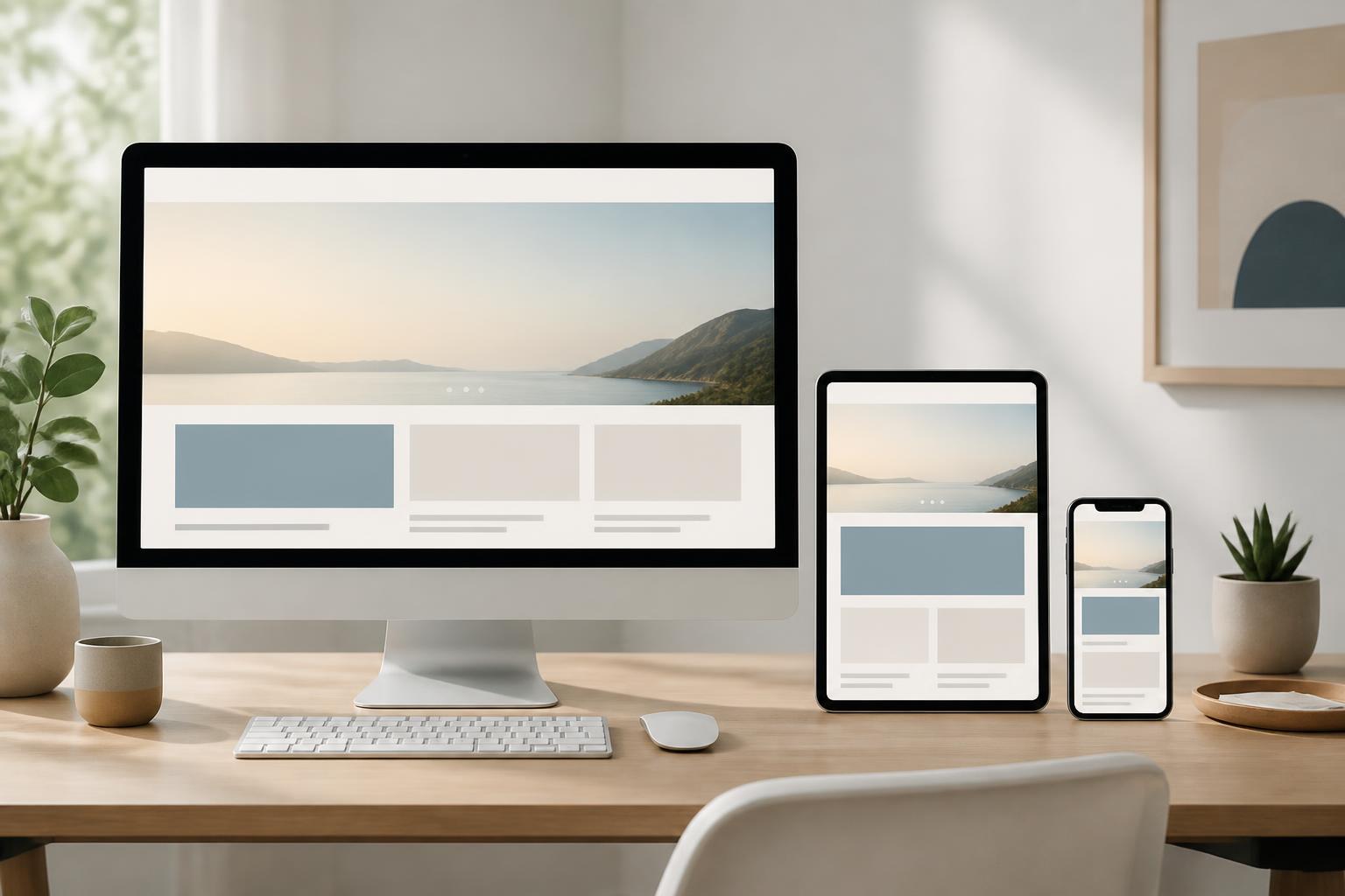
Mobile-first design addresses this problem by starting with small screens before expanding to tablets and desktop screens. This approach does not mean that the website serves phone users exclusively. On the contrary, it forces the design team to identify what is truly necessary, organize content by priority, and build an experience around core needs instead of filling space with decorative elements.
How Is Mobile-First Different from Making a Responsive Website?
Responsive design is the ability of an interface to adapt to multiple screen sizes. A responsive website can change the number of columns, image sizes, spacing, and the way elements are displayed as the viewport changes. This is an important technical requirement for modern websites, but responsive does not automatically mean mobile-first.
In a desktop-first process, the design team typically creates a layout for large screens and then finds ways to fit the elements into a narrower space. Content that originally sat side by side may be stacked vertically, a long navigation bar may become a collapsed menu, and wide information tables may overflow the screen. The result may still “scale” technically but may not necessarily be convenient in practice.
With mobile-first, initial decisions are made based on the constraints of small screens. Designers must choose priority content, identify the primary action, control form length, and consider how users interact with their fingers. When expanding to larger screens, the additional space is used to improve readability and navigation rather than becoming a reason to add too many more elements to the page.
Start with Needs Rather Than Device Size
A common mistake is to view mobile-first as a list of screen sizes that need to be supported. Remembering specific device breakpoints can be useful during testing, but they should not be the only starting point. More important is understanding what users are trying to accomplish and in what circumstances.
An e-commerce website may need to prioritize product search, category filtering, price viewing, delivery-fee checking, and starting the purchasing process. A service website may focus on information about capabilities, service coverage, contact methods, or appointment booking. A corporate website focused on recruitment, meanwhile, needs to make open positions, application requirements, and instructions for submitting applications easy to access. Different goals will lead to different content orders and ways of organizing actions, even if everything is displayed on the same type of phone.
Before drawing the interface, the team should make a list of users’ most important tasks. For each task, they need to answer several questions: Where does the user start? What information do they need to make a decision? Which actions could cause confusion? Which step is most likely to make them give up? This analysis helps turn mobile-first into a goal-based design method rather than merely a CSS convention.
Prioritizing Content on Small Screens
Phone screens are not suited to presenting all information at once. Users typically scroll vertically and see only a small portion of the page at any given time. Therefore, the top of the page needs to clearly explain what the website offers, what users can do next, and why they should continue exploring.
The order of the content should reflect its level of importance and should not depend on the habit of placing every piece of information in one large block at the top of the page. A short heading, a sufficient description, and a clear call-to-action button are often more useful than a long introduction. Key benefits can be presented in short sections, while in-depth information can be placed in the appropriate section or revealed when users need it.
Prioritizing content does not mean cutting things out arbitrarily. Information related to pricing, terms of use, privacy, processing times, or return policies still needs to be easy to find. The issue lies in how it is organized and presented. Content can be divided into clear groups, headings can accurately describe its substance, and users can be spared from reading through too many irrelevant sections before finding an answer.
Designing Actions for Fingers
On touchscreen devices, users do not use a mouse pointer to position themselves precisely on individual pixels. They tap, swipe, and drag with their fingers, sometimes while moving or in unfavorable lighting conditions. Therefore, interactive elements need sufficiently recognizable touch areas and reasonable spacing to reduce accidental taps.
The primary button should be clearly distinguished from secondary links, especially in areas with multiple actions. Buttons placed too close together make interaction difficult, while labels that are too short, such as “Submit” or “Next,” may not indicate what will happen next. More specific labels such as “Submit a Consultation Request” or “View Delivery Information” help reduce hesitation and create clear expectations.
Forms on phones also need to be designed with restraint. They should request only the data truly needed for the current step. Input fields need clear labels, keyboard types appropriate to the data, and error messages placed near the area that needs correction. If a form is long, it can be divided into steps with headings and let users know where they are in the process. Forcing users to re-enter information because of a minor error makes the experience much more burdensome than it is on a large screen.
Expanding the Interface from Small to Large
After defining the basic layout for small screens, the team can expand the design by adding space intentionally. When the viewport is wider, content can be divided into multiple columns, menus can be displayed directly, and secondary areas can appear beside the main content. However, each change should serve readability or task completion rather than merely making the interface look fuller.
Expansion should be based on breakpoints determined by the content. If a heading wraps in a way that makes it difficult to read or a group of buttons no longer has enough spacing, that may be a sign that the layout needs to change. Design should not be based only on a list of common devices, because websites are viewed on many types of screens and in many different modes. A flexible layout system will be more sustainable than fixing the interface for a few specific sizes.
On large screens, empty space also needs to be used carefully. Content that stretches too wide reduces readability, while columns that are too narrow force readers to wrap lines constantly. The reading width, font size, line height, and spacing between sections should be adjusted together to create a natural reading rhythm.
Performance Is Part of the Mobile-First Experience
A beautiful design that loads slowly is still a poor experience. Mobile devices may use unstable connections, have limited processing power, or need to conserve battery capacity. Large images, unnecessary code libraries, dense effects, and elements that load even before they appear in the viewport can all increase waiting time.
From the design stage onward, the size and role of each visual asset should be identified. Images need to be prepared for their appropriate display dimensions, use optimized formats, and should not rely on one overly large file for every placement. Motion effects should be used only when they support orientation or provide feedback for an action. If an effect slows down the main content, it is no longer an interface priority.
Performance is also related to how content loads. The information users need to see first should be prioritized, while elements lower on the page can load when needed. However, delaying content should not cause it to shift position continuously while the page is loading, as this can easily lead to accidental actions. Design and development need to work together to balance speed, stability, and content completeness.
Testing in Real-World Usage Contexts
Mobile-first cannot be evaluated simply by shrinking a browser window on a computer. Testing should be conducted on real devices or in an appropriate simulated environment, using different input methods and connection conditions. Notable situations include opening the website from an external link, returning to the page after switching applications, entering data with a virtual keyboard, and using the website with the screen in portrait mode.
Testers need to observe not only whether the page displays correctly but also how easy each step is to understand. Can users recognize the primary button? Do they know whether an element is loading or has been selected? Do error messages help them fix the problem? When they rotate the screen or return from another page, is the information they entered still there? These questions often uncover problems that static interface checks cannot reveal.
Errors should be recorded according to their impact on tasks. A gap that is not perfectly balanced may be acceptable in the early stages, but an unresponsive payment button or a required field that is not clearly marked needs to be addressed first. This prioritization helps the project focus on usability quality rather than simply refining surface-level details.
Mobile-First Needs to Be Maintained After the Website Is Published
The interface does not end when the website is handed over. New content, new campaigns, tracking tools, and business requirements can gradually make a page cumbersome or unbalanced. A promotional block added to the top of the page, a form with many additional fields, or an unoptimized image can all degrade the phone experience.
Businesses should maintain a regular review process for important pages. They can begin by monitoring high-value tasks, checking the steps users commonly abandon, and reviewing pages on small screens after every major change. When the content, marketing, and development teams all understand the mobile-first prioritization principle, protecting the quality of the experience becomes a shared responsibility rather than one that belongs only to the designer.
Mobile-first design is not a trend intended to eliminate the desktop experience. It is a method that helps websites begin with what is essential, respect the context of use, and expand the interface based on real needs. When content is organized clearly, actions are easy enough to perform, performance is considered early, and testing takes place continuously, the website will have a stronger foundation across all screens.