


Designing Accessible Websites: Expanding the Experience for Every User

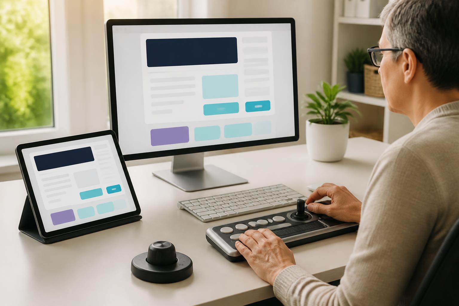
A website with a beautiful interface is not necessarily easy to use. Visitors may struggle to read text that is too small, distinguish buttons using only color, navigate with a keyboard, or listen to content through assistive tools. These obstacles often do not appear during the design process if the team tests the website on only one device and with only one method of interaction.
Accessible website design, or design oriented toward accessibility, asks a broader question: can people with different abilities, devices, and circumstances receive information and accomplish their goals on the website? This is not an additional layer of decoration added at the end of a project. It is a way of thinking that needs to be incorporated from the moment the content structure is built and colors are selected, through interface design, testing, and operation.
What Is Website Accessibility?
Website accessibility is the extent to which a website can be used by a wide range of users, including people with limitations related to vision, hearing, mobility, or cognition. The concept also concerns situations that are very common in digital life: users accessing a site on a phone in bright light, using a slow network, dealing with an injured hand, unable to turn on sound, or doing several things at once.
Therefore, accessible design does not mean creating a separate version for a small group. A form with clear labels is useful to screen-reader users, but it also helps anyone quickly understand what they need to enter. Good contrast supports people with limited vision while also making content easier to read when the screen is affected by glare. Buttons that are large enough benefit people who have difficulty with control, but they are also more convenient on touchscreens.
This approach takes the quality of the experience beyond subjective impressions. Instead of asking only whether the interface looks modern, the team needs to consider whether the website is easy to perceive, operate, understand, and use reliably through different access methods.
Start with Content and Structure
One reason websites are difficult to access is disorganized content structure. When headings are created only by increasing the font size or applying bold formatting, readers can still see the hierarchy, but assistive tools have difficulty identifying the relationship between sections. Using the correct H1, H2, and H3 levels gives the page a clearer order and helps users quickly move to the section they are interested in.
Content should also be divided into meaningful paragraphs, use direct language, and avoid placing too much information in a single block of text. Links should accurately describe where they lead instead of repeatedly using vague phrases such as “learn more.” When users listen to a list of links or navigate with a keyboard, specific link names help them make decisions more quickly.
Images need appropriate alternative text based on their role on the page. If an image conveys information, the alternative text should briefly express the important content. If an image is purely decorative and adds no meaning, it can be marked so assistive tools can skip it. Filling in alternative text mechanically—for example, by repeating the file name or providing an unnecessarily long description—does not improve the experience of receiving the content.
Do Not Use Color as the Only Signal
Color plays an important role in brand recognition and interface organization, but it should not be the only way to communicate a state. A form that signals an error by changing its border to red may not be clear enough for people who have difficulty distinguishing colors. A better approach is to combine color with a text message, a meaningful icon, and a clearly noticeable display position.
Similarly, links within paragraphs should not differ from the surrounding content only by color if that difference is too difficult to notice. The states of buttons, input fields, and system messages should also be conveyed through multiple signals, such as a color change combined with a border, icon, or descriptive content. The goal is not to eliminate color, but to ensure that users can still understand the interface when they cannot fully perceive the colors.
The contrast between text and its background needs to be considered from the stage of building the design system. Choices that look refined on a design screen may become difficult to read when displayed on another device or in unfavorable lighting conditions. Body text, button text, error messages, and interactive elements all need to be tested—not just large headings.
Design Interactions That Do Not Depend on a Mouse
Many websites are created on the assumption that users always have a mouse or can perform precise touch interactions. This assumption can create difficulties for people who use a keyboard, assistive devices, or alternative input methods. An accessible website should allow users to move through interactive elements in a logical order, identify the currently selected element, and activate actions without using a mouse.
The focus state needs to be clearly visible. If the focus effect is removed entirely to make the interface look more minimalist, keyboard users will not know where they are on the page. This indication may be a border, a background change, or another form that fits the design language, as long as it is easy to notice and does not blend into the background.
The order in which users move through form fields also needs to be logical. Users should move from the label to the input field and then to the related message in a predictable way. Pop-up dialogs must have a mechanism that directs attention to the correct content while also allowing users to close the dialog and return to their previous position without becoming lost on the page.
Forms and Error Messages Should Be Designed as a Conversation
Forms are often where the quality of the experience becomes most apparent. An input field containing only placeholder text can become confusing when the user starts typing because the guidance disappears. Labels should be placed in a stable position and specifically describe the data that needs to be provided. If a field is required, this status should be presented clearly rather than relying only on a small indicator.
When an error occurs, the message should explain where the problem is and how the user can fix it. The statement “Invalid information” is often not helpful enough if it does not specify the required format or which field has a problem. For long forms, the website can display an error summary in an easy-to-notice area while also placing a message near the relevant field. This prevents users from having to scan the entire page to find the cause.
Important changes after a form is submitted also need to be communicated clearly. When a page reloads without any indication of success, users may submit the form repeatedly or assume that the system is not working. Status messages should use easy-to-understand content, be receivable in multiple ways, and not disappear too quickly.
Audio, Video, and Motion Need Alternatives
Multimedia content can make a website more engaging, but it also creates additional barriers if no support options are provided. Videos with dialogue should include captions so that people who cannot hear the audio can still follow the content. If important information appears only in an image or spoken words and is not presented in text form, some users will be unable to fully receive it.
Autoplaying audio can interrupt the experience, especially when users are in public places or using a screen reader. If a website needs to play audio, users should have clear control to stop, pause, or adjust the volume. Motion effects should also be used in moderation. Continuous motion, flashing effects, or changes that happen too quickly can cause discomfort and distract users.
Test Accessibility Throughout the Entire Process
Accessibility should not be tested only after the website is complete. During the planning stage, the team can review page naming, menu structure, and task-completion flows. When designing the interface, it is necessary to check colors, text size, touch targets, and interaction states. During development, testing with a keyboard, enlarging content, and using assistive tools can help identify problems before they spread.
Automated tools can help identify certain issues, such as missing alternative text, an inappropriate heading structure, or contrast problems. However, automated results cannot completely replace real-world use. A button with a technically valid name may still be difficult to understand in a specific context. An interaction flow that produces no errors in a tool may still confuse users. Therefore, manual testing and observing how users complete tasks remain essential.
The team should also test situations that are close to real life, such as using only a keyboard, turning off images, increasing text size, using a small-screen device, or accessing the site with an unstable connection. Each test should be tied to a specific goal, such as finding contact information, signing up for a service, reading an article, or completing a purchase. This approach ensures that issues are evaluated based on their real-world impact rather than solely on a list of errors.
Accessibility Is Part of Website Quality
Accessible website design does not make an interface less modern. On the contrary, it encourages teams to remove unnecessary complexity, communicate more clearly, and build interactions that are predictable. These improvements often benefit all users, from their ability to read content and find information quickly to their confidence when completing a form.
To get started, a business does not necessarily have to change its entire website at once. It can prioritize the most important pages, the flows that generate conversions, or the points where users frequently abandon the process. The team can then create a list of issues, rank them by impact, and incorporate accessibility criteria into the design process, content development, and review before publication.
A good website is not measured only by how it looks when opened on a designer’s screen. Its value also lies in its ability to empower different users to read, understand, and take action. When accessibility becomes a guiding principle throughout the process, the website becomes more sustainable, less dependent on a single device or interaction method, and capable of creating a fairer experience for the online community.