


Accessible Website Design: When a Good Experience Leaves No One Behind


Accessibility Is Not Just a Concern for One Group of Users
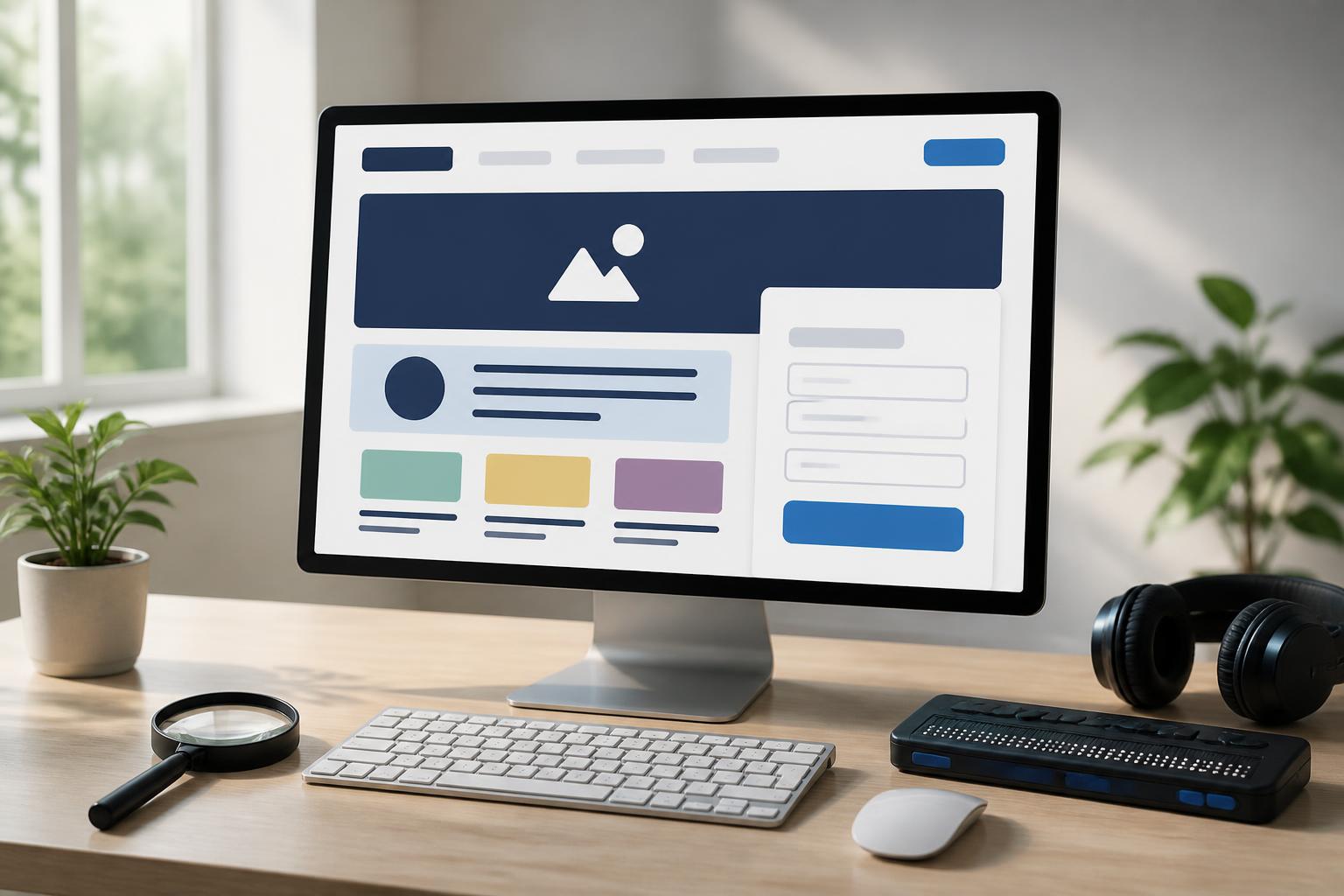
A website is considered effective not only when its interface is attractive or displays well across different screen sizes. It must also help visitors read information, find their way around and complete their goals without encountering unnecessary obstacles. In reality, users have very different abilities, devices, environments and browsing habits. Some people use their phones in brightly lit places, some operate only with a keyboard, some need screen readers to understand content, while others have difficulty distinguishing colors or following movement that is too fast.
Accessible website design is the process of proactively reducing such barriers. The concept is often discussed in the context of supporting people with disabilities, but its benefits are much broader. A clear structure, easy-to-recognize buttons, logically ordered content and usable forms can improve the experience for most visitors. When businesses regard accessibility as part of digital product quality, their websites become more user-friendly, consistent and reliable.
Common Barriers in Website Design
The first barrier often lies in the way information is presented. A page may use eye-catching colors but lack sufficient contrast between text and background, making the content difficult to read in many conditions. Text that is too small, overly tight line spacing or text placed over highly detailed images also increases the burden on users. If the meaning of a notification is conveyed only through the color red or blue, people who cannot distinguish colors will have difficulty recognizing the status of the content.
Complex navigation is another problem. Visitors may get lost when a menu contains too many levels, item names are unclear or the positions of components change from one page to another. For keyboard users, a website that does not establish a logical movement order creates an especially frustrating experience. They may have to move through many unrelated elements before reaching the main content or the form submission button.
Multimedia content also needs to be considered. Videos without captions are difficult to access for people who cannot hear audio, while images without alternative text fail to provide enough information to screen reader users. These errors are sometimes difficult to notice during a typical design process because the interface still appears complete when viewed and operated with a mouse. Therefore, accessibility needs to be tested through different methods of use rather than evaluated solely by visual appearance.
Foundational Principles for Building Accessible Websites
Content Structure Must Be Clear
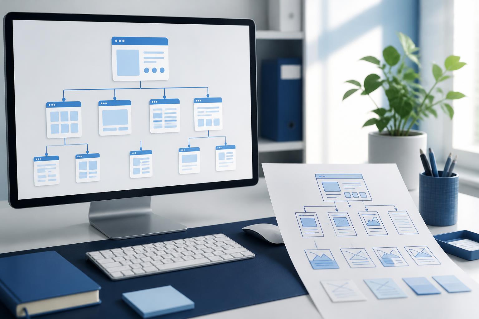
A web page should have a logical information order, beginning with the main heading, followed by major content sections and then smaller subsections. Using the correct heading levels helps readers quickly understand the layout while also helping screen readers explain the relationships between sections. Headings should not be created merely to make text larger; they need to accurately reflect the content presented below them.
Paragraphs should also be divided into reasonably sized blocks, avoiding the concentration of too many ideas in one long section. Lists, information tables and instructional steps need to be presented consistently. When content is well organized, users can quickly scan a page to find the relevant section without having to read everything from beginning to end.
Every Important Function Needs a Clear Way to Be Used
Buttons, links and forms are the components that directly lead users to take action. Button labels should describe a specific outcome instead of using overly general phrases such as “Click here” or “Learn more” in every situation. A label such as “Submit a consultation request” helps users understand much more clearly than a button labeled simply “Submit.”
Users also need to know which component is currently selected or receiving input. The focus state of buttons and links should not be removed merely to create a minimalist interface. If a pop-up window appears, the website needs to indicate how to close it, how to move within it and where the user will be returned after it closes. These details make a major difference for people who do not use a mouse or who use assistive technology.
Do Not Rely Entirely on Color
Color can create emphasis and help group information, but it should not be the only signal used to convey meaning. An error state in a form should be accompanied by a text notification placed near the relevant field. Links within paragraphs need an appropriate identifying feature, such as a difference in typeface or presentation, rather than merely a change in color.
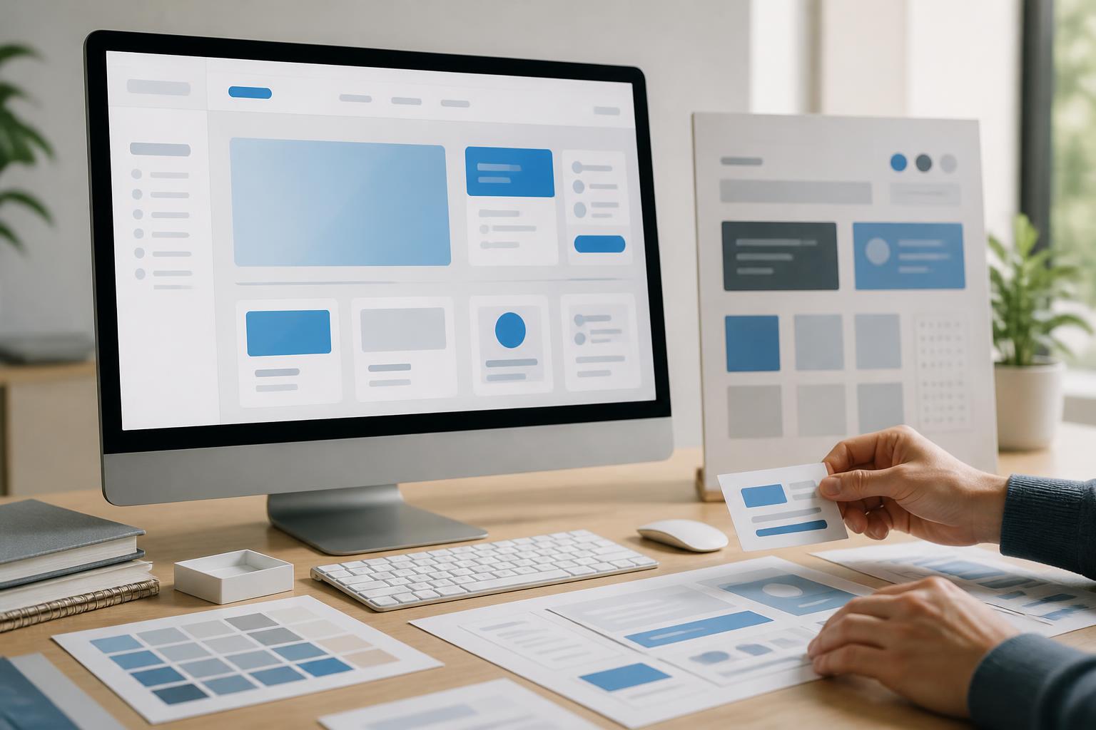
Contrast should also be considered from the stage when the interface system is first built. A color palette that looks attractive in a design may no longer be easy to read when placed against different backgrounds. Checking colors with specialized tools is only a supporting step; practical evaluation on multiple devices and in various lighting conditions remains essential.
Images, Videos and Dynamic Content Need to Be Handled Deliberately
Images on a website do not serve only a decorative role. When an image conveys information, its alternative text needs to accurately describe the image’s content or function. If an image is intended only to create atmosphere and adds no information, it should be handled in a way that prevents screen readers from reading unnecessary descriptions. The goal of alternative text is not to describe every visual detail, but to convey the necessary meaning within the context of the page.
Videos should have captions synchronized with the spoken content. If a video contains important information that appears only through visuals or on-screen actions, an additional description can help users receive the information more fully. Motion effects should also be used in moderation. Automatic, high-speed or continuously repeating motion can be distracting and may make some people uncomfortable. Users should have a way to pause or turn off unnecessary moving content.
Forms and Conversion Processes Must Be Easy to Understand
Registration, ordering, contact and payment forms are often where users decide whether to continue. Each input field needs a clear label associated with the correct field. Helper text can explain the desired format, but it should not replace the label because helper text often disappears when users begin typing.
When an error occurs, the notification needs to clearly explain where the problem is and how the user can fix it. The message “Invalid data” is usually not helpful enough if it does not indicate which field needs to be checked. For multi-step processes, the website should show users which step they are on, how much remains to be completed and whether the information they have entered has been saved. This transparency helps reduce anxiety, especially when the process requires a large amount of data or takes a long time to complete.
Businesses should also avoid requesting unnecessary information. Every additional field increases the effort required and the likelihood that users will abandon the process. Good design is not only about making a form look better; it also means reviewing the entire process to remove steps that do not create clear value.
Accessibility Needs to Be Tested Early
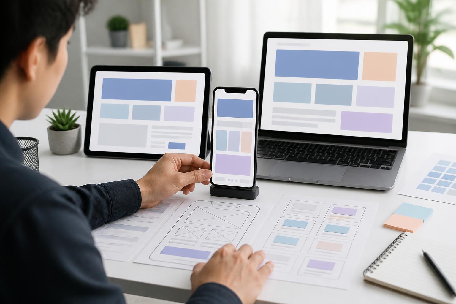
If accessibility is checked only at the final stage, fixing issues may affect the interface structure, content and source code. Therefore, teams should incorporate this criterion from the planning stage. During the sketching stage, they can ask questions about the order of content, navigation and the purpose of each component. When building the interface, they need to check colors, the size of interactive areas, focus states and adaptability to different input methods.
Automated tools can help detect certain issues, such as missing alternative text, structural errors or insufficient contrast. However, tools cannot completely replace manual testing. Teams should try navigating with a keyboard, zooming in on content, turning off images, using a screen reader and testing on devices of different sizes. Observing users as they perform specific tasks also helps uncover difficulties that purely technical testing may overlook.
Accessibility is not a one-time task. Whenever a website adds a feature, changes content, integrates an external tool or launches a new campaign, these criteria need to be reviewed again. Content and design review processes should include an accessibility check so that quality does not deteriorate over time.
Investing in an Open Experience Is Also an Investment in the Brand
An accessible website creates a feeling of being respected. Users do not have to guess which buttons can be pressed, search for information within a cluttered layout or be forced to use only one method of interaction. A clear experience also makes it easier for internal employees to manage content while reducing the number of support requests caused by basic interface errors.
More importantly, accessibility reflects a design mindset focused on people rather than merely on brand imagery. An interface with numerous effects does not necessarily create a good experience, while a simple structure, coherent content and predictable interactions can serve users more sustainably. When implemented from the beginning, these principles usually become part of the design and development process instead of turning into costly corrective work.
Conclusion
Accessible website design begins with specific decisions: organizing content in a logical order, using color responsibly, providing alternative text, building clear forms and ensuring that functions can be used in multiple ways. This does not mean making a website less appealing or limiting creativity. On the contrary, it is a way to create a digital product with clear goals, ease of use and the ability to serve more people.
Businesses can begin by reviewing their most important user journeys, such as finding a product, submitting a contact request, registering an account or completing a payment. Based on the barriers identified, teams can continue improving the structure, content and interface according to priority. A truly professional website does not merely take users to the right place; it also helps them move through the entire journey with independence and confidence.