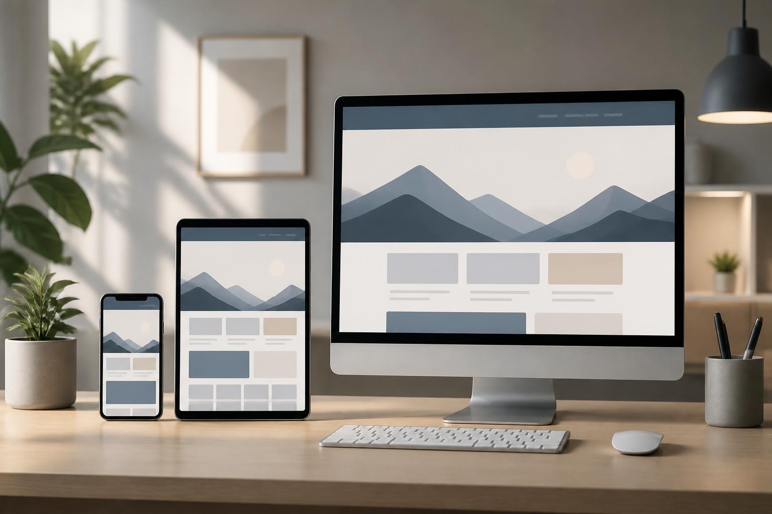



Design system for websites: From interface guidelines to a consistent experience


As a website develops over time, design decisions are often made at different points and by different people. One page uses a dark blue button, while another uses light blue; the same form has different spacing between input fields; headings, content cards, and notifications are presented in many different ways despite serving the same purpose. These small differences may not immediately attract attention during a single visit, but when they accumulate across the entire website, they create a sense of inconsistency and increase operating costs.
A design system is built to solve this problem. It is not merely a color palette or a button library in design software. A complete design system is a collection of principles, components, usage rules, and documentation that helps teams create consistent interfaces across multiple contexts. For a business website, this system also serves as a bridge between brand strategy, user experience, interface design, and the technical development process.
How is a design system different from a brand identity system and a UI library?
A brand identity system usually focuses on how a brand appears to the public, such as its primary colors, typefaces, logo, imagery, and communication tone. These elements are very important, but they are not enough to guide the creation of a website with dozens of page types and multiple interaction flows.
A UI library is usually a collection of interface components that have already been designed or coded, such as buttons, menus, dialogs, content cards, and forms. It helps teams reuse components, but it may lack principles explaining when they should be used, in what context, and how they should be combined.
A design system encompasses both of these layers while also adding an operational perspective. The system may define naming conventions, component states, spacing rules, visual hierarchy, behavior across different devices, displayed content, and quality assurance methods. Therefore, a design system should not be viewed as a static design product. It is a living foundation that is updated as the website, brand, and user needs change.
Core components of a design system for websites
Design principles
Before building specific components, the team needs to agree on several foundational principles. Should the website prioritize clarity or expressiveness? Should the interface create a professional, friendly, or minimalist impression? How quickly should the components help users complete tasks? These questions give later decisions a common basis instead of making them depend entirely on each designer’s personal preferences.
The principles should also describe how to balance consistency and flexibility. Not every page needs to look exactly the same. A brand introduction page may be more image-rich than a checkout page, but both should still share the same language for typography, status colors, action buttons, and spacing rules.
Design tokens
Design tokens are basic values that are named and reused throughout the system. They may include background colors, text colors, font sizes, font weights, spacing, border radii, shadows, and animation durations. Instead of entering a separate color code for each button, the team can define the primary action color in one place and use that convention-based name across multiple components.
This approach offers clear benefits when the brand needs to change. If the primary color is adjusted, the team does not have to manually search for and edit every page. Tokens also help the design files and source code speak the same language, thereby reducing the gap between the design file and the actual product.
Interface components
Components such as buttons, links, input fields, menus, product cards, pricing tables, dialogs, and notifications should be described in full. Each component needs to have a default state, hover state, selected state, loading state, disabled state, and error state when those states are appropriate to its function.
A good component is not only attractive in its ideal state. Users often encounter interfaces with long data, missing content, slow connections, or invalid actions. Therefore, the design system documentation should clearly specify how components respond in real-world situations. This is what enables the system to create a much more stable experience than simply providing screenshots of sample interfaces.
Layout patterns and combination rules
Individual components do not make a complete website. The team needs to add layout patterns for recurring needs such as listing pages, detail pages, article pages, contact pages, service registration pages, or search results pages. A pattern should not rigidly lock down all content; instead, it should indicate which structure is appropriate, which areas are required, and which parts can be changed.
Combination rules help prevent each person from building a layout in their own way. For example, a service detail page may need a title, a value proposition section, a call to action, supporting information, and frequently asked questions. When this structure is standardized, the team can focus more on content quality and business objectives instead of constantly debating the basic arrangement.
Why should a website have a design system?
The first benefit is consistency. Users do not have to relearn how to interact when moving from one page to another. The position of the primary action, the way errors are displayed, and the hierarchy of content become more predictable. This consistency helps reinforce brand credibility, especially for websites that provide services or handle important information.
The second benefit is implementation speed. Once components have been designed, tested, and coded, the team can reuse them instead of starting from a blank page. Speed does not come only from faster drag-and-drop work. More importantly, discussions among content writers, designers, and developers become more specific because everyone refers to the same shared system.
The third benefit is maintainability. Websites often change according to campaigns, products, regulations, or customer feedback. If each page is built in its own way, even a small change can lead to many unexpected errors. A design system helps contain the impact, identify the relevant components, and make updates in a more controlled way.
The system also supports team expansion. New staff can quickly understand the conventions instead of having to reread the entire history of the project’s decisions. External partners also have a clear foundation for creating additional pages without causing the interface to deviate from the shared foundation.
How to build a design system in a practical way
Audit the existing interface
You should not begin by redesigning the entire website. The first step should be to audit the existing pages, components, and variations. The team can make a list of the button styles, form fields, headings, content cards, colors, and spacing currently in use. Duplicate, conflicting, or one-off elements should be marked for evaluation.
The audit helps reveal the true scale of the problem. Some websites may seem to have a consistent style but actually contain many unnecessary variations. Conversely, some differences may stem from legitimate functional needs and should not be removed merely to achieve superficial uniformity.
Prioritize high-impact components
It is not necessary to build the entire system all at once. Start with components that appear frequently and directly influence user actions, such as typography, colors, buttons, links, forms, notifications, and heading structures. Once these foundations are stable, more complex components will be easier to standardize.
Another approach is to select a group of pages with high business value for experimentation. During implementation, the team will discover exceptions and adjust the rules before expanding them across the entire website. A phased approach also reduces the risk of disrupting current operations.
Connect design with source code
A design system delivers its full value only when the design and source code are closely connected. A button in the design software should correspond to a clearly named component in the development system. Rules for states, sizes, and usage should also be reflected in the real product, not exist only in the documentation.
The design and development teams should participate in decisions together from the beginning. If a component is difficult to implement, too costly, or creates unstable behavior, the design should be adjusted instead of waiting until the handoff stage. Continuous collaboration helps limit situations in which the interface in the prototype differs greatly from the published website.
Common mistakes when implementing a design system
The most common mistake is treating a design system as a project for beautifying the interface. When the focus is only on colors and appearance, the system will lack rules for content, behavior, states, and update responsibilities. A useful design system must answer which component should be used, in what circumstances, and who is responsible for maintaining it.
The second mistake is creating too many variations from the outset. Teams sometimes want to accommodate every possible situation, so they build a component with too many options. As a result, the system becomes difficult to understand and test, and allows internal users to use it for the wrong purposes. It is better to start with demonstrated needs and then expand when there is a specific reason.
The third mistake is a lack of governance mechanisms. New components may be added arbitrarily, names may change from person to person, documentation may quickly become outdated, and no one may know which version is recommended. Therefore, businesses need to define how changes are proposed, how their impact is assessed, how versions are recorded, and how relevant teams are notified.
Evaluating the effectiveness of a design system
The effectiveness of a design system is not measured only by the number of components created. Businesses can track the time required to design and develop a type of page, the number of duplicate variations, the number of interface errors found during testing, and the time needed to make a common change. These indicators show whether the system truly makes work simpler or merely creates more documentation.
Feedback from the teams using the system is also very important. If designers and developers frequently have to find ways around the rules, this may be a sign that the system does not accurately reflect real needs. If components are reused but end users still experience inconsistent behavior, the business needs to review the implementation rather than merely updating the documentation.
A good design system does not make every web page look exactly the same. It creates a strong enough foundation for intentional differences to be expressed in the right places. When colors, typography, layouts, components, and interaction rules are organized into a shared language, the website can develop more quickly while still retaining its identity and clarity. This is a long-term investment in digital product quality, collaboration efficiency, and the business’s maintainability.