


Design system for websites: How to create a consistent and scalable design foundation


When a website has only a few pages, a team can usually control its interface through experience and direct communication. But as the number of pages grows, more people become involved in editing, and the business continually adds new features, small differences begin to appear. Colors are no longer consistent, spacing between content blocks is changed arbitrarily, buttons have multiple display styles, and the same notification is presented in different ways. These issues not only make the interface look less polished but also make the design, development, and maintenance processes slower.
A design system is an approach that helps solve this problem. It is not simply a set of rules about colors or a ready-made interface library. A good design system combines design principles, interface components, usage guidelines, and management processes so that team members can work together to create a consistent experience. For corporate websites, e-commerce sites, content platforms, or online services, a design system can become an important foundation for long-term development.
What exactly is a design system?
A design system can be understood as a common language shared by design, content, product development, and website administration teams. This language defines how a website uses colors, typography, icons, layouts, buttons, forms, notifications, and many other components. More importantly, it explains why a component is used in a particular context, when another variation is needed, and how to maintain consistency when new requirements arise.
An interface library usually focuses on components that have already been built. A design system, by contrast, has a broader scope. It may include a design vision, principles for the user experience, content rules, technical standards, component names, and the ways components work together. Therefore, creating a few button styles in design software is not enough to form a complete design system.
A design system is also not a product that is completed and then left unchanged. Websites evolve according to business goals, user behavior, and implementation technologies. Components need to be reviewed, updated, and removed when they are no longer suitable. A useful system is one that can grow alongside the website while still preserving its core principles.
Why does a website need a shared design system?
Maintaining consistency in the experience
Users do not view each web page as a completely separate product. They form expectations based on what they have seen before. If the primary button on one page is blue, rounded, and placed on the right, but on another page it changes color, position, or label, users may spend time guessing what the interface means. Consistency reduces unnecessary thought and makes familiar actions easier to recognize.
This is especially important for websites with many types of content. An introduction page, service page, article page, and account area may serve different purposes, but they still need to share a unified visual language. A design system establishes common rules so that differences between areas serve their intended purposes rather than resulting from each person designing in their own way.
Shortening design and development time
When common components have been defined and tested, the team does not have to start from scratch for every new page. Designers can use agreed-upon patterns, while developers can reuse components that already exist in the codebase. More time can be devoted to solving the actual problems of a page instead of repeating basic decisions about colors, spacing, or button states.
This efficiency does not mean that every page must look exactly the same. A good design system provides building blocks and principles for combining them, while the team can still create layouts suited to each page’s goals. Reusability makes implementation more flexible, as long as new variations are added intentionally and documented in the system.
Reducing maintenance costs
When an interface is built from shared components, updates are also easier to control. For example, if a website changes the appearance of its action buttons, the team can identify the places where that component is being used instead of manually reviewing every page. However, the degree of convenience also depends on how the system is connected between design and source code. A library that exists only in a design file, without corresponding implementation conventions, will have difficulty delivering its full benefits.
Component layers a design system should include
Building a design system should begin with foundational elements and gradually expand to more complex components. This approach helps the team understand the relationship between each layer while avoiding the creation of too many interface patterns before common principles have been established.
Design principles
Design principles answer questions such as what impression the website wants to create, what it prioritizes in the experience, and how to balance brand identity with usability. One website may prioritize clarity, restraint, and the speed at which information is understood; another may need to convey flexibility, strong visual expression, or expertise. These principles give the team a basis for making new decisions when there is not yet a corresponding component in the library.
Design tokens
Design tokens are named basic values used repeatedly in design and development. They may include background colors, text colors, font sizes, corner radii, spacing, line heights, or shadow levels. Rather than recording each value in isolation, tokens help the team understand that value’s role in the system.
For example, a color can be identified not only by its color code but also by a role such as primary action color, warning color, or secondary background color. Role-based naming makes future interface changes easier to control. When the brand updates its primary color, the team can adjust the value at the appropriate layer instead of manually editing every component.
Interface components
This is the most visible part of a design system, including buttons, input fields, menus, content cards, dialogs, navigation bars, tables, filter chips, and notifications. Each component should have a clearly documented name, purpose, structure, states, and usage context.
A button, for example, does not only have a default state. It may be hovered over, selected, disabled, or processing an action. On touch devices, its feedback may also differ from that in a mouse-based environment. If only a static image is recorded, the team can easily overlook important situations. A component’s documentation should explain when to use a primary button, when to use a secondary button, and how the text on the button should describe the action.
Layout and content patterns
Individual components alone do not guarantee a good page. A website also needs combined patterns, such as layouts for service pages, product detail pages, article pages, or contact forms. These patterns help the team envision how to arrange information for a specific goal, but they should not become rigid templates that force all content to look the same.
Alongside layouts, content rules also deserve consideration. Button labels, headings, error messages, and input instructions should use consistent wording. Clear language helps users understand what they need to do while reducing situations in which the same action is referred to by multiple terms across the same website.
A process for building a suitable design system
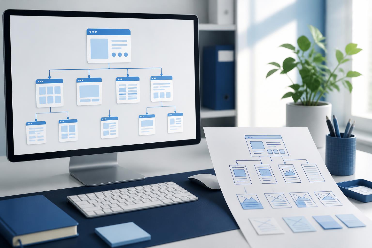
Not every website needs a large system from the outset. A business can begin by auditing its current interface. Gather the key pages, record the components currently in use, and mark duplicate variations. This step often reveals how many button styles the website has, how many ways forms are displayed, or how many spacing values are being used inconsistently.
After the audit, the team should determine its priorities. Components that appear frequently or are directly related to important actions can be standardized first. There is no need to try to address every detail at once, because a system that is too large from the beginning can easily become difficult to maintain and rarely used.
The next stage is defining the foundation and creating components. Designers, developers, and content specialists should be involved early to avoid a situation in which a visual library cannot be implemented in practice. Each component should be compared across the design, source code, and interface at the necessary screen sizes. Differences discovered during this process should be addressed as system-level issues, not merely as errors on an individual page.
Once the system begins to be used, its documentation should be written in a way that makes it easy to consult. Useful documentation does more than show what a component looks like; it also answers when it should be used, when it should not be used, and what limitations it has. Examples using real content are often easier to understand than overly abstract descriptions.
Common mistakes
The first mistake is treating a design system as a project owned solely by the design department. If developers are not involved, the components may be difficult to reuse in source code. If content specialists are not consulted, the system may lack rules for headings, notifications, and real-world language situations.
The next mistake is over-standardization. Not every difference is an inconsistency. A checkout page, an article-reading page, and a brand introduction page may need different ways of organizing information. The goal of a design system is to create clarity in the elements that need to remain stable while preserving room for genuinely different needs.
Focusing only on appearance can also make the system less effective. Colors and typography are important, but error states, feedback after an action, empty states, long data values, and behavior during slow loading also need to be described. Users experience the entire interaction process, not just the interface in its perfect state.
Finally, a design system will quickly become outdated if no one is responsible for maintaining it. A business should define how new components are proposed, how changes are approved, and how people are notified when a component is updated. The process does not need to be complicated, but it must be clear enough for everyone to know where changes should be made and who needs to be informed.
A design system creates long-term value for a website
The value of a design system lies in more than having a better-looking interface. It helps a business establish a repeatable way of working in which experience-related decisions are recorded and shared instead of depending on the memories of a few individuals. When the team changes or the website expands, product knowledge can still be maintained through components and documentation.
A well-built system also enables a website to develop in a controlled manner. The team can experiment with new layouts without breaking the rules that help users find their way around. Groups working in parallel can coordinate more effectively because they rely on the same set of terms and components. Over time, this helps reduce fragmentation in the experience and supports more stable website maintenance.
However, a design system does not replace design thinking. It cannot decide which content is important, what obstacles users are facing, or how a page should persuade them. A system only delivers its full benefits when it is built around real needs, tested through use, and consistently serves a clear website goal.
For websites that are still growing, starting with a manageable scope is often the practical choice. A business can audit common components, agree on several important principles, build a documented library, and establish an update process. Once that foundation proves its value, the design system can gradually expand to cover additional areas and features. In this way, the website not only has a consistent interface in the present but also gains a flexible foundation for future changes.