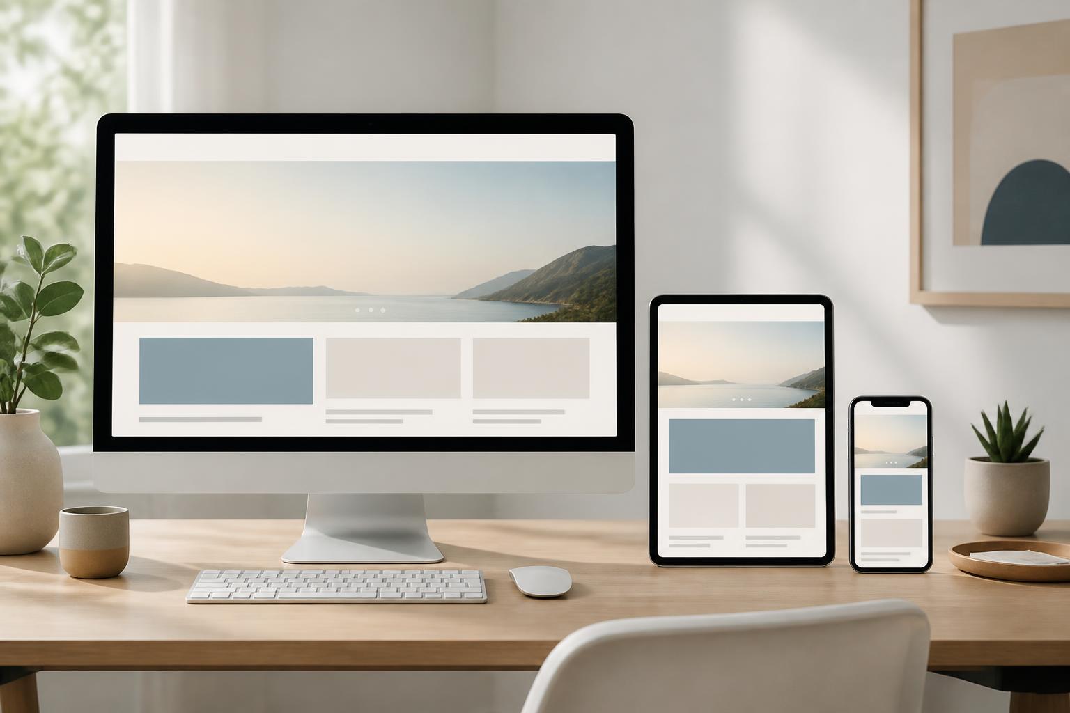



Mobile-First Website Design: Starting with Small Screens to Expand the Experience


Phones have become one of the most familiar touchpoints between users and websites. Visitors can find information, view products, submit consultation requests, or complete an action directly on a small screen. As a result, mobile-first website design is attracting increasing interest from businesses. However, mobile-first does not mean taking a desktop interface and shrinking it to fit a phone screen. It is a different way of thinking about content structure, priority order, touch interactions, and the scalability of the interface.
In a conventional process, design teams may start with large screens because the display area is spacious and makes it easy to arrange multiple components. With mobile-first, the small screen is treated as the starting point. The most important content and functions must be identified first, after which the interface is gradually expanded as more space becomes available. This approach helps websites avoid containing too many components without a clear focus, while also creating a consistent foundation for different screen sizes.
What Does Mobile-First Really Mean?
Mobile-first is a design method in which the experience on mobile devices is built first, rather than being treated as a reduced version of the desktop experience. Designers must answer basic questions from the outset: What does the user need to see first? What is the primary action? Which components can be omitted? What content needs to remain visible, and what content can be placed behind an expansion action?
Phone screens force project teams to make clear choices. A header area cannot contain too many messages, buttons, images, and links at the same time. Limited space also makes issues involving reading order, font size, spacing between components, and data entry methods more noticeable. If these issues are addressed well on small screens, expanding the design for computers generally has a stronger foundation.
This does not mean that a website should serve phone users exclusively. The goal of mobile-first is to create a flexible system in which each screen size receives an appropriate layout. The desktop interface may include additional content columns, whitespace, filters, or supplementary information areas, but expanded components should serve usability goals rather than merely fill space.
Factors to Identify Before Designing
Prioritizing Content and Actions
Before drawing the interface, a business needs to identify the primary objective of each page. An about page may focus on capabilities and contact methods. A product page may prioritize images, specifications, pricing, or a consultation request button. An article page needs to highlight the title, content, related information, and the ability to read continuously. Once the objective is clear, components on the small screen can be arranged according to their importance rather than according to presentation habits.
Priority content should appear early and be easy to recognize. Supporting information can be placed later, in expandable areas, or on related pages. This is not arbitrary content reduction. Each decision should be based on the journey users are expected to take and the questions they need answered at each step.
Building a Flexible Content Structure
A mobile-first website should use a content structure that can adapt. Headings need to be concise while remaining descriptive, paragraphs should be divided into easy-to-read blocks, and lists of information need to follow a logical order. Areas containing large amounts of content can be organized with tabs, filters, accordions, or subpages, but these mechanisms must be clear and must not conceal important information.
Designing the content first also helps reduce dependence on a fixed layout. If each section contains only a few lines of sample text, the interface may look balanced in the design, but quickly break down when real content is inserted. Therefore, it is necessary to test short titles, long titles, multi-line paragraphs, images with different aspect ratios, and cases in which data is missing.
Choosing Interactions Suitable for Touchscreens
On mobile devices, users primarily interact with their fingers. Links, buttons, and selectable areas should be arranged to reduce the likelihood of accidental taps. The spacing between actions that could be confused with one another also needs to be considered, especially in forms, filters, and checkout areas.
Users should not be required to perform overly complex actions just to complete a simple task. If a form requires too many fields, a business can consider dividing it into clear steps or requesting only the information that is truly necessary. Input fields should also use the keyboard type appropriate for the data being entered, such as a numeric keyboard for phone numbers or verification codes.
From Small Screens to Large Interfaces
Once the foundation for mobile devices has been completed, the interface can be expanded according to different space thresholds. Expansion should not be based solely on a few common device sizes. More importantly, the layout should change when content begins to run out of room or when empty space becomes excessive. A single content column can become two columns, the navigation bar can display additional labels, and filters can appear directly instead of being placed inside an expandable window.
This approach allows the design to respond to content. A page with many product cards does not necessarily need to use the same number of columns on every screen. The number of columns can change to maintain a reasonable display size and prevent elements from becoming too small. Similarly, a wide data table may require a different presentation on a phone, such as allowing horizontal scrolling or converting each record into an easy-to-read information block.
The grid system, spacing, typography, and colors also need to be defined consistently. When these rules are established as a system, creating new pages or adjusting the interface becomes less dependent on isolated decisions. Content, design, and development teams can share an understanding of when a component should be used, which variations are permitted, and what limitations should be avoided.
Common Mistakes When Applying Mobile-First
A common mistake is treating mobile-first as simply hiding content on phones. If important information is hidden without clear guidance, users may not know where to find it. Reduction must be accompanied by a reasonable way to access the content, such as a link to view details, a clearly labeled expandable area, or a separate page for in-depth content.
Another mistake is checking the interface at only one screen size. A page may display well on the designer’s device but encounter problems when the width changes, when users increase the text size, or when actual content is longer than expected. Testing should cover multiple widths, orientations, browsers, and usage situations. In addition to visually inspecting the interface, teams need to complete all important actions, such as searching, submitting forms, opening menus, selecting filters, and returning to the previous page.
Businesses should also avoid placing too many interactive components in the header area. A welcome screen with multiple banners, pop-ups, and calls to action can make it difficult for users to determine what to do next. Each component should have a specific purpose and be placed where it does not obstruct the primary task.
Evaluating Effectiveness After Launch
Mobile-first design does not end when the interface is launched on the website. After deployment, teams need to observe how users actually interact with important pages. Signals such as form completion rates, commonly abandoned steps, internal search queries, or feedback from customer service can suggest where improvements are needed. Data should be interpreted together with the objective of each page, because a short visit does not necessarily indicate a problem if users quickly found the information they needed.
Regular reviews also help identify changes that affect the mobile experience. New content, marketing tools, registration forms, or third-party components can make the layout feel cramped, make interactions more difficult, or interrupt the user journey. Therefore, website management processes should include a review on small screens after every significant change.
Conclusion
Mobile-first website design is a way of placing users’ core needs at the center from the earliest stage. This method requires businesses to prioritize content, simplify actions, build flexible components, and test under real-world usage conditions. When implemented correctly, mobile-first does not create a website intended only for phones; it establishes a system that can adapt to many devices and access contexts.
The most important point is not which screen size the team starts with, but how it makes decisions. Each component should answer the questions of what it helps users do, why it appears in that position, and how it will change when the available display space changes. An interface built on clear principles will be easier to expand, easier to maintain, and more likely to create a consistent experience throughout the user’s journey on the website.