


Website Information Architecture: The Foundation for Helping Users Find Exactly What They Need

A website is often judged by its colors, images, typography, or motion effects at first glance. However, visual elements only create an initial impression. When users begin looking for a product, reading service information, or carrying out a specific task, they care much more about whether the website helps them find exactly what they need. If the answer is no, even an attractive interface will struggle to keep them engaged.
That is why information architecture should be regarded as a foundational part of website design. This concept is not limited to navigation menus; it also includes how content is categorized, how sections are named, how relationships between pages are built, and how users are guided through each step. A well-organized information architecture makes a website easier to understand for both visitors and administrators, while also providing a foundation for long-term content development.
What Is Website Information Architecture?
Information architecture is the way content on a website is organized, arranged, and presented so that users can orient themselves, search for information, and accomplish their goals. Those goals may include viewing a price list, finding contact information, comparing products, reading a guide, or submitting a consultation request.
In practice, information architecture is reflected in many familiar components. The main menu shows which groups of content the website contains. Breadcrumbs help users understand where they are within the site structure. Internal links connect related content. A search tool supports direct access to specific information. Category names, page titles, and the order in which items are prioritized also contribute to this system.
The important point is that information architecture does not begin with choosing a ready-made interface template. It begins with understanding whom the website serves, what types of information it provides, and what actions users typically want to take. Until these questions are clarified, designing menus or arranging pages can easily become a matter of subjective judgment.
Why Does Content Structure Have Such a Major Impact on a Website?
Reducing the Feeling of Being Lost
Users do not usually read an entire website in a fixed sequence. They may enter through the homepage, an article, a product page, or a search result. Therefore, every page needs to provide enough cues for them to understand where they are and which direction they can take next. A clear hierarchy reduces the need to go back repeatedly or open numerous pages for comparison.
By contrast, when sections have vague names, categories overlap, or links lead to unrelated content, users have to guess what the website is trying to convey. This process increases hesitation and makes the experience feel burdensome, even when each individual page has been carefully designed.
Supporting Business Goals
Information architecture does not serve only the convenience of visitors. It also affects the website’s ability to guide users toward important actions such as viewing products, signing up, making contact, or requesting a quotation. When content is arranged according to a logical journey, calls to action can appear in the right context instead of being scattered mechanically throughout the site.
For example, a service provider may need to clearly separate information about its solutions, suitable audiences, implementation process, frequently asked questions, and contact details. If everything is crammed onto one long page or scattered without clear connections, potential customers will find it difficult to evaluate the service and understand what to do next.
Creating a Foundation for Expansion
Websites rarely remain the same size from the first day onward. Over time, a business may add products, introduce new services, publish new content, or serve different customer groups. A structure built arbitrarily will quickly become cramped. The menu may contain too many items, categories may overlap in meaning, and there may be no clear place for new pages.
By contrast, when content groups are defined according to clear principles, a website can expand without losing its coherence. This benefit is often overlooked when businesses focus only on getting a website online quickly.
Components to Define Before Design Begins
User Groups and Primary Needs
A website may serve multiple user groups, but not all groups have the same questions. New customers may need to understand what the business offers, while existing customers may be interested in usage instructions or post-purchase support. Job seekers, meanwhile, may be looking for information about the working environment and available positions.
Creating a list of user groups helps the design team avoid assuming that everyone follows the same journey through the website. For each group, the team should identify the information they need, its level of priority, and the desired action after they engage with the content. This provides a basis for deciding which content belongs in the main menu, which should be placed in secondary areas, and which should be linked within individual pages.
Categories and Relationships Between Content
Once user needs have been identified, the content should be inventoried. This list may include pages about the company, products, services, articles, documents, frequently asked questions, contact information, and other support pages. Each item should be considered in terms of its purpose, intended audience, level of importance, and relationship to the remaining items.
A common mistake is to classify content according to the company’s internal structure rather than according to how users search for information. Department names or operating procedures may be familiar to employees, but they may not be easy for customers to understand. A website’s structure should prioritize language and logic that visitors can recognize quickly.
Naming Conventions
Menu and category names should be concise while still being clear. Overly general terms such as “Information,” “Solutions,” or “Other” may leave users unsure of what they contain. However, names that are too long can also make the interface cumbersome and create display difficulties in different areas.
Businesses should standardize their terminology across the entire website. If one area uses “Products,” another area should not switch to “Merchandise Categories” when referring to the same type of content. Consistency helps users form expectations and reduces the time needed to become familiar with the website.
How to Build a Practical Information Architecture
Start with Content Rather Than the Interface
Before deciding where buttons should go or designing visuals, determine what information the website needs to convey. A simple content inventory can record the page name, purpose, user group, current status, and proposed location. For an existing website, this step can also help identify duplicate, outdated, or unused pages.
Not every piece of content needs to be retained as it is. A page containing information similar to another page may be merged with it. Low-value content can be updated, relocated, or removed after careful evaluation. A good structure is usually the result of a selection process, not merely a process of adding more pages.
Draft the Website Structure
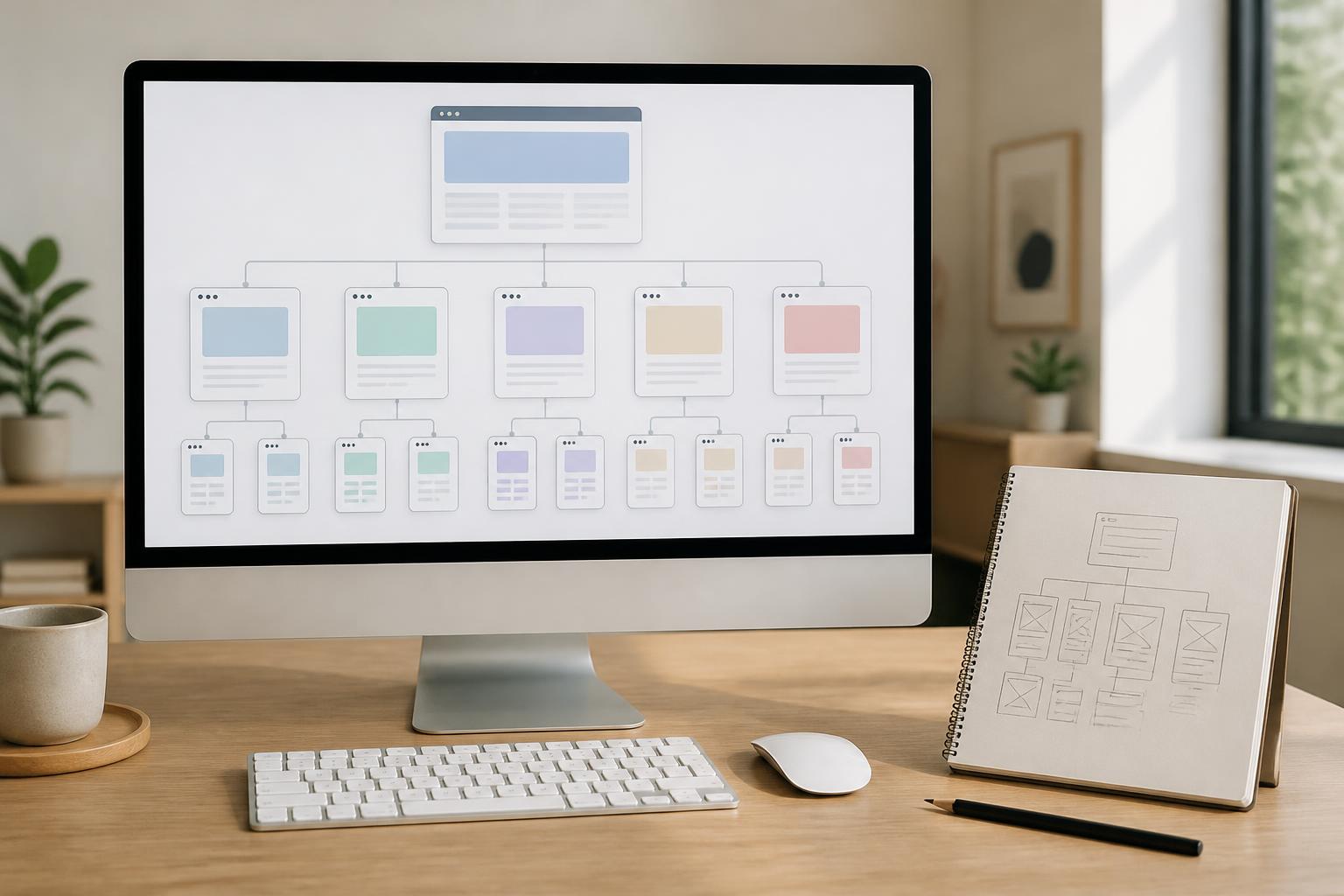
A website map helps visualize the levels of content before moving on to detailed design. The first level usually contains the most important groups. In-depth pages are placed beneath the appropriate groups, while connections between related content should also be shown.
The map does not need to be complicated. A clear draft can already answer important questions: Which page do users enter first? How many ways are there to reach a product page? Where is the instructional content located? Is any page isolated from the rest of the site? These questions help identify problems early, before the costs of interface revisions and development increase.
Test with Specific Scenarios
Rather than simply examining the map, the team should simulate real tasks. For example, a user may need to find the warranty policy, view a service for small businesses, or submit a consultation request. Track how many steps are required, which points require guessing, and where users may be likely to go back.
This testing approach is especially useful when multiple classification methods coexist. A product may be grouped by industry, purpose, price, or intended user. It is not always advisable to place every criterion in the main menu. Some criteria are better suited to filters, a search bar, or contextual links. The choice depends on user priorities and the actual volume of content.
Common Mistakes When Organizing a Website
The first mistake is placing too many items in the main menu. When every piece of content is treated as important, users can no longer tell which options are primary. The menu should focus on high-value, frequently accessed content groups; secondary items can be placed in the footer, an expanded menu, or other more suitable locations.
The second mistake is using internal terminology. A business may be accustomed to the names of its own products or processes, but new visitors may not understand them. If specialized terminology must be used, the website should provide explanations in the title, description, or related content.
Another mistake is creating pages with no clear next destination. Not every page needs to lead users toward a commercial action, but it should help them understand what to read next, which related content to view, or where to seek support when needed. These links should also reflect the correct expectations and avoid generic labels that force users to try several times.
Finally, many websites are designed once and then neglected after launch. Search needs change, content grows, and products may be adjusted. Information architecture should be treated as a system that can be reviewed periodically, not as an immutable blueprint.
Evaluating the Quality of Information Architecture
There is no single structure that suits every website. However, it can be evaluated through several fundamental questions. Can users understand the names of sections without further explanation? Can they identify their current location and return to the previous content group? Are important pages easy to access? Is any piece of content placed in too many categories or in none at all?
In addition to direct feedback, website usage data can also point to potential problems. Repeated search queries that do not lead to suitable content, pages that users frequently leave after visiting, and links that are rarely used all deserve attention. Data does not provide answers on its own, but it helps the team ask the right questions and prioritize what needs to be improved.
Conclusion
Information architecture is the foundation that determines whether a website remains easy to understand and use over the long term. It connects business goals with the actual needs of visitors through the classification of content, naming, navigation, and links between pages. A good structure does not need to be flashy, but it must help users quickly recognize what the website offers, where information is located, and what the next step is.
Businesses should invest in content inventories, identifying user groups, drafting a website map, and testing specific scenarios before going deeply into interface design. When this foundation is clear, decisions about design, content, and website development become more consistent. More importantly, the website can continue to expand without losing the coherence that creates a trustworthy user experience.