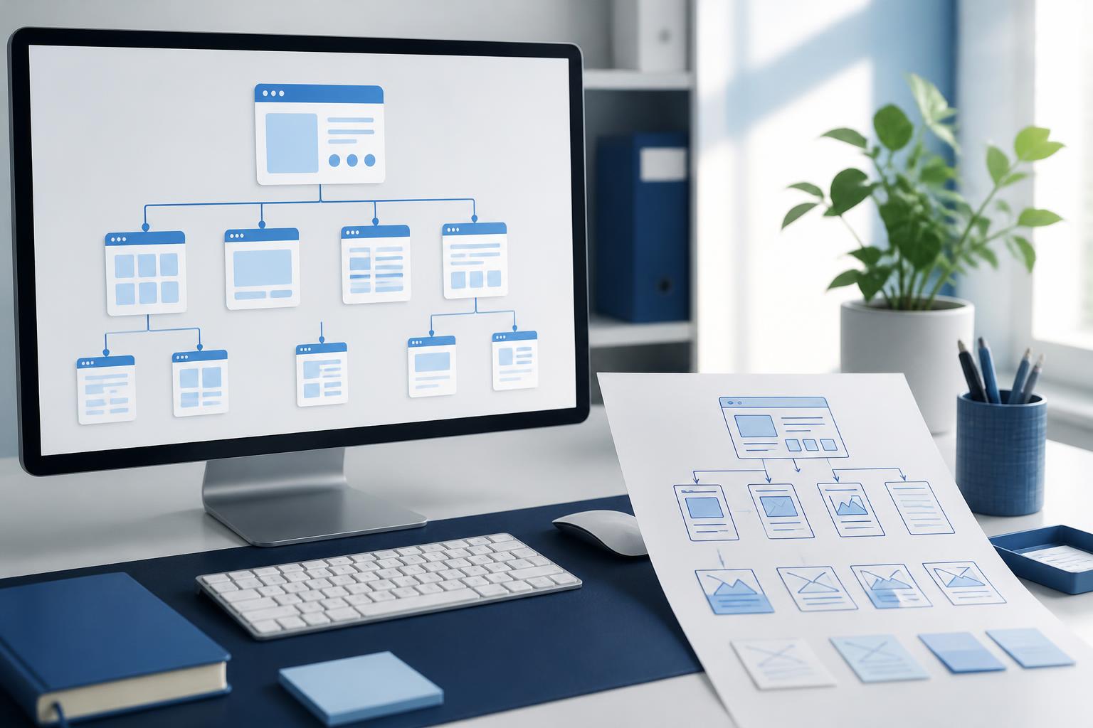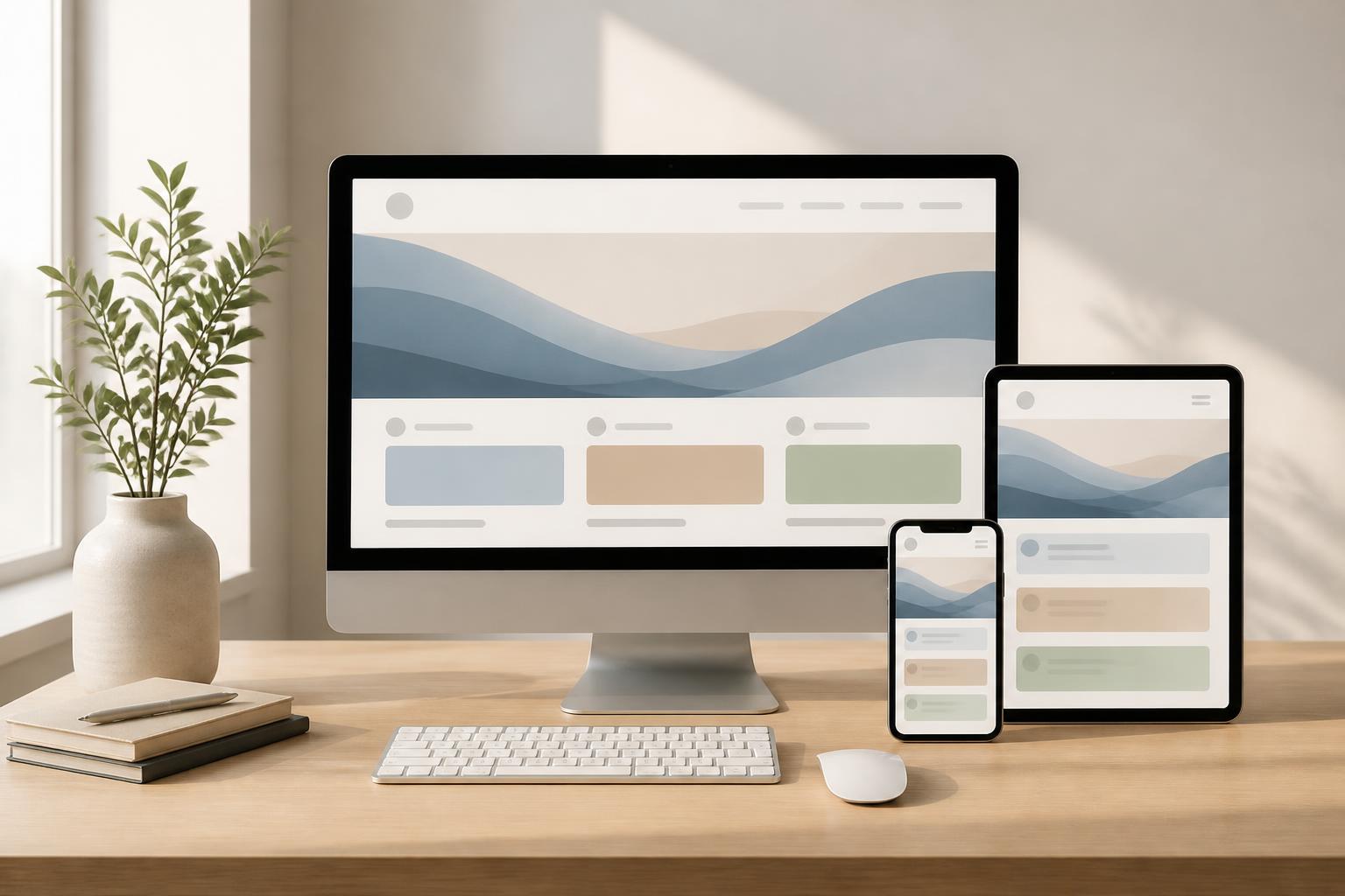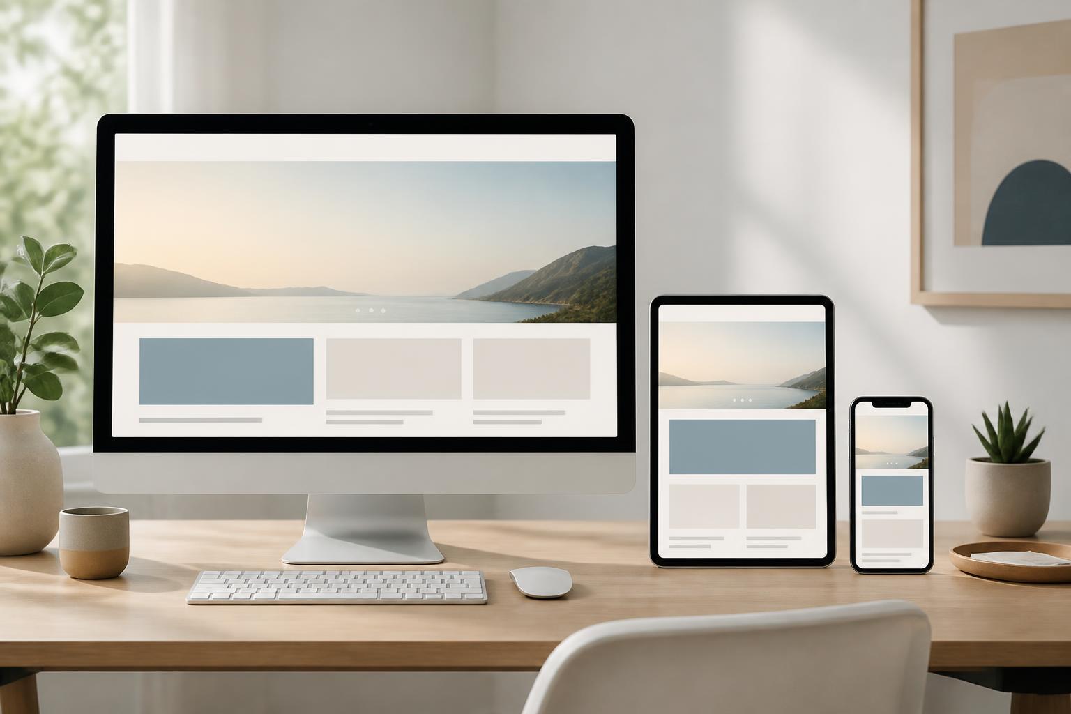



Website Interface System Design: Creating a Consistent and Scalable Experience


A website may contain many pages serving different purposes, from the homepage, about page, and product categories to contact forms and account areas. However, users still expect the entire experience to belong to the same brand and operate according to a consistent logic. When colors, spacing, button styles, or content presentation change arbitrarily from page to page, the website can easily feel unprofessional, even if each individual screen is beautifully designed.
That is why interface systems have increasingly become an important part of the website design process. Instead of treating each page as an independent product, teams build a set of reusable rules, components, and layout patterns. This system helps turn brand direction into specific interface decisions while also creating a shared language among content creators, designers, and developers.
What Is a Website Interface System?
A website interface system is an organized collection of design principles, design tokens, shared components, and usage guidelines. It may include primary colors, typography, type scales, layout grids, spacing, buttons, forms, content cards, navigation bars, notifications, and many other components that commonly appear on a website.
The important point is that an interface system is not merely a visual library or a collection of button samples. A component is truly useful only when it is accompanied by information about its purpose, states, usage, and limitations. For example, a call-to-action button needs rules governing its content, size, position, hover state, and disabled state. This allows everyone involved in the project to make consistent choices instead of making assumptions in each individual situation.
This system is also different from a fixed interface template. An interface template usually describes a completed screen or group of layouts, whereas an interface system focuses on rules and components that can be combined to create many different screens. A new website can begin with a few basic components and gradually develop as content and functional needs increase.
Why Does a Website Need an Interface System?
Maintaining a Consistent Brand Identity
Brand identity in the digital environment is not limited to a logo or primary color. Users also recognize a website through its visual rhythm, heading hierarchy, button shapes, image style, and the way components respond during interaction. When these elements are clearly defined, new pages can retain common characteristics without requiring the team to repeat the entire discussion from the beginning.
Consistency does not mean that every page must look exactly the same. A product page may need more information and actions than an about page, while an article needs to prioritize readability. An interface system establishes foundational principles that allow pages to differ in function while still belonging to the same overall experience.
Shortening Design and Development Time
Once common components have been defined, the team does not have to redraw every button, panel, or content block for each page. Designers can focus on the structure and purpose of the screen, while developers have a clear foundation for implementation. Shared changes, such as adjusting the color of a primary button or the corner-radius rules, are also easier to control when components use the same source of truth.
This benefit is particularly clear when a website contains many types of content or is updated frequently. A content team can create new pages using tested blocks instead of requesting a complete redesign. However, reuse is effective only when components are sufficiently flexible and have clear boundaries. Combining too many cases into one complex component can make the system difficult to understand and maintain.
Reducing Discrepancies Between Designs and the Actual Product
In many projects, the interface in the design files and the deployed interface may differ because each side interprets the rules in its own way. An interface system provides a shared language for discussion. Instead of vaguely describing a button as needing to be “more prominent,” the team can discuss the button’s role, priority level, specific size, and states.
This does not completely eliminate the need for communication between design and development, but it helps keep those discussions focused on practical issues. Components with clear names, specifications, and usage guidelines also facilitate quality checks before the website goes live.
The Foundational Layers of an Interface System
Design Principles
Before choosing colors or drawing components, it is necessary to define the principles that guide the interface. One brand may want to convey clarity, trustworthiness, and restraint; another may prioritize a sense of energy, approachability, and strong visual appeal. Principles should not stop at general adjectives but should be translated into design decisions.
For example, if clarity is a priority, the system may limit the number of typefaces, strengthen heading hierarchy, and keep action-oriented content concise. If a brand wants to create a sense of approachability, its imagery and writing style can be guided to avoid language that feels overly mechanical. These principles help explain why a choice is accepted or rejected.
Basic Design Tokens
Design tokens are values used repeatedly throughout an interface, such as colors, font sizes, font weights, corner radii, content-area widths, spacing, and display layers. Standardizing these values helps prevent a situation in which every page uses a different shade of gray, spacing value, or heading size.
It is not necessary to create an overly large set of specifications from the start. A small, easy-to-understand system is often more valuable than a long list that the team does not use. Values should be named according to their role and purpose rather than using names that are difficult to remember. For example, the color intended for primary actions should be identified by its role in the interface, so that future brand adjustments do not undermine the meaning of the component.
Components and States
Components are reusable interface blocks such as buttons, input fields, cards, menus, dialogs, pricing tables, or quote blocks. When describing a component, it is necessary to consider not only its normal state but also interaction and error situations. A button may be loading, disabled, or selected. An input field may display guidance, a validation error, or a completion message.
Fully describing states helps the website respond clearly to users. It also limits situations in which one page displays errors in red, another uses a notification that is difficult to notice, and users do not understand what to do next. Component names and structures should be consistent so that developers can implement them without creating multiple nearly identical versions.
Layout Patterns and Usage Processes
Once the basic components are available, the team can combine them into common patterns such as hero sections, feature blocks, product lists, frequently asked questions sections, or registration forms. Layout patterns help address recurring needs at a higher level, but they should not become rigid templates for every type of content.
Alongside visuals, the system documentation should clearly state when to use a pattern, when not to use it, and how to handle content that is longer than expected. A pattern that looks good only with short copy can easily cause problems when applied to a long heading, another language, or a screen of a different size. Therefore, real content needs to be included in testing throughout the building process.
The Process of Building an Appropriate Interface System
The first step is to audit the existing website or the scope of the website to be built. The team should gather the screens, identify repeated components, and record inconsistencies. This audit helps reveal actual problems instead of building a system based only on assumptions.
Next, the components need to be categorized according to how broadly they are shared. Foundational elements such as typography, colors, and spacing are usually defined first. These are followed by interactive components and layout patterns. The classification should be simple enough that new project members can find the information they need without spending a great deal of time learning the system.
After the first version has been created, the system needs to be tested across multiple types of pages and content. A button that works well on the homepage may not be suitable for a data table. A product card may work well with landscape images but break when the image has a different aspect ratio. Testing in diverse contexts helps identify which components are genuinely reusable and which should be separated.
Finally, the system needs to be maintained as part of the website’s operating process. Every change to the brand, functionality, or content may create a need for updates. The team should agree on how to propose changes, who is responsible for reviewing them, and how to communicate when a component has been modified. Without a management mechanism, the system can easily become outdated documentation while the actual product continues to develop in another direction.
Common Mistakes
A common mistake is to begin with decoration instead of identifying the problem that needs to be solved. An interface system should not be merely a collection of attractive colors. If it does not reflect business objectives, content needs, and user behavior, it may produce a consistent interface that is nevertheless ineffective.
Another mistake is trying to standardize everything too early. A website still needs room for special cases, especially when the product contains many types of content. Standardization should reduce repeated decisions, not prevent necessary solutions. When an exception occurs frequently, it may be a sign that the system needs an additional component or a new rule.
Many teams also focus only on ideal states and overlook errors, empty data, long content, different permission levels, or interrupted actions. These situations commonly arise during actual use and have a significant impact on how users perceive the website’s quality. A good system must describe what happens when things do not go according to plan.
A Foundation for Long-Term Website Development
Interface system design is not a one-time task that ends after completion. It is a way of organizing design decisions so that a website can grow without losing consistency. When built on real needs, clear documentation, and an appropriate update process, the system helps teams work faster while retaining control.
For businesses preparing to build a new website, investing in an interface system early helps reduce dependence on arbitrary decisions made page by page. For an existing website, the auditing and standardization process can begin with a group of important pages and then expand gradually. The ultimate goal is not to create an enormous set of rules, but to build an experience that is clear, consistent, and flexible enough to grow alongside the brand.