


Accessible Website Design: Expanding Opportunities for All Users


A website is considered effective not only because it has an attractive interface, fast loading speed, or the ability to generate conversions. Its effectiveness also lies in the fact that the more people can read, understand, and use the website independently, the greater the value it provides. This is the foundation of accessible design, an approach that places users’ diverse needs at the center from the very beginning of the digital product development process.
In practice, website visitors may use small screens, unstable connections, outdated browsers, or assistive tools for reading content. Some people experience difficulties with vision, hearing, mobility, or concentration. Others may be in brightly lit environments, somewhere noisy, holding a phone with one hand, or temporarily limited in how they can interact. Accessible design helps a website work more clearly in all of these situations, rather than serving only an idealized group of users.
What Is Accessible Design?
Accessible website design is the process of creating interfaces, content, and functions that many people can use, including those with certain sensory, mobility, cognitive, or device-related limitations. This concept does not mean making every interface superficially simple. The goal is to remove unnecessary barriers, helping users understand where they are, what they can do next, and how they should interact to accomplish their goals.
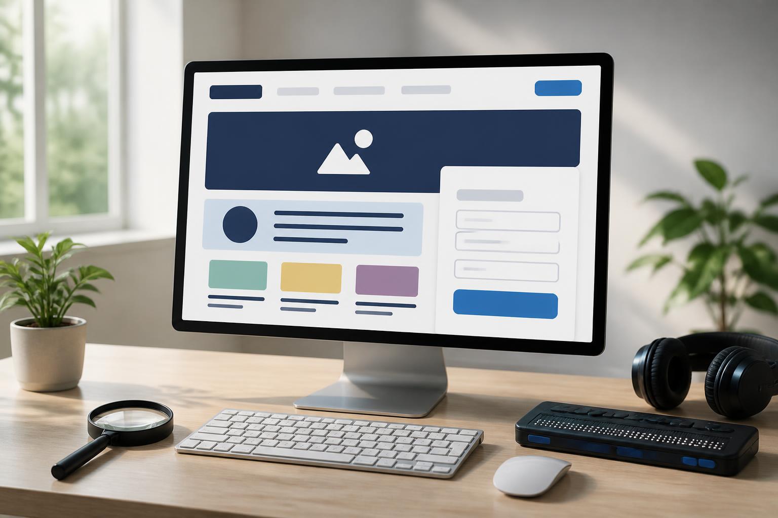
An accessible website usually has a logical content structure, clear headings, sufficient color contrast, easy-to-understand forms, buttons with easily recognizable states, and keyboard navigation. Images need appropriate descriptions when they convey information. Videos with spoken content should include captions. Error messages also need to explain the problem specifically so users know its cause and how to fix it, rather than displaying only a vague general notification.
Why Should Accessibility Be Considered from the Beginning?
If accessibility is considered only after a website has been completed, the development team may have to revise multiple layers of the product, from the source code structure to the content and presentation. At that point, the cost of adjustments is often higher, while some foundational decisions are already difficult to change. Conversely, if accessibility requirements are incorporated during the planning stage, the design team can choose an appropriate color system, typography, navigation structure, and content organization from the outset.
This approach also helps the team view the website from a broader perspective. Instead of asking only whether the interface looks good, the team can ask additional important questions: Can users recognize what this button does? Can the information be accessed without using a mouse? Are form errors explained clearly enough? Does the content remain easy to understand when users zoom in on the screen? Questions like these contribute to the overall quality of the product.
Important Principles of Accessible Website Design
Content Structure Must Follow a Clear Order
Users do not usually read an entire page in the same way. They quickly scan headings, opening paragraphs, lists, and highlighted points to find the information they need. Therefore, content should be organized in a logical order, with the main heading describing the topic of the page, subheadings dividing the content into smaller sections, and each paragraph focusing on one main idea.
Using headings at the correct levels benefits not only on-screen readability but also helps assistive tools understand the structure of the page. A heading should not be created merely because larger text is needed, nor should intermediate heading levels be skipped when moving to a new section of content. A clear structure helps users quickly locate information and return to the section they need without having to reread the entire page.
Color Should Not Be the Only Signal
Color can help distinguish states, content groups, or levels of priority, but it should not be the only means of conveying meaning. For example, if red is used alone to indicate an error in a form, some users may not recognize the problem. Error messages should be accompanied by descriptive text, an appropriate icon, or another form of presentation so that the information remains clear when colors change, display poorly, or cannot be adequately distinguished.
The contrast between text and background also requires attention. Light-colored text on a light background may create a refined impression in a design mockup, but it can be difficult to read under different lighting conditions. When choosing interface colors, the team should check the main content, secondary text, borders, button states, and interactive elements rather than evaluating the overall design only by looking at it on a single screen.
Navigation Should Work Consistently
Menus, links, and buttons should be placed in predictable locations, use consistent terminology, and clearly indicate their functions. A button labeled “Submit Request” is more useful than one labeled only “Continue” when users need to know exactly what action they are about to take. Links in the same context should also have descriptive names, avoiding excessive repetition of generic links such as “Learn More” without indicating their destination.
The website should also show the state of an element when it is selected, focused, processing, or complete. Users operating with a keyboard or assistive device need to know the current position of the control cursor. If the focus state is removed entirely for aesthetic reasons, navigation can become difficult and uncertain.
Forms Should Guide Users Rather Than Make Them Guess
Contact, registration, and ordering forms are often decisive points in the website user journey. An accessible form should have clear labels for each field, concise instructions when necessary, the required data format, and error messages placed near the relevant location. Users should not have to guess where they entered incorrect information or delete all their data simply because one field has the wrong format.
If a field is required, this should be indicated clearly. When a form submission fails, the website should retain correctly entered data whenever possible while identifying the step that needs to be corrected. This approach not only supports people with disabilities but also reduces frustration for anyone completing a form on a mobile device or under unstable network conditions.
Content Is Also Part of Accessibility
A well-built interface can still become difficult to use if the content is confusing, contains too many technical terms, or lacks context. Sentences should be direct, paragraphs should be a reasonable length, and important information should be placed where it is easy to find. When using abbreviations, the website should explain them the first time they appear if general readers may not be familiar with the term.
Images should be considered according to their role in the content. If an image is purely decorative, its description should not repeat unnecessary information. If an image contains a chart, product, or important instructions, the alternative content should convey its main meaning. For videos, captions help users follow along in quiet environments, public places, or when they cannot hear the audio. Transcripts can also support people who want to read quickly and find a specific piece of information.
Testing Accessibility in the Design Process
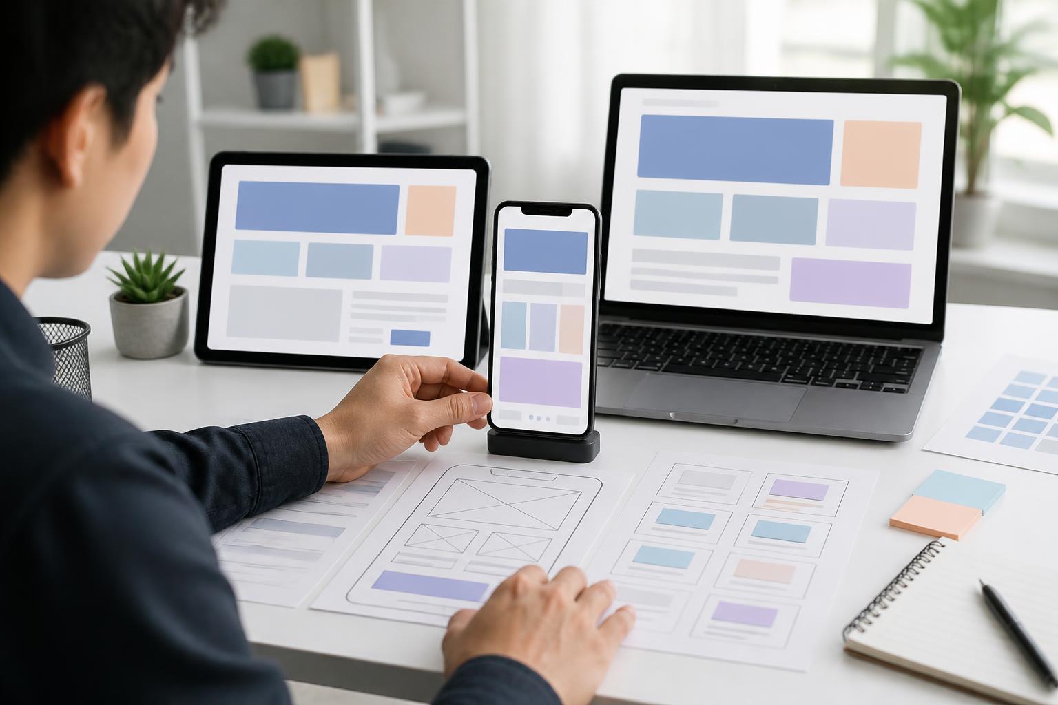
No single testing step can identify every problem. Teams should combine design reviews, testing on multiple screen sizes, keyboard-navigation trials, and checks of interactive states. Automated tools can help detect some common errors, but they cannot replace the evaluation of content, context, and real-world experience.
Inviting users with diverse needs to participate in testing provides a more direct perspective. They can point out barriers that teams familiar with the product may easily overlook, such as confusing wording, an unnatural sequence of actions, or insufficiently clear notifications. Testing should begin early and be repeated whenever the website undergoes major changes, rather than being performed only before launch.
Accessibility Creates Long-Term Value
Accessible design is not an added feature intended for a small group. When a website has a clear structure, understandable content, and predictable interactions, the experience of most users also improves. New visitors can grasp information more easily, customers encounter fewer obstacles when making contact, and the operations team has a consistent foundation for developing additional pages or functions.
More importantly, accessibility reflects how a brand respects the diversity of its users. A website that does not force everyone to use it in the same way creates a greater sense of trust and professionalism. This value is difficult to measure with a single metric, but it directly affects the quality of the experience and the long-term relationship between a business and its customers.
Even when it is not possible to improve the entire website at once, the team can still begin with practical steps: reviewing contrast ratios, standardizing heading structures, clarifying button labels, improving error messages, and checking keyboard navigation. When these principles become a familiar part of the design process, the website will not only look better but also become more open, flexible, and useful to more people.