


Accessible Website Design: Expanding the Experience for All Users

Website design is often evaluated based on visuals, loading speed, mobile display, and how conveniently users can accomplish a specific goal. However, one aspect is easy to overlook: whether the website is truly usable by many different groups of people. Users may have limitations related to vision, hearing, mobility, or cognition, or they may simply be in an unfavorable situation, such as being in a dimly lit place, having a slow connection, or being able to use only one hand.
Accessible design, commonly referred to as web accessibility, aims to reduce these barriers. It is not a separate layer of features intended only for people with disabilities, nor does it mean making the interface less attractive or more complicated. When implemented properly, accessibility helps make a website’s structure clearer, its content easier to understand, and its interactions more consistent for all users.
What Is Accessible Design?
An accessible website allows users to perceive content, navigate between areas, interact with interface components, and understand the results of their actions without depending on a single method. For example, users should not be forced to use a mouse if the website can be operated with a keyboard. An image that conveys important information should not be perceivable only visually; it should also have an appropriate description.
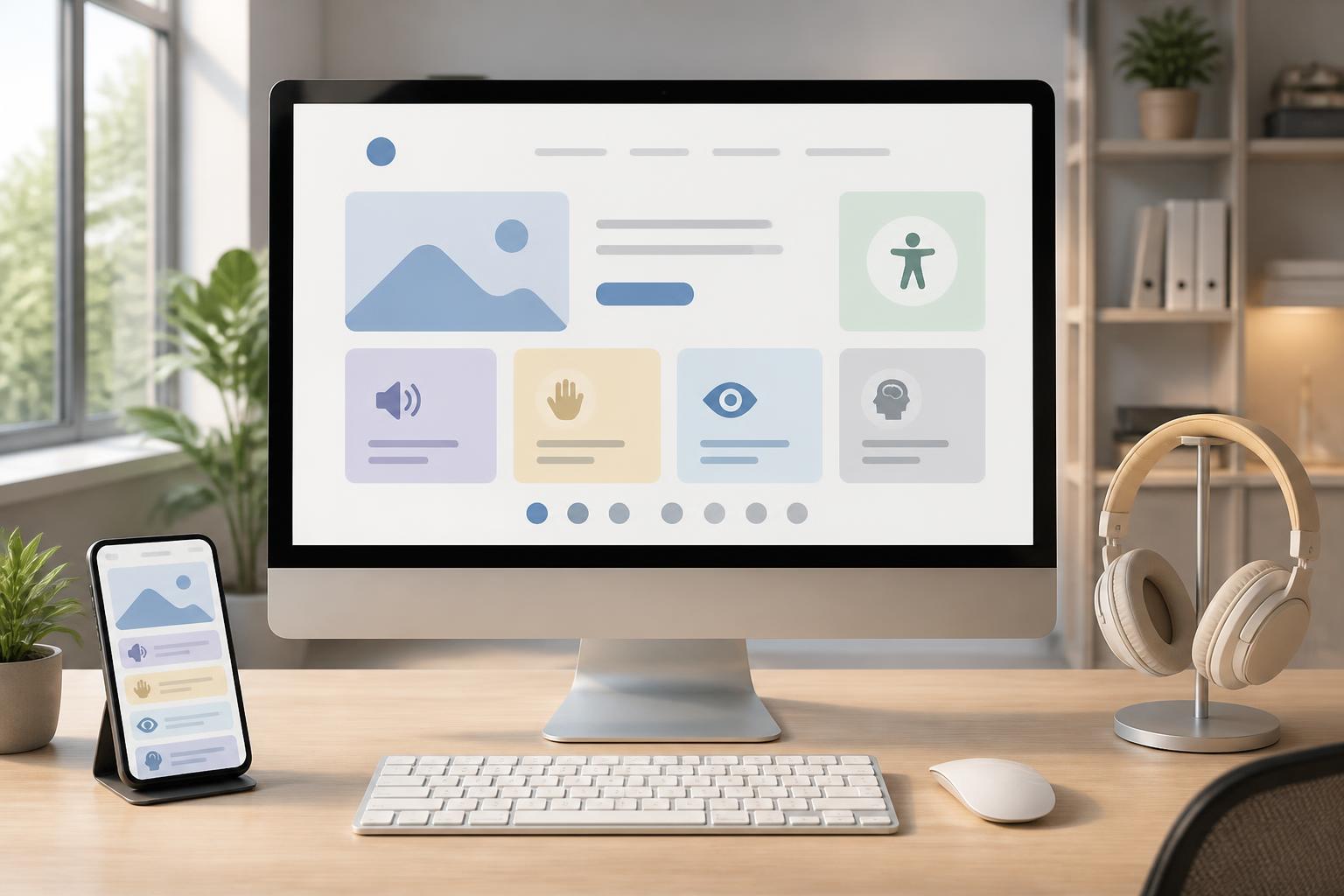
Accessibility includes multiple layers. At the visual layer, a website needs suitable contrast, readable text sizes, and clear interaction states. At the motor layer, clickable areas must be large enough and usable with a keyboard or assistive technology. At the auditory layer, audio content should be accompanied by captions or a transcript when necessary. At the cognitive layer, the writing, layout, and interaction flow should avoid causing unnecessary confusion.
The important point is that accessibility should not be treated as an inspection task at the end of a project. If the team discovers problems only after the interface, content, and system have been completed, repair costs are usually higher and the solutions are more likely to be patchwork. Accessibility should be incorporated from the moment the team identifies user groups, builds the information architecture, and designs basic components.
Start with Content Structure and Semantics
An accessible website must first have a logical structure. Users may see a page divided into a header, main content, sidebar, and footer, but people who use screen readers need to rely on semantic structure to identify those areas. Therefore, using the correct HTML element for the correct purpose is more meaningful than simply making the interface look attractive.
Each page should have one main heading that clearly expresses its subject. Subheadings should be arranged in a logical hierarchy, avoiding jumps from a high-level heading to a much deeper level simply to change the text size. Paragraphs should be presented as paragraphs, lists should use list structures, and forms should have labels associated with their input fields. This organization helps users quickly scan content and allows assistive tools to provide more accurate information.
Links also need clearly descriptive text about their destinations. Generic phrases such as “learn more” or “click here” do not tell users where they will be taken, especially when they hear a list of links read separately from the surrounding text. A specific label such as “View website design service pricing” is more useful because it describes both the action and the expected result.
Ensure Keyboard Usability
Many users control websites with a keyboard because of motor limitations, because they use assistive devices, or because they want to work quickly. Others may not use a physical keyboard but still need similar principles when using assistive technology. If the keyboard focus becomes trapped in a dialog box, cannot reach the form submission button, or disappears between components, users will be unable to complete the task.
During the design process, it is necessary to determine a logical movement order between elements. This order should follow the page’s natural reading order and information flow rather than depending entirely on the visual position created by CSS. Every button, link, input field, and interactive control must be reachable. When a component is selected, the focus state must also be clear enough for users to know where they are.
A common mistake is removing the default focus outline because it is considered aesthetically unrefined. This causes keyboard users to lose track of their current position. If the display style needs to be changed, designers should create a new focus state with good contrast that is easy to recognize rather than removing it entirely.
Color, Typography, and Readability
Color can create emphasis, establish information hierarchy, and direct attention, but it should not be the only signal used to convey meaning. A form that indicates errors only by changing a border to red may be difficult for people with color blindness or those viewing it on a low-quality screen. Notifications should combine color with an appropriate icon, text, and a clearly visible position.
Contrast between text and its background needs to be considered from the moment the color system is developed. Small text, thin type, or content placed over images is often harder to read than expected. Designers should check normal, hover, selected, disabled, and other states, as well as how content appears on different backgrounds. A color palette that looks attractive in a static design is not necessarily still easy to read when implemented across multiple screens.
Text size, line spacing, and the width of text blocks also directly affect the experience. Overly long paragraphs, lines that are too wide, or unclear spacing between groups of information make content difficult to follow. Content should be divided into paragraphs with specific topics, use subheadings when necessary, and avoid excessive use of all-capital letters. Allowing browsers to enlarge content without causing loss of functionality or horizontal overflow is also a practical requirement.
Images, Video, and Multimedia Content
Decorative images and images that convey information need to be handled differently. Decorative images can use an empty attribute so assistive technology can ignore them, while meaningful images need a concise description that is appropriate to the context. The description should not merely list what appears in the image; it should convey the information users actually need to understand the page content.
For charts, diagrams, or images containing large amounts of data, a short description is often insufficient. The main content should also be presented in text or in a data table that can be read. This not only supports users with visual impairments but is also useful when an image fails to load, when users want to copy the information, or when the content is viewed on a device with a small screen.
Videos should have synchronized captions, especially when they contain instructions, product information, or training content. Transcripts allow users to read instead of listen and also make the content easier to search and reference. Automatically playing audio should also be limited because it can be annoying, distract users, or create problems for people who are in environments where silence is required.
Forms and Conversion Flows
Forms are often where shortcomings in accessible design become most apparent. Each input field needs a specific label indicating what information the user must enter. A placeholder should not be used in place of a label because its content may disappear when the user begins typing. If a form requires a special format, instructions should appear before the user submits the data.
Error messages need to identify which field has a problem, explain the cause, and indicate how to fix it. A message such as “Invalid data” is less useful than a sentence that clearly states, “The phone number must contain between eight and eleven digits.” When a form is long, the system should also preserve information that has already been entered correctly so users do not have to fill it out again from the beginning.
For multistep processes such as placing an order, registering an account, or requesting a consultation, the interface should indicate which step the user is on, how much remains to be completed, and how they can return to make edits. Action buttons must be named consistently. If a button saves, submits, continues, or goes back, its name should reflect the actual result rather than using vague labels.
Do Not Forget Mobile Devices and Context of Use
Accessibility on phones is not simply a matter of shrinking a desktop interface. Mobile users may operate a device with one hand, use it outdoors, encounter reflected light, or rely on the operating system’s zoom function. Therefore, touch targets need appropriate spacing, important buttons should not be placed too close to the edge of the screen, and content must not depend on hover interactions.
Motion, transition effects, and automatically updated content also need to be used carefully. Effects that are too fast can cause discomfort, while information that changes continuously may not give users enough time to read. Moving elements should have a mechanism for pausing when necessary, while dynamic notifications should be provided in a way that allows assistive technology to recognize them without interrupting the entire experience.
Testing Accessibility in the Website Design Process
No single tool can detect every problem. Automated testing tools are useful for finding common issues such as missing image descriptions, illogical heading structures, low text contrast, or unlabeled form fields. However, they cannot fully evaluate whether content is easy to understand or whether an interaction flow is genuinely logical.
Teams should combine automated testing with navigating pages by keyboard, enlarging content, disabling images, checking multiple screen sizes, and testing with screen readers. More importantly, when conditions allow, people with different usage needs should be invited to participate in testing. Real-world feedback often reveals obstacles that internal teams have become accustomed to and therefore no longer notice.
Testing also needs to take place at every stage. During planning, the team can consider user groups and important tasks. When designing the interface, it is necessary to check colors, focus states, touch-target sizes, and content structure. During development, the team must ensure that the actual components maintain the intended behavior. After the website goes live, changes to content, plugins, or the content management system must still be monitored to avoid creating new errors.
Accessibility Is Part of Website Quality
Accessible website design is not a matter of adding a few technical attributes to a completed interface. It is an approach that asks who can use the website, what barriers they may encounter, and how the business needs to communicate information so that everyone has an opportunity to accomplish their goals. When incorporated into the process early, accessibility often supports clarity, usability on mobile devices, content quality, and the durability of the digital product.
Businesses can start with specific actions: building a consistent heading structure, checking keyboard navigation, providing clear form labels, adding descriptions for meaningful images, including captions for videos, and testing with real users. These improvements not only help the website serve more people but also create a strong foundation for a transparent, professional, and trustworthy experience.