


Mobile-First Website Design: From Small Screens to a Seamless Experience


Phones have become one of the most important touchpoints between users and websites. A customer may discover a brand through a search engine, open a product page from social media, read service information while on the move, or complete a form right on a small screen. Therefore, displaying well on mobile devices is no longer an add-on after the desktop website has been completed. It is a fundamental requirement in the website design process today.
However, designing for mobile does not mean taking a desktop interface and simply shrinking it. Phone screens have limited space, input methods are different, connection conditions vary, and usage is often brief, fast, and dependent on context. A layout that is reasonable on a large screen may become cramped, difficult to read, or difficult to operate when moved to a smaller device. A more appropriate approach is to start with the core needs of mobile users, then expand the experience for larger screens.
What does mobile-first really mean?
Mobile-first, or prioritizing mobile devices, is a design method in which the development team treats the small screen as an important starting point. Instead of trying to place every desktop interface element on a phone, the design team needs to determine which content is most valuable, which actions need to be completed most quickly, and which information can be placed at a secondary level.
This method requires the project to answer practical questions from the outset. Why do users visit the page? Do they need to read, search, make a call, submit a request, or make a purchase? Which elements must appear immediately within the first visible area? Which content can be hidden in a menu or displayed after a tap? When these questions are resolved early, the website usually has a clearer structure on both phones and computers.
Prioritizing mobile also helps limit the amount of detail placed in the interface. A page may contain a great deal of information, but it still needs a specific order of priority. The heading, key benefits, call-to-action button, trust-building information, and supplementary explanations should be arranged according to the user journey, rather than appearing simultaneously as a dense block of content.
Factors that determine the experience on small screens
Flexible layouts instead of fixed dimensions
A website needs to adapt to a range of screen widths, from small phones to tablets and desktop computers. Flexible layouts typically rely on content areas that can expand and contract, appropriately calculated spacing, and images that can adjust to the available display space. Setting fixed widths for too many elements can easily cause content to overflow, text to be cut off, or users to have to scroll horizontally.
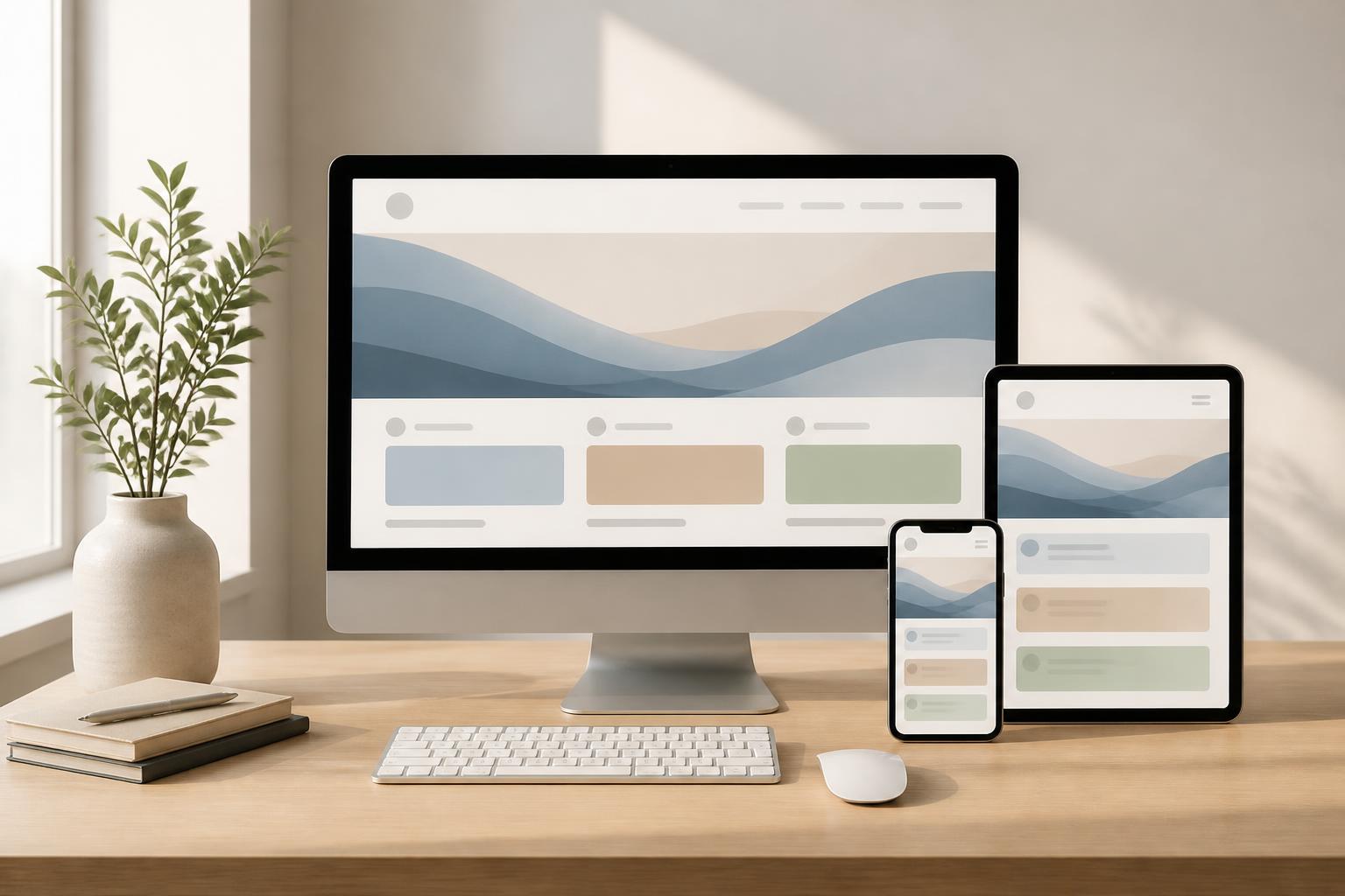
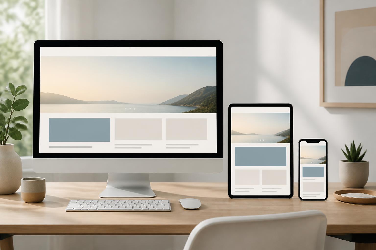
Responsive design does not mean that every screen must look exactly the same. A navigation bar with many items on a computer can be condensed on a phone. Two columns of content can become a single vertical column. A wide information table may require a different presentation so that users can still read the important fields without having to zoom in repeatedly.
Readability must be prioritized
On small screens, typography, contrast, and line spacing have a clear impact on the user experience. Text that is too small forces readers to zoom in; lines that are too long make it difficult for the eyes to follow; spacing that is too tight causes paragraphs to run together. Conversely, a typographic system with a clear hierarchy helps users quickly distinguish headings, main content, captions, and calls to action.
Content also needs to be edited to suit the way people read on phones. Long paragraphs should be divided into focused blocks, but they should not be split into too many disconnected lines. Subheadings should appear only when they genuinely help users find their way. Important points can be emphasized through position, weight, or whitespace instead of overusing colors and effects.
Actions must be clear and easy to perform
Fingers are not as precise as a mouse pointer. Therefore, buttons, links, and form fields need sufficiently convenient touch areas and should be spaced apart to reduce the risk of accidental taps. An important action button should have a specific label, such as “Submit a Consultation Request” or “View Product Information,” rather than an overly general label.
Forms on phones should also be streamlined. They should request only the data that is truly necessary for the current step. Input fields need clear labels, suitable formats, and error messages that indicate how to fix the problem. If users have to enter too much information at once, they may abandon the process before completing it. When appropriate, dividing a form into short steps can help reduce the sense of burden.
Performance is part of design
A beautiful interface that loads slowly still creates a poor experience. On mobile devices, users may access a website through an unstable connection or under limited resource conditions. Therefore, performance needs to be considered from the design stage, not checked only after programming has been completed.
Images should be prepared at the exact dimensions required for display, avoiding oversized files for small areas. Elements that do not need to appear immediately can be loaded at an appropriate time. Motion effects should support orientation or provide feedback for actions, rather than becoming a burden that makes the page respond slowly. Code files, libraries, and external resources should also be reviewed to avoid unnecessarily increasing loading times.
Performance is not only about how quickly the initial page becomes visible. Users also care about whether the menu opens quickly, whether buttons respond, whether content shifts position while loading, and whether moving to the next page feels seamless. A well-optimized website needs to create a sense of stability throughout the entire user experience.
Mobile should not be treated as a shortened version
A common mistake is to hide too much content on phones under the assumption that mobile users need only basic information. In reality, users may access a website by phone simply because it is the most convenient device at the moment they need to learn more. If important information is omitted, they may have to switch to another device or leave the website to find an alternative source.
The solution is not to place all the content on one long, disorganized screen. Instead, information should be organized in layers. Important content should appear first, detailed explanations should expand when users need them, and related groups of information can be placed in collapsible areas. This structure keeps the interface clean without removing valuable content.
Switching between devices also needs to be taken into account. Someone may begin researching on a phone and then return on a computer to complete an action. Content, category names, and links between pages should be consistent so that users do not feel they are using different versions of the website.
The mobile-first website design process
An effective process usually begins by identifying user groups, business objectives, and the key actions on the website. From there, the design team can create a content map and outline the experience flow before focusing on colors or imagery. Sketching on a small screen helps reveal unnecessary content, cumbersome steps, and confusing points early on.
Once the structure is in place, the interface can be developed from the smallest size and gradually expanded. Each breakpoint should be considered based on content and functionality, not merely on the names of devices. When there is more space, the interface can add columns, increase breathing room, or include more secondary information. When space becomes tighter, the order of priority must be preserved.
Testing should also begin early and be repeated many times. The team should test different screen sizes, including tapping, scrolling, data entry, and returning to the previous page. In addition to technical testing, observing a user complete a specific task can reveal issues that are difficult to predict from the design alone, such as an overlooked action button, a misleading heading, or a form that creates a sense of insecurity.
Balancing business goals and convenience
Websites usually have clear objectives, such as collecting contacts, introducing services, selling products, or supporting customers. Mobile-first design does not diminish the role of these objectives. On the contrary, it helps present them at the right time and in a form that is easier to act on.
However, every empty space should not be turned into a sales invitation or registration request. Constantly displaying pop-ups, covering content, or placing too many buttons can interrupt the experience. An effective call to action needs to match the context of the page and the benefit the user will receive. When users are reading foundational information, they may need a link to learn more; when they have fully reviewed the service information, they may be ready to submit a consultation request.
Good design is a process of balancing clarity, speed, usability, and conversion goals. There is no single layout that suits every type of website. A news site, corporate website, online store, and booking platform will have different priorities. What matters is that design decisions stem from specific user behavior and needs, rather than following a currently popular interface pattern.
Conclusion
Mobile-first website design is an approach that places core content, clear actions, and stable performance at the center of a project. It does not merely create an interface that fits a phone screen; it also requires businesses to understand what users need, eliminate unnecessary steps, and organize information in a logical order.
When implemented correctly, a website will not be divided into one version for computers and another for phones. Instead, the entire system can adapt naturally to a range of usage contexts. This provides a foundation for a more consistent experience, clearer support for business objectives, and room for the website to grow alongside users’ needs.