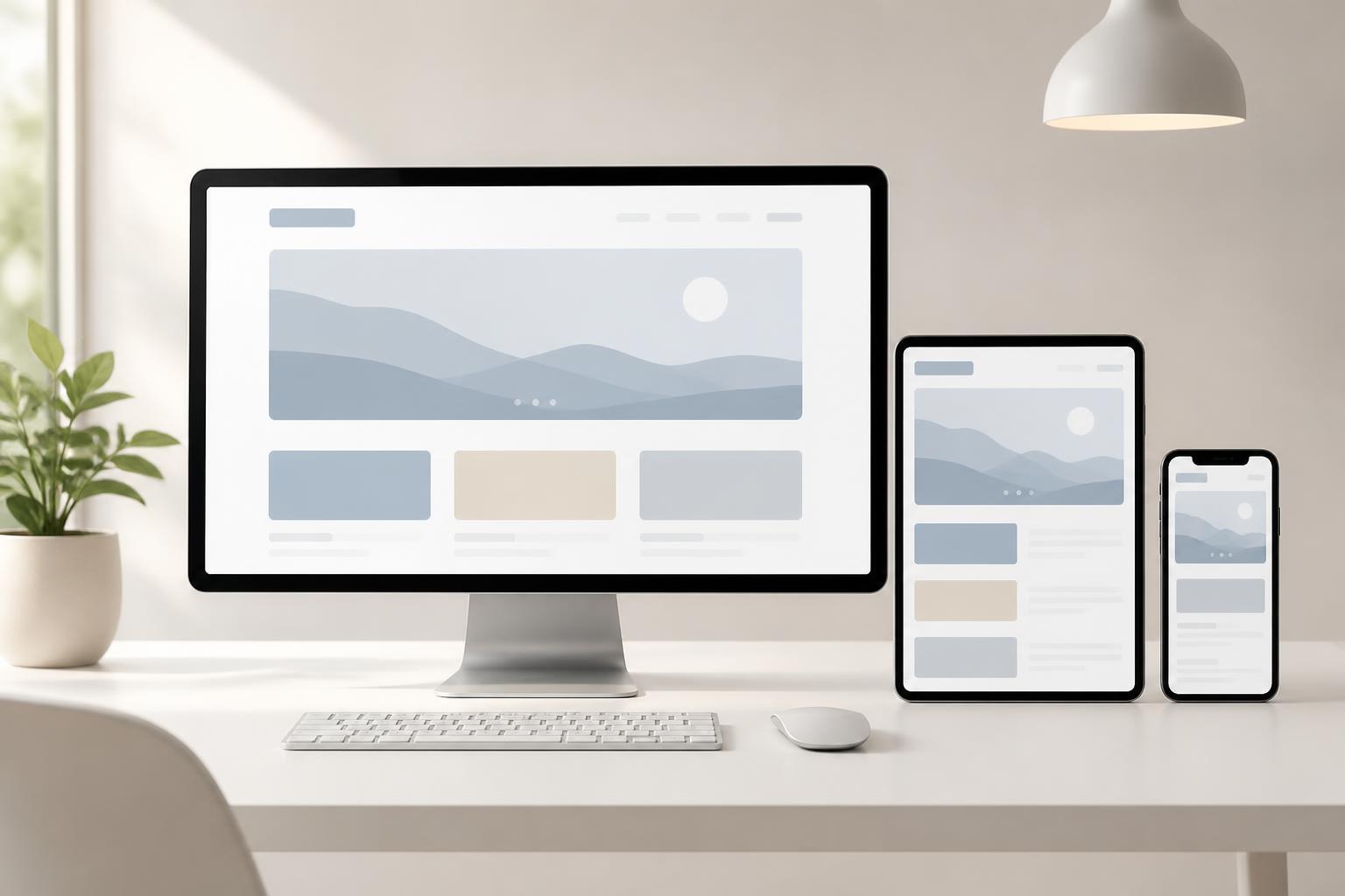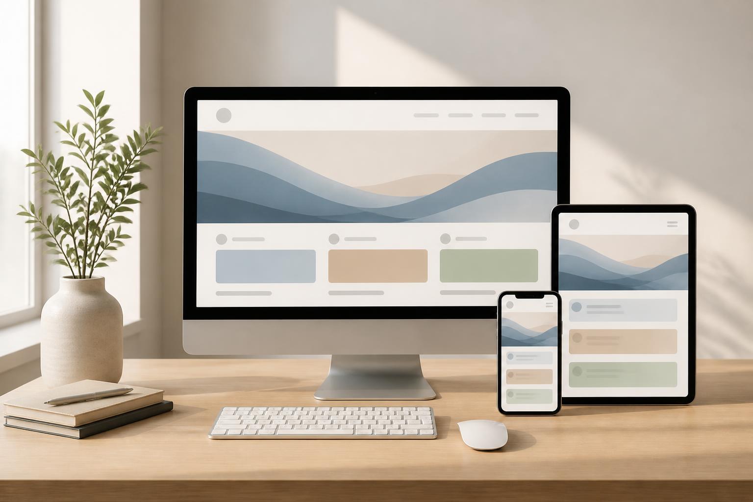



Mobile-First Website Design: Starting with Small Screens to Serve Users Better


Phones have become one of the most important touchpoints between users and websites. Visitors may encounter a brand through search results, social media posts, advertisements, or a link shared in a conversation, and then open it immediately on a small screen. In this situation, a website has very little time to make an impression. If the content is difficult to read, buttons are hard to tap, or the very first interaction creates an obstacle, users may leave before understanding what the business offers.
Mobile-first design emerged from this practical need. Instead of fully building an interface for desktop and then shrinking it for phones, the design team starts with the small screen, identifies the most important content and actions, and then gradually expands the experience for larger screen sizes. This is not a decorative trick but a method for making decisions about a website’s content, layout, navigation, and performance.
What Does Mobile-First Really Mean?
Responsive design and mobile-first design are often mentioned together, but they are not exactly the same. Responsive design is the ability of an interface to adapt to different screen sizes. A responsive website can be displayed on phones, tablets, and desktop computers. Mobile-first, meanwhile, is a design mindset that begins with the version for small screens before developing wider versions.
The difference lies in the order of priorities. With the traditional approach, design teams often tend to place many elements on a large layout: a navigation bar, banner, content columns, introductory sections, filters, forms, and other utilities. When moved to a phone, these elements are stacked, reduced in size, or hidden. As a result, the interface may still function technically but become cumbersome and difficult to use.
Mobile-first forces the project team to ask questions earlier: What does the user need to know first? What is the most important action? Which content can be omitted? And which elements truly need to appear on a small screen? When these questions are resolved from the beginning, the version for larger screens usually has a clearer foundation instead of being merely a layout filled with additional details.
Why Start with Small Screens?
It Helps Identify Core Content
Limited display space forces every element to compete for attention. This is a useful constraint during the planning stage. Businesses need to distinguish essential content from supporting content, information that must be read immediately from information that can be viewed later, and the primary action from secondary options.
For example, a service website may need to clarify three things right at the top of the page: what solution the business provides, who the solution is for, and how visitors can get in touch. Information such as the company’s history, partner list, or in-depth articles may still be valuable, but it does not necessarily need to appear before the main introduction. This arrangement helps users understand the offering more quickly without having to scroll through too much content.
It Limits the Uncontrolled Addition of Features
Wide screens often make it easy to add more elements. An empty space can be filled with a banner, information box, filter, or new function button. However, every element creates additional requirements for content, design, development, and maintenance. When moved to a phone, these additions can turn into a long sequence of actions or obscure the page’s primary objective.
Starting with smaller devices helps the project team control the scope more effectively. A feature should be retained only if it addresses a clear need and has an appropriate place in the user journey. This is particularly useful for e-commerce websites, service websites, and information portals serving multiple user groups.
It Creates a Strong Foundation for Performance
Interface design and performance are closely connected. Large images, complex effects, unnecessary code libraries, or too many elements loading at the same time can make the experience on mobile devices less stable. When designing mobile-first, the team has an opportunity to consider early on how images will load, how content will be displayed, and how to reduce elements that do not serve the primary objective.
Performance is not merely a technical number. It directly affects how users feel when opening a page, moving between sections, filling out a form, or completing an action. A simple interface with a logical loading order and no unnecessary visual showmanship generally creates better conditions for real-world use.
Important Principles for Designing a Mobile-First Website
Prioritize Content According to the Page’s Purpose
Every page should have one primary purpose. A service page needs to help users understand the solution and submit a consultation request. A product page needs to support viewing information, comparing products, and making a purchase. An article page needs to help readers consume the content easily. This purpose should be reflected in the content structure on phones, where limited space makes a lack of clarity more noticeable.
Instead of placing all the information at the top of the page, content can be divided into layers. The first layer addresses the most urgent need. The following layers explain details, provide evidence, answer frequently asked questions, or lead users to the next action. This organization does not mean hiding information; it helps information appear at the right time.
Design Easy-to-Use Touch Targets
On phones, users interact with their fingers rather than a mouse pointer. Links, buttons, and form fields need sufficient spacing to reduce accidental taps. The primary call-to-action should also be quickly recognizable through its position, shape, color, and meaningful label, rather than relying only on an icon that users may not understand.
Important actions should not be placed too close to the edge of the screen or crowded among too many other links. For forms, the number of input fields should be carefully considered. If information can be collected at a later step or automatically filled using existing data, businesses should avoid requiring users to provide too much information at the outset. A short, easy-to-understand form generally makes the process feel more manageable.
Keep Navigation Simple Without Losing Context
Menus on phones are usually condensed to save space. However, putting every link behind a menu icon is not always the best choice. Users still need to know where they are, which areas they can access, and how to return to the previous step.
An effective navigation system should prioritize frequently visited areas, use clear labels, and remain consistent across pages. For websites with multiple levels of content, location indicators, back links, or clearly grouped categories can help users avoid feeling lost. Good navigation is not merely about being able to open a menu; it also helps users form accurate expectations about the website’s structure.
Ensure Readability in Real-World Conditions
Users may access a website in many different situations, such as in low-light environments, while moving, or with an unstable network connection. Therefore, content on small screens needs a readable font size, suitable contrast, and reasonably sized paragraphs. Headings should help readers scan an article quickly, while paragraphs should be divided by idea rather than continuing at excessive length.
Images and videos should also serve the content rather than merely fill empty space. Important images should be presented at an appropriate size, include alternative descriptions when necessary, and not make users wait too long. Autoplaying videos, continuous motion effects, or overly prominent image backgrounds can be distracting, especially when they do not contribute to the page’s objective.
The Mobile-First Implementation Process in a Website Project
Before designing the interface, the project team needs to understand the users and the business objectives. This can begin by identifying the main visitor groups, the situations in which they come to the website, and the action the business wants them to take. Without clarity on these factors, choosing colors or arranging content blocks can easily become a matter of personal preference.
The next step is to build the content structure for small screens. At this stage, the wireframe does not need many visual details. What matters is determining the order of headings, descriptions, images, call-to-action buttons, supporting information, and navigation. The content, design, and development teams should discuss these elements together to identify difficult requirements early and determine which components might affect loading speed.
Once the structure is clear, the design team can develop interfaces for larger screen sizes. More space should not be understood as a reason to put all content on the same screen. The desktop version can add content columns, more visual presentation options, or more convenient interactions, but it should still preserve the prioritization logic established on the phone.
Testing should also begin early rather than waiting until the website is complete. Even a simple prototype can show whether users recognize the primary action, understand the menu, can read the content, and encounter difficulties when entering data. In addition to internal testing, feedback from real users helps uncover issues that the project team may overlook because they have become too familiar with the product.
Common Mistakes
A common mistake is to treat mobile-first as placing the phone interface first in a presentation while keeping the same volume of content and features as the desktop version. The result may look uncluttered on the surface, but users have to scroll through too many irrelevant sections. Mobile-first needs to begin with prioritization, not merely with the size of the viewport.
Another mistake is hiding important functions simply to make the interface look simpler. Condensing navigation is necessary, but if users cannot find contact information, the shopping cart, filters, or progress status, the minimalism has reduced the site’s usefulness. Every hidden element needs a clear and predictable way to access it.
Businesses should also avoid testing a website on only one specific device. Screens, operating systems, browsers, network speeds, and the ways people hold their phones can vary. Testing under multiple conditions helps reveal issues with layout, touch targets, content loading, and display that a single environment cannot fully reflect.
Mobile-First as the Foundation for a Consistent Experience
Mobile-first design does not mean that every website must have the same interface or completely eliminate image-rich layouts. This approach simply requires every decision to stem from users’ real needs and the page’s objectives. When core content is identified, interactions are simplified, and performance is considered from the beginning, a website has a better chance of working well across multiple devices.
For businesses, the benefits of mobile-first also lie in the ability to use resources purposefully. Instead of continually fixing a desktop interface that has been awkwardly reduced, the team can build a content and component system with clear rules from the outset. The website can then be expanded more easily when adding pages or services or adjusting the conversion journey.
A phone may be the starting point, but the ultimate goal remains to serve users throughout their entire journey. A well-designed website needs to be flexible across multiple screens, clear in different contexts, and supportive of the right action at the right time. Starting with the small screen is a practical way for businesses to force themselves to focus on what matters most before expanding the experience.