


Mobile-First Website Design: Starting with Small Screens to Serve Users Better

Phones have become a familiar point of contact between users and websites. Someone may see a link on social media, look up information while on the move, browse products during a break, or submit a consultation request directly from a handheld device. For this reason, designing websites with a mobile-first mindset is becoming increasingly meaningful for businesses, organizations, and individuals building an online presence.
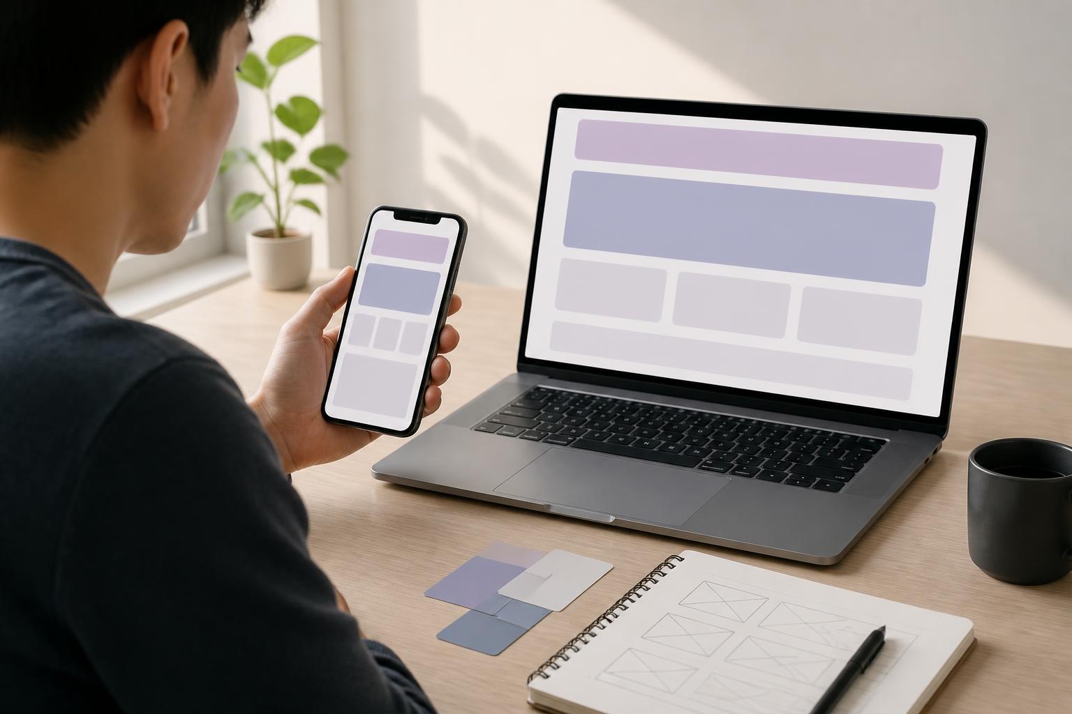
Mobile-first is often simply understood as making a website fit a phone screen. This understanding is incomplete. The essence of the approach is to begin the design process with the constraints of small screens, touch interactions, and access conditions that are not always ideal. The interface is then gradually expanded for tablets and larger screens. This is a way of setting priorities, not a trick for shrinking a layout.
How is mobile-first different from shrinking a website?
In the traditional process, teams often sketch the desktop interface first. A wide screen allows multiple columns, long navigation bars, dense information tables, and secondary areas positioned beside the main content. When moved to a phone, all of these elements are stacked or condensed. If they are not carefully considered, the result can be a cramped interface with many small buttons, hard-to-read text, and unnatural interactions.
Mobile-first design takes the opposite approach. A small screen forces designers to answer important questions from the beginning: Which content must appear first? What task does the user need to complete? Which elements can be removed or placed later? How large should buttons be to make them easy to tap? Which images truly provide value? Once the core decisions are clear, expanding the layout for larger screens usually has a stronger foundation.
This does not mean that a website on a computer must be bare. The extra space can still be used for product comparisons, data tables, filters, or in-depth content. However, these expanded sections should serve the user’s goals rather than appear simply because the interface has more room.
Why start with the small screen?
Prioritizing important content
A phone screen does not have enough room for all information to appear at once. This limitation helps businesses identify which content plays a direct role in explaining, guiding, or encouraging action. Instead of placing every piece of information on the first page, the team must arrange the order and remove sections that are repetitive, less relevant, or can be provided later.
This process often makes content clearer on every device. Headings are written more precisely, paragraphs become less rambling, calls to action are easier to recognize, and the page structure has a more specific purpose. This is a benefit of editorial thinking, not just a benefit of interface design.
Reducing the risk of an overloaded interface
Large spaces can create the impression that another section, information box, or function button can be added without causing any impact. Yet every element increases the amount of attention users must allocate. When designing from the phone screen, unnecessary choices are often identified earlier. The interface can then be expanded in a controlled way, rather than requiring the team to find ways to cut down a computer layout that has already become too complicated.
Considering performance from the beginning
Phone users may access a website through an unstable connection, on devices with different processing capabilities, or in situations where they need a quick response. Therefore, mobile-first encourages teams to consider image sizes, the number of resources, content-loading methods, and the necessity of effects during the design stage itself. Performance should not be treated as work that is carried out only after the interface is complete.
Factors to decide when designing mobile-first
Content structure and order of priority
Before drawing the interface, it is necessary to determine why users come to the website. Do they want to read information, find an address, browse a catalog, compare options, or submit a request? Each goal can lead to a different content order. On a phone, important information should appear early and be presented in blocks that are easy to scan. Supporting content can be placed later, inside expandable sections, or on dedicated pages.
Prioritization should also be based on the usage context. A service website may need to highlight contact methods and service areas. An e-commerce website may prioritize images, prices, product availability, and purchase actions. A website providing documents, meanwhile, needs to focus on searching, reading, and returning to the position being viewed. There is no single fixed order that suits every type of website.
Clear navigation
A desktop navigation bar can contain many items at once, while a phone usually has to use a collapsed menu. Putting all links behind a single icon does not automatically create a good experience. Users still need to know where the menu opens, how content groups are organized, and how to return to the previous page.
An appropriate navigation structure should use familiar labels, avoid dividing content into too many levels, and keep interaction locations consistent. If an important action such as calling, booking an appointment, or submitting a form needs to be performed frequently, it can be placed in an easy-to-recognize location instead of being hidden among many choices.
Touch target size
Fingers are not as precise as a mouse pointer. Links and buttons placed too close together can easily cause users to tap the wrong item, especially on small screens or while they are moving. Therefore, the design needs to provide enough space between related actions, use clear labels, and avoid relying solely on color to distinguish states.
Icons can support quick recognition, but important actions should not be represented only by icons that are difficult to interpret. A button with a specific name usually helps users understand the result of tapping it, while also supporting usability in a wider range of contexts.
Forms on phones
Long forms are one of the factors most likely to make users give up. With mobile-first design, teams should consider whether each field is truly necessary, group related questions, and choose an input type appropriate for the data. Number, email, or date fields should call up the correct keyboard and device assistance mechanisms when the platform allows it.
Field labels should always be easy to see, error messages should identify the specific problem, and users’ entered data should not be erased when an error occurs. For multi-step processes, indicating where users are and how much remains to be completed can help them stay more in control.
Expanding the design from phones to larger screens
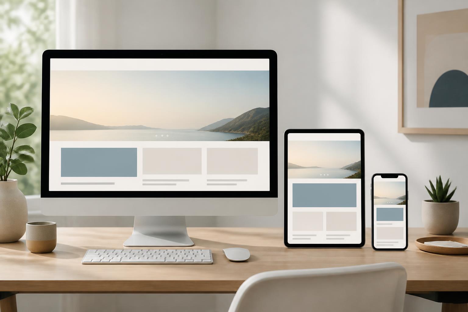
After addressing the needs of small screens, the team can expand the layout according to different amounts of available space. Expansion should not be based solely on device size, because two screens with the same width may still be used in different contexts. What matters is that the layout changes when content begins to run out of room or when empty space becomes wasteful.
A single content column on a phone can become two or three areas on a large screen. An image can be placed beside the description instead of above it. Filters can be displayed directly rather than requiring each panel to be opened. However, every change needs to preserve the same logic and terminology so that users do not feel they are accessing different websites.
This is also the time to consider how multidimensional content such as comparison tables, calendars, long lists, or maps should be displayed. Not every component should be forced into a narrow screen. It may be necessary to allow deliberate horizontal scrolling, divide the content into sections, or provide an alternative view that is easier to use.
Test in real conditions instead of relying only on the design
An interface that looks reasonable in a design tool can still cause problems when used in reality. Test users may fail to notice the button they need to tap, misread a label, overlook a notification, or have difficulty returning to the previous step. Therefore, testing should begin with specific tasks rather than simply asking users whether they like the interface.
Observe how someone finds a product, reads an article, submits a form, or performs a primary action. Record when they stop, tap the wrong item, scroll too much, or have to guess. These observations are more valuable than checking the interface on only one screen size. The website should also be reviewed under different conditions, such as when the text size is increased, images have not finished loading, or content is longer than expected.
Alongside usability testing, accessibility and state consistency must be checked. Users need to recognize when an action is being processed, when data has been submitted, and when an error has occurred. These states are especially important on phones, where users may be paying attention to several things at once.
Common mistakes
The first mistake is treating mobile-first as a mandatory reduced version of the desktop website. In that case, important content may be hidden too deeply or removed simply because it is difficult to arrange. The right approach is to identify goals and needs first, then find an appropriate way to present them on each screen.
The second mistake is overusing collapsed menus, pop-up windows, and swipe gestures. These mechanisms can save space, but they can also increase the number of steps and make functions difficult to discover. Every time content is hidden, there should be a clear reason, along with a sufficiently understandable indication that tells users where to find it.
Another mistake is optimizing only the interface while overlooking content and loading speed. A page with a beautiful layout that takes a long time to display, uses heavy images, or has an unreliable form still creates a poor experience. Mobile-first requires coordination among design, content, development, and testing, rather than being assigned entirely to a single department.
Mobile-first should become a working principle
Mobile-first design is not a decorative interface choice, nor is it intended only for websites with high levels of phone traffic. It is a way of organizing the decision-making process so that important content is prioritized, interactions are carefully considered, and performance is taken into account early. When done properly, a website is not only suitable for small screens but also becomes clearer on larger screens.
Businesses can begin by taking inventory of the main tasks, identifying essential content, and building a simple version for phones. The team can then test it with real users, adjust points that create obstacles, and only afterward expand the interface for other screen sizes. This approach helps the design stay aligned with user needs instead of chasing the number of elements.
In an environment where users can access websites anywhere, the small screen is no longer a secondary case to be handled last. It is a real-world context for testing the clarity, effectiveness, and ease of use of the entire digital product.