

System-Based Website Design: The Foundation for a Consistent and Scalable Experience


A Website Is More Than a Collection of Individual Pages
When beginning to build a website, many businesses tend to focus on specific pages such as the homepage, about page, services page, or contact page. This approach is suitable for a small project with limited content, but its limitations become apparent as the website grows. Each time a new page is added, the team has to decide on the colors, heading sizes, button styles, spacing between sections, and ways to present images. Without shared principles, the interface can easily become patchwork, even when each individual page still appears complete.
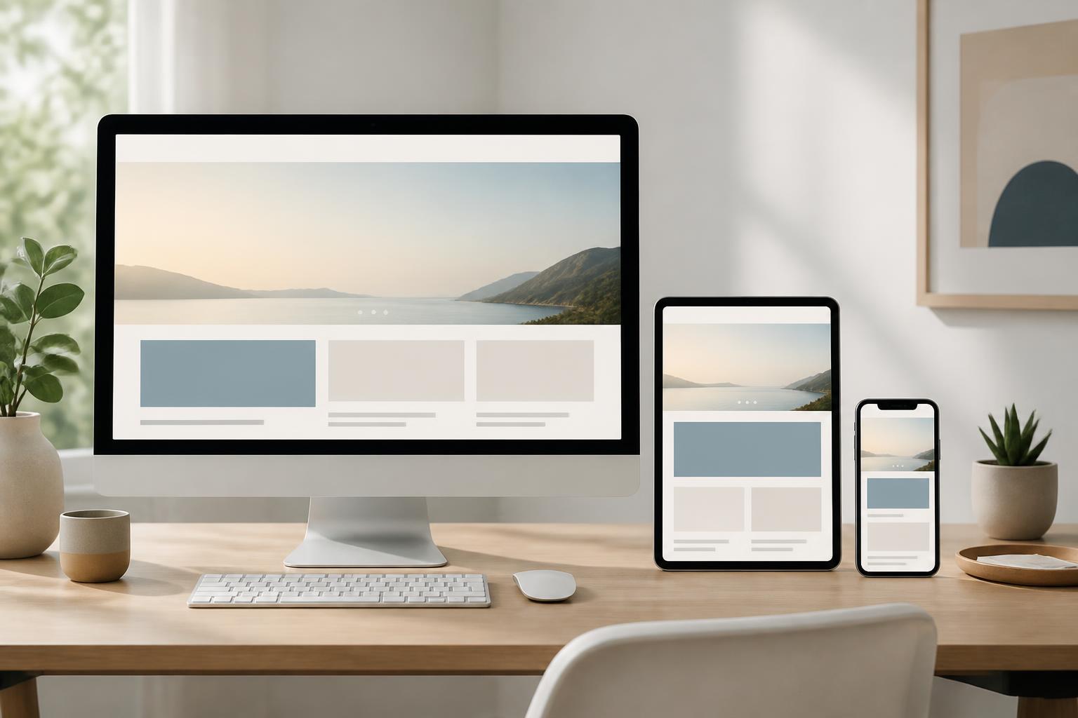
System-based website design is a way of organizing an interface around components, rules, and relationships that have been defined in advance. Rather than viewing each page as an independent product, this approach treats the website as a unified whole with a consistent visual language. A call-to-action button, product card, or frequently asked questions section can be used in multiple places while retaining familiar identifying characteristics and behavior.
Importantly, a design system does not mean that every page must look exactly the same. Its goal is to create intentional consistency while still allowing each type of content to be presented appropriately. E-commerce websites, service websites, and content publishing websites all have their own needs, but their basic components still need to work together within the same system.
The Layers That Make Up a Design System
Visual Foundations
The first layer includes the elements that create the website’s overall appearance. These may include the color palette, typography, heading hierarchy, rules for using icons, corner radii, borders, shadows, and spacing. These elements should not be selected in isolation. The primary color should have a clearly defined role, secondary colors should support information hierarchy, and accent colors should be used selectively so viewers can identify important areas.
Spacing is also part of the design language. If each content block uses different spacing without a reason, the website will lose its visual rhythm. Conversely, establishing a relatively consistent spacing scale helps make the relationships between elements easier to recognize. Designers do not need to turn every decision into a rigid formula, but they should define basic levels to limit arbitrary adjustments.
Interface Components
Interface components are reusable blocks such as buttons, form fields, navigation bars, content cards, pricing tables, notification boxes, confirmation dialogs, or call-to-action sections. Each component should be described not only in terms of its appearance but also its states and usage. For example, a button may have a default state, a hover state, a pressed state, a disabled state, or a loading state.
Defining states helps the interface provide clearer feedback. Users need to know whether an action has been received, whether a data field contains an error, or whether a function is currently unavailable. If only the default state is designed, the product often looks fine in a presentation but can easily encounter problems in actual use.
Layout Patterns and Combination Rules
Individual components are only the building materials. To create a complete website, it is necessary to define how they are combined into common layout patterns. For example, a service page may include a brief introduction, key benefits, the implementation process, frequently asked questions, and a contact button. An article page may include a title, classification information, a featured image, the main content, and related articles.
These patterns are not intended to limit creativity; they help the team begin with a well-founded structure. When a new page needs to be published, the person responsible for the content does not have to build everything from scratch. They can choose the closest pattern and then adapt it to the specific objective. As a result, interface quality depends less on whether each individual remembers all the rules.
Why Design Systems Matter as a Website Grows
The most noticeable benefit is consistency. Viewers can quickly recognize which element is the main heading, which information is supplementary, and which action needs to be taken. When familiar components appear in similar ways across multiple pages, users do not have to relearn how to use the website in each context. This consistency creates a professional impression, but more importantly, it reduces friction during exploration and interaction.
A design system also helps reduce coordination costs between teams. Designers can communicate with developers using shared names and rules instead of describing every detail through separate images. Content managers know which types of blocks have already been prepared and where they can be used. When multiple people work on the same website, a shared foundation helps limit unnecessary differences between sections.
Scalability is another benefit. A website can add landing pages, a member area, search functionality, or a new content group without having to change the entire interface. If components are built with structure, a single improvement can be applied in multiple places. For example, when the rules for displaying buttons are adjusted, buttons using the same component can be updated consistently instead of being edited manually on each page.
However, a design system does not automatically solve every problem. A system that is built too complexly will be difficult for the team to use. A set of rules that is not updated will quickly become outdated. Therefore, the value of a system lies in how well it fits the website’s actual scale, processes, and objectives.
How to Get Started Without Turning the Project into a Burdensome Documentation Set
Businesses do not necessarily have to build a complete system from day one. A more practical approach is to begin by auditing the existing interface. Gather the important pages, record the components that are used repeatedly, and identify inconsistencies. There may be multiple button styles serving the same purpose, several heading levels with very similar appearances, or multiple form patterns designed in different ways.
After the audit, the team should prioritize components that appear frequently and directly affect the experience. Buttons, typography, colors, form fields, navigation bars, and basic content patterns are often reasonable starting points. Standardizing a few important groups first will create a clearer impact than trying to describe every rare case.
Each component should have concise, easy-to-consult guidance. The guidance may state the component’s name, purpose, states, situations in which it should be used, and situations in which it should not be used. If there are multiple variations, the differences between them should be explained. For example, a primary button is intended for the most important action in an area, while a secondary button is used for an additional option. This type of description helps system users make more consistent decisions.
Alongside design, implementation should also be reviewed. A component that looks identical but is built with multiple separate pieces of code will be difficult to maintain later. The development team should communicate with designers early to determine which components can be reused, how they should be named, and how variations should be handled. Coordination from the beginning is generally more effective than waiting until the end of the project to find a way to synchronize the two sides.
Common Mistakes
One common mistake is placing too much emphasis on appearance while neglecting content and behavior. An attractive color palette cannot replace a clear information structure. A set of components with numerous effects is also of little value if users do not understand what to do next. A design system must serve the website’s objectives; it should not become a collection of decorative elements detached from practical needs.
The second mistake is creating too many variations. When each component has too many options for size, color, and presentation, the system becomes difficult to use. The person responsible may choose the wrong variation or create a new one simply because they cannot find a suitable option. Before adding a version, consider whether the need will recur and whether it is truly different in terms of function.
Another issue is building a system only for the design mockups without considering real content. Overly long headings, images with different aspect ratios, error messages, or empty states can all cause the layout to change. Therefore, testing should use data that is close to reality, including short and long content, missing images, and situations in which errors occur. This is how weaknesses in the system can be identified early.
Finally, design documentation is often neglected after the website goes live. Whenever a new component is added, the brand is changed, or the way something is displayed is adjusted, the documentation should be updated accordingly. This does not need to become a burdensome procedure, but someone must be responsible for it and there must be a clear way to record changes.
Measuring the Value of a Design System
The effectiveness of a system should not be evaluated solely by whether the interface looks better. Businesses can track the time required to create a new page, the number of duplicate components, the number of interface errors discovered after release, and how easily a shared change can be updated. These indicators help reveal the system’s impact on the workflow.
User feedback is also important. If visitors frequently overlook action buttons, have difficulty completing forms, or fail to recognize the relationship between pages, the problem may lie in the structure and presentation rather than in the content alone. A design system should be improved based on real-world observation instead of being treated as an unchanging set of rules.
Conclusion
System-based website design is an investment in the foundation, not an extra decorative step at the end of a project. By defining a visual language, building reusable components, and establishing how they should be combined, businesses can maintain a consistent experience even as the website continuously adds content and features.
A good system does not need to be massive. It needs to be clear, sufficient for current needs, and capable of developing alongside the product. When updated through use, the system becomes a point of connection between content strategy, design, development, and operations. This is the foundation that helps a website not only function well at launch but also remain coherent through subsequent stages of expansion.