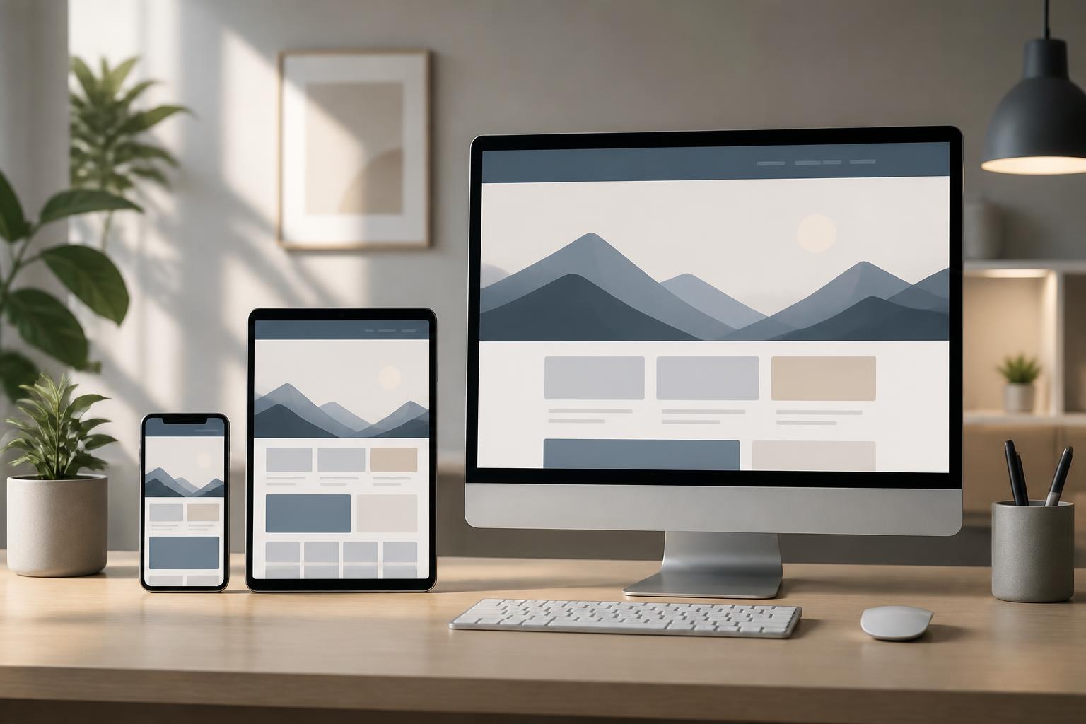



Website Design Systems: How to Create Consistent and Scalable Experiences


When a website begins to have many pages, multiple content groups, and several people involved in updating it, inconsistencies in the interface often appear very quickly. A button on one page may have a different color from one on another page, the spacing between content blocks may be uneven, headings may use multiple typefaces, or the same function may be displayed differently in different places. Each small discrepancy may not be immediately irritating, but together they make the website look unprofessional and require users to spend more time understanding how to interact with it.
A website design system is built to solve this problem. It is not merely a color palette or a few ready-made interface templates. It is a collection of principles, components, and conventions that helps a team create websites that are consistent, easy to use, and scalable. When prepared properly, this system helps connect brand objectives with the actual experience of visitors, while significantly reducing the effort required to design or develop new functions.
What is a website design system?
A design system can be understood as a common language among content creators, designers, developers, and the people who manage a website. This language defines which colors the website should use, what the typography should look like, how components should be arranged, and how they should respond to user actions. The system is not intended to limit creativity, but to provide a stable foundation so that creativity can be applied in the right places.
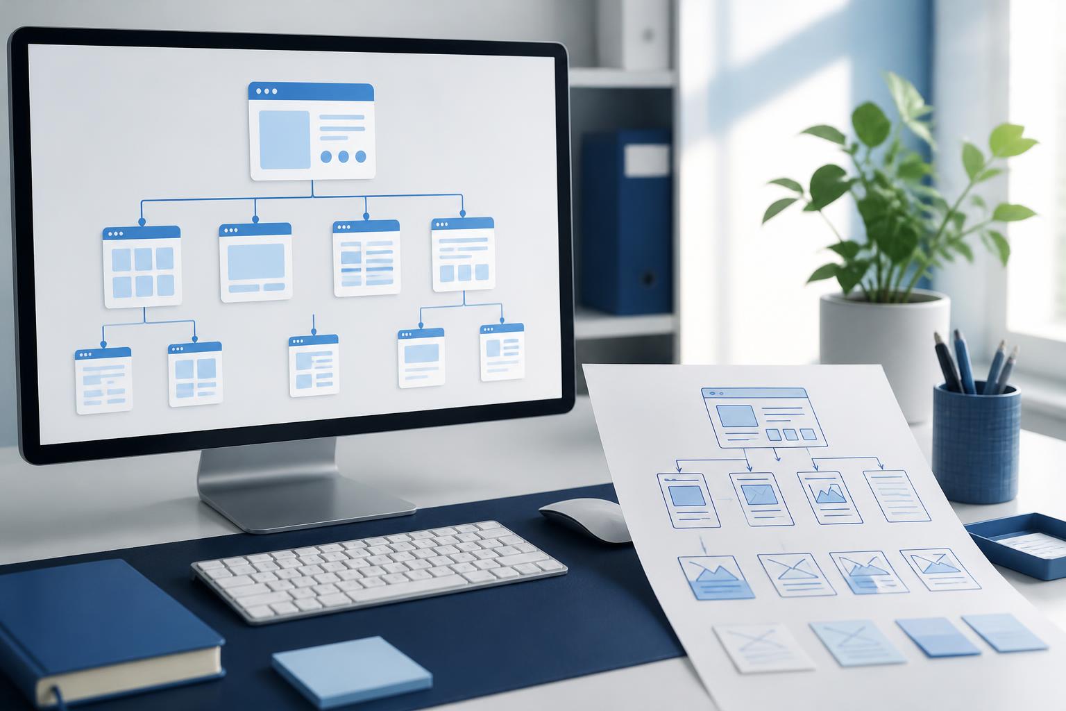
A complete system usually consists of three layers. The first layer is made up of foundational principles such as the color palette, typography, layout grid, spacing, corner-radius sizes, and shadow depth. The second layer consists of interface components such as buttons, form fields, content cards, navigation bars, dialogs, and notifications. The third layer includes layout patterns or guidelines for combining components to serve specific situations, such as a service detail page, a contact page, or an account area.
The important point is that these components do not exist independently. Colors need to support readability, typography must suit the content structure, and buttons and forms need to clearly reflect the actions users can take. A good system always considers the relationships between elements instead of focusing only on the appearance of each individual detail.
Why does a website need a consistent interface language?
Consistency helps users form expectations. Once they understand that a button has a particular color, shape, and response, they can recognize similar buttons on other pages without having to learn from the beginning. This is especially useful for websites with large amounts of content, registration processes, appointment scheduling, request submissions, or purchases.
Consistency also reduces the burden on the operations team. If every page is designed in its own way, a small change such as adjusting a button color or updating the typography may require checking many different interface patterns. By contrast, when shared components are clearly defined, changes can be implemented in a controlled manner and the risk of omissions can be minimized.
From a branding perspective, a design system helps a website maintain a stable identity even when many people are involved in producing it. A new article, a service page, or a contact form can still convey the same visual feeling if it is built from common rules. Visitors do not merely see a beautiful website on one particular page; they recognize a seamless experience throughout their exploration.
Foundational components that need to be standardized
Colors and their intended meanings
A color palette should not be created solely according to aesthetic preferences. Each color needs to have a clear role, such as a primary color for brand recognition, an action color for important buttons, background colors for different levels of sections, and status colors for success messages, warnings, or errors. Naming colors according to their roles is more useful than naming them based on personal impressions, because a color may be adjusted in the future while its function remains unchanged.
A website should also avoid using color alone to communicate information. An error state should be accompanied by explanatory text or an appropriate icon, rather than merely changing a border to red. This approach supports users with different color-perception abilities and makes information clearer across different devices and lighting conditions.
Typography and content structure
Typography directly affects readability and the hierarchy of information. The system should clearly define the typeface and styling for headings, paragraphs, captions, links, and form content. In addition to size, attention should be paid to weight, line height, paragraph length, and the spacing between heading levels. A page with a well-structured typographic system helps users scan the content quickly before deciding to read it carefully.
Too many typographic levels should not be created unless they have a clear purpose. A moderate number of heading and supporting-text levels is usually much easier to maintain than many nearly identical variations. When content is updated by many people, simple conventions also help prevent each person from choosing a separate format.
Spacing and layout grids
Whitespace creates rhythm on a page and helps distinguish groups of information. If the space between elements in the same group is too large, users may think they belong to different areas. If every element is placed too close together, the page will feel heavy and be difficult to scan. Therefore, the system should provide a reasonable spacing scale so that pages can use spacing consistently.
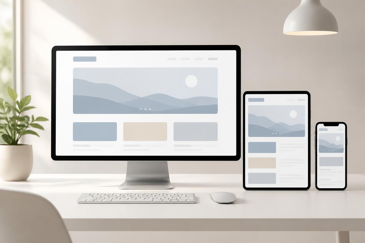
The layout grid also needs to be described in a way that is easy to apply. The team should know the maximum width of the content area, how columns change on smaller screens, and when a group of components needs to shift from a horizontal row to a vertical layout. These rules help the interface adapt flexibly without requiring every page to be handled as a completely separate case.
Interactive components
Buttons, links, input fields, select lists, and dialogs are components that users interact with directly. They need to have normal, hover, selected, processing, and disabled states where appropriate. Visual feedback indicates whether the system has received an action, thereby reducing repeated clicks or the impression that a function is not working.
Forms need to be designed with particular care. Field labels should clearly state what information users need to provide, while error messages should identify the problem and explain how to fix it. A generic message such as “Invalid data” is often not helpful enough. Form components in a design system should come with rules for labels, hints, error states, and completion messages.
The process of building a design system for a website
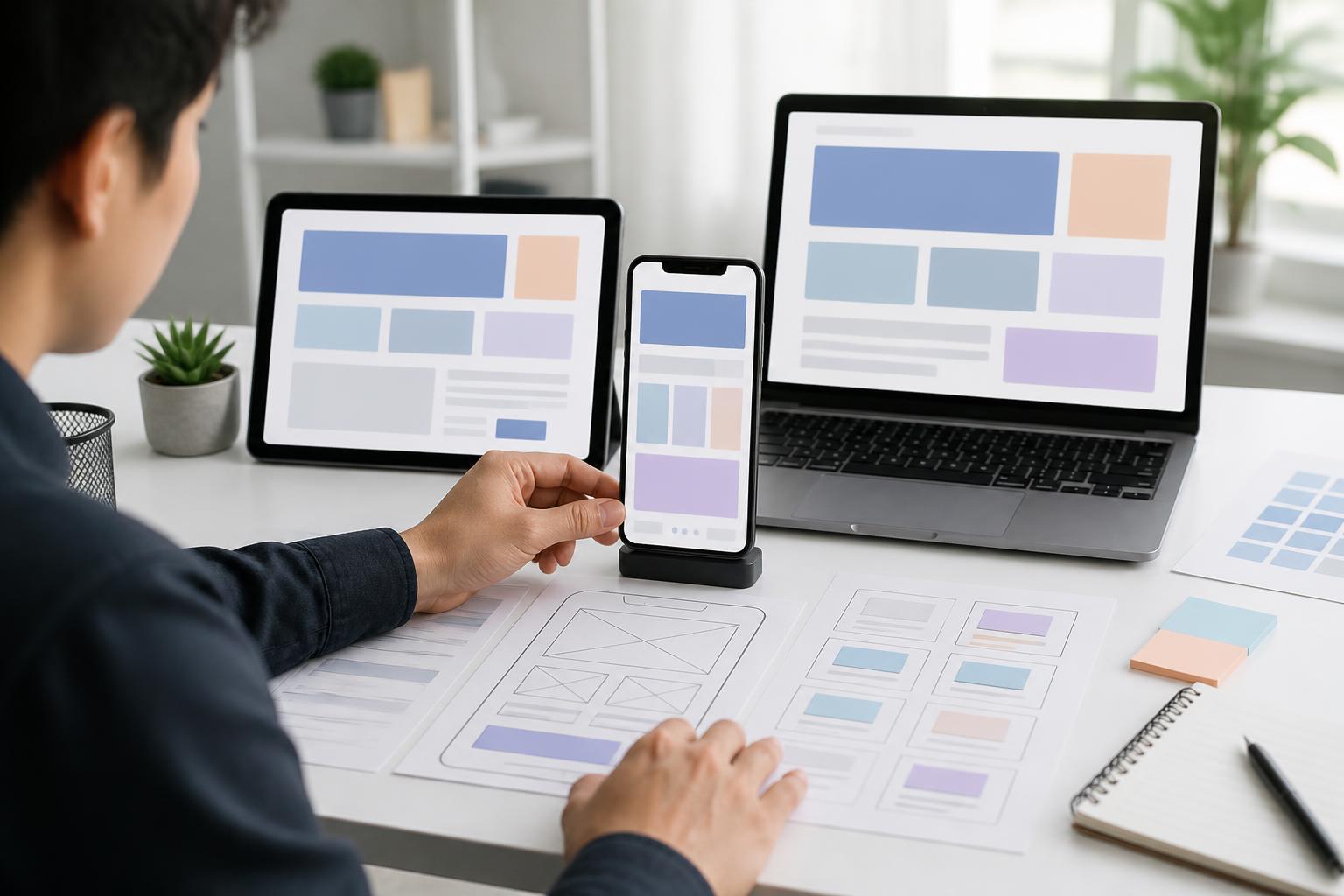
The first step is to audit the existing interface. The team can review important pages and record the colors, typography, buttons, forms, and layout patterns currently in use. The purpose is not to immediately eliminate every difference, but to understand the degree of fragmentation and identify the components that appear most frequently.
Next, similar components should be grouped together to identify a standard version. There may be multiple button styles serving the same purpose or several ways of displaying a notification for the same state. The choice of version should be based on the content objective, ease of use, responsiveness across screen sizes, and suitability for the brand.
Once the foundation has been aligned, the team should document the usage rules in an easy-to-read format. The documentation does not need to be long or overly technical. A component example should explain when it is used, when it should not be used, what states it has, and what content-related points require attention. If there are only images without instructions, future users may still apply the component incorrectly.
Finally, the system needs to be tested in real-world contexts. A component may look good in a static example but encounter problems when the content is long, when a form contains errors, when it is displayed on a small screen, or when users enlarge the text. Testing should therefore include unusual situations rather than checking only ideal states.
Maintaining the system as the website grows
A design system is not a document that is created once and then put away. When the website has a new feature, the team needs to consider whether that function can use an existing component or whether a new component needs to be added. If a new variation is created, its rationale should be clearly stated to prevent increasingly large numbers of nearly identical versions from appearing.
Change management should also have someone responsible for it. This person does not necessarily have to carry out all the work themselves, but they need to ensure that new proposals are evaluated from multiple perspectives: content, design, technology, accessibility, and the impact on pages that are already live. A simple approval process will help the system develop with direction instead of expanding in response to each short-term request.
In addition, it is necessary to distinguish between mandatory rules and areas of flexibility. Factors related to readability, interaction states, or form structure may need to be followed strictly. Meanwhile, the presentation of images, the choice of featured content, or the layout for a specific campaign can be adjusted within appropriate limits. This balance helps the website remain consistent without becoming mechanical.
The long-term value of a good design system
The greatest value of a design system does not lie in the number of components it lists, but in its ability to help the team make quick, well-grounded decisions. When a new page needs to be built, no one has to start with a blank screen. They can combine foundations that have already been tested and spend more time on content, business objectives, and users’ actual needs.
The system also enables the website to develop sustainably. A consistent interface is easier to explain, test, and improve. When the brand changes or technology is upgraded, the team can adjust each layer of the system instead of manually modifying dozens of pages. This is how design becomes a long-term capability of the website rather than work focused on handling individual screens.
A professional website is therefore not judged solely by an attractive homepage. A reliable experience is created through the details that are repeated every day: how headings guide readers, how buttons respond, how forms provide guidance, and how pages connect to one another. Building a website design system is the process of organizing these details into a common language, so that the website is both easy to use today and ready to scale in the future.