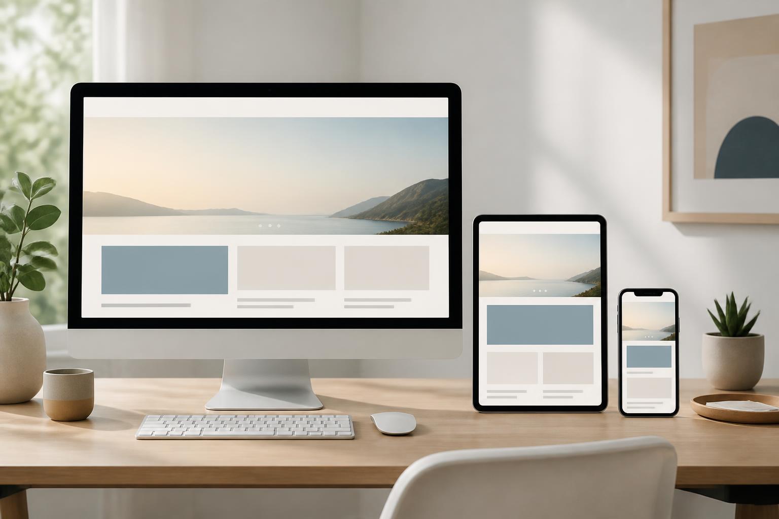



Mobile-First Website Design: Building a Better Experience from the Small Screen


Phones have become one of the most familiar touchpoints between customers and businesses. A person may see a brand name on social media, search for information on Google, open a link from an email, or access it directly through a mobile browser. In many cases, a website on a small screen is the first impression a business creates.
However, quite a few websites are still built with a desktop-centered mindset. The interface is designed to be wide and then reduced to display on phones. This approach often results in text that is difficult to read, buttons that are too small, images that take up too much space, and important actions pushed too far down the page. Users may not identify the specific cause, but they may leave before understanding what the business offers.
Mobile-first design offers a different approach. Instead of starting with a large screen and cutting things down, the design team starts with the limited space of a phone. The most important content, functions, and actions are identified first, and then the interface is gradually expanded for tablets and desktop computers. This is not a decorative trend, but a method that helps websites become clearer about their objectives and more disciplined in how they organize the experience.
What does mobile-first really mean?
Mobile-first does not mean designing only for phones. The concept describes the order of priorities in the website-building process. The small screen is treated as the context with the greatest limitations in terms of space, visibility, and interaction. When an interface works well in that context, expanding it to larger screens has a clearer foundation.
On phones, users typically scroll vertically, interact with their fingers, and read content for short periods. They do not have much room to view many choices simultaneously. Therefore, mobile-first design forces the team to answer important questions: What information needs to appear first? Which call-to-action button deserves priority? What content can be condensed? And which functions are truly necessary?
In traditional design, moving from a desktop interface to a phone can sometimes feel like trying to fit all the furniture from a large room into a small space. Mobile-first design begins by choosing what is most essential, arranging it appropriately, and only then adding space and features when the screen allows. As a result, the interface does not become dependent on unnecessary elements.
Start with objectives instead of starting with the interface framework
A common mistake is to open design software and immediately build the homepage before agreeing on the objective. For a business website, the objective may be to introduce services, receive consultation requests, sell products, provide documents, or support customers. Each objective requires a different arrangement of content and call to action.
Before designing, a business should identify its primary user groups and the situations in which they access the website. A customer looking for an urgent service will need to see contact information and a fast-handling process. Someone comparing multiple providers will be more interested in capabilities, service scope, completed projects, and how to request a quote. If these needs are mixed together in one interface, users will have to filter the information themselves.
A mobile-first design should be built from a content-priority system. The top section of the page can focus on the problem the business solves, the customer groups it serves, and the next action. Content demonstrating capabilities, frequently asked questions, and detailed information can be arranged in subsequent sections. This order should reflect the decision-making journey, not merely the desire to place as much information as possible on the page.
Organize content so users can read it easily
Small screens are not well suited to long, continuous paragraphs, vague headings, or information blocks without clear stopping points. Content needs to be divided into sections with clear purposes. Headings should indicate what each section is about, while the opening paragraph should help readers understand why the information is relevant to them.
Condensing content does not mean removing every detail. An in-depth article, service page, or product page can still be long if the information is layered appropriately. The beginning provides the main answer, while later sections explain, substantiate, and add detail. Users can stop when they have enough information or continue reading if they need to learn more deeply.
Call-to-action buttons also need to use specific wording. Labels such as “Submit” or “Learn more” often do not indicate what will happen. Depending on the context, wording such as “Get a consultation,” “View service packages,” “Download the document,” or “Schedule a discussion” may be used. A good button is not only visually appealing but also reduces hesitation before the next action.
Whitespace and reading rhythm
Whitespace on phones plays an important role because it separates groups of information and reduces a cramped feeling. When all elements are too close together, users may have difficulty distinguishing the heading, description, and button. Conversely, appropriate spacing creates a steady reading rhythm without requiring too many borders or effects.
Design also needs to pay attention to line length. A paragraph that is too wide on a computer may become easier to read when constrained, but on a phone, constant line breaks can also cause fatigue if the sentences lack structure. Content, font size, line height, and spacing between paragraphs should be checked on actual devices rather than viewed only within a mockup frame.
Design touch interactions and forms
Fingers are not as precise as a mouse cursor. Therefore, links, buttons, and interactive areas in a mobile interface need to be large enough to tap easily and should not be placed too close together. This is a fundamental experience issue that is often overlooked when design is based only on a computer screen.
Navigation bars on phones also need careful consideration. Placing too many items in a menu makes it difficult for users to choose, while hiding all important content behind multiple layers of menus makes the journey longer. The items shown in the primary navigation should be destinations of high value to users, such as services, products, business information, and contact details.
Forms are a particularly important area for lead-generation websites. A long form can discourage users before they complete it. Businesses should consider which information fields are truly needed at the first step and which can be requested after the conversation has begun. Field labels should be clear, error messages should be easy to understand, and entered data should not be lost when users correct an incorrect field.
For phone numbers, email addresses, or dates, the way the keyboard is displayed and the input format also affect the experience. These small details do not create as much visual impact as colors or images, but they determine whether users complete an action.
Loading speed needs to be considered from the design-selection stage
Website speed is not solely the responsibility of the server administrator. Decisions about images, fonts, motion effects, external libraries, and content structure can all affect display time. An interface with many effects that causes the main content to appear slowly will reduce the value of those effects themselves.
Images should be prepared at the exact dimensions needed for display and compressed appropriately for their intended use. Not every image needs a high resolution. Images below the top section of the page can be loaded when needed instead of requiring the browser to load everything as soon as the user opens the page. Icons and decorative elements should also be used selectively.
Font management is also important. A website that uses too many typefaces or depends on multiple external files may introduce unnecessary delays. A simple, readable, and consistent type system is often more suitable for a business website, especially when content needs to be displayed across many devices and browsers.
Responsive design needs to go hand in hand with mobile-first
Mobile-first design and responsive design are related concepts, but they are not exactly the same. Mobile-first design concerns how the interface is prioritized and built. Responsive design concerns the ability of the layout to adapt to different screen sizes. A good website needs both: a foundation with clear priorities and the ability to adjust appropriately as the available space changes.
When expanding to a larger screen, every element should not simply be stretched horizontally. The additional space can be used to create content columns, provide supplementary information, or increase spacing to make the interface feel more open. However, every expansion must still serve the original objective. A large screen is not a reason to bring back content that was intentionally removed.
The testing process should include multiple screen sizes, orientations, and browsers commonly used by the target customer group. The team should observe not only whether the interface breaks, but also whether users understand the order of the information, can tap buttons easily, and can complete tasks without obstacles.
Accessibility is part of design quality
A mobile-first website also needs to be built with attention to accessibility. Text must have sufficient contrast against the background, content should not be distinguished solely by color, and meaningful images need appropriate descriptions. Headings should be organized hierarchically so users can understand the structure of the page.
Interactive components need to have clearly recognizable states when they are selected or activated. Videos, pop-up windows, and motion effects should not interfere with reading or navigation. Some users may use devices with larger text sizes, interact more slowly, or use a different input method. The more flexible the design, the better the website can serve a range of usage situations.
Accessibility should not be treated as a final bug-fixing step in a project. If it is considered from the beginning, it often helps make content clearer, navigation more logical, and the interface easier to use for everyone.
Common mistakes when implementing mobile-first
The first mistake is confusing mobile-first with shrinking a desktop interface. In that case, the old column system, images, and menu are retained, with only their sizes changed. The result is that users have to scroll too much or zoom in to read.
The second mistake is focusing too heavily on the top section of the page. Businesses try to fit the logo, menu, heading, image, call-to-action button, and multiple messages into a small space. The top section becomes overwhelming, while users have not yet had time to understand the website’s core value.
The third mistake is hiding too much content behind expansion actions. Collapsing content can make a page more compact, but if every answer is behind a button, users will have to take many actions to assess whether the website is suitable for them.
The final mistake is checking the interface only when the project is nearly complete. Problems with content, navigation, or forms are often difficult to fix once they are tightly integrated with the code and page structure. Testing early with a simple prototype helps identify the wrong direction before the cost of changes increases.
A practical design process
A mobile-first process can begin by listing the business objectives, user needs, and key actions for each type of page. The team then builds the content structure, arranges priorities, and sketches the basic interface blocks. At this stage, there is no need to invest in colors or effects. What matters is checking whether users can move from the initial information to the desired action.
Next comes the development of a design system consisting of colors, typography, buttons, forms, content cards, and interaction states. When these components are consistent, expanding the website becomes easier to control. The interface is then tested on actual devices, together with checks of content, speed, accessibility, and important links.
Once the website is operational, the optimization process is not over. Businesses should monitor the pages that are visited, the steps at which users commonly stop, and the questions customers repeatedly ask during consultations. The data observed can suggest changes to content, button placement, form structure, or the way services are presented. Mobile-first is therefore not only a method for the design stage, but also a way to maintain a focus on the experience throughout the website’s lifecycle.
Designing a website from the small screen helps businesses see clearly what is truly necessary. When content is prioritized, interactions are simplified, speed is considered early, and the interface is tested in real-world contexts, the website will have a stronger foundation for serving both mobile and computer users. An effective website is not the place that contains the most components, but the place that helps visitors understand the information correctly and complete their goals with as few obstacles as possible.